The Beauty of Order: Grids and Interface Design
Interface design shapes the way we interact with digital environments, setting the stage for seamless experiences. Yet, an unsung hero lurks behind the most successful, user-friendly interfaces - the humble grid. This structural framework, often unseen by users, serves as the backbone for visual elements, helping designers to create harmonious, intuitive layouts. This blog post unpacks the role of grids in interface design, unveiling their power, purpose, and practice. We'll explore their historical roots, delve into types, examine their influence on modern UI trends, and offer practical tips for their effective use. Let's embark on this journey, revealing the fundamental role grids play in creating captivating digital landscapes.
Unraveling the Grid: A Design Journey
What Are Grids and Why Do They Matter?
Grids in design can be thought of as invisible maps, guiding the placement and proportion of elements. They serve to organize content, maintain consistency, and provide a visual rhythm, making interfaces more digestible and aesthetically pleasing.
A Historical Dive into Grids
The concept of grids traces its roots back to the manuscript layouts of medieval scribes, later adopted by print media to arrange text and images. As digital technology evolved, so did the grid, transitioning into the digital design realm. In the mid-1980s, grid systems began their journey into graphic interface design with the advent of Graphic User Interfaces (GUIs), playing a crucial role in making digital content accessible and engaging.

The Great Leap: Grids in Digital Media
Grids found a new playground with the emergence of the internet. Web designers quickly recognized their value in creating structured, coherent layouts. With the ongoing evolution of web and app design, the use of grids has become an industry standard, a testament to their time-tested effectiveness and adaptability. As we'll see in later sections, these foundational systems continue to shape and influence modern interface design trends.
Getting to Grips with Grids: The Essentials
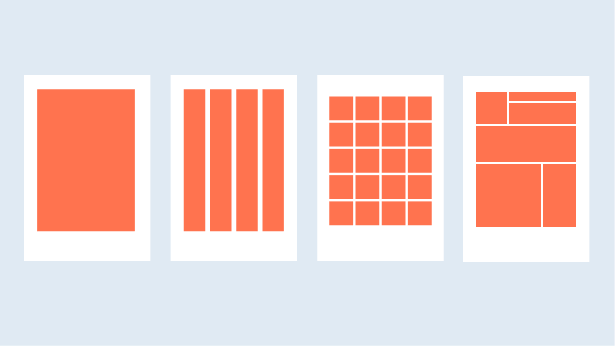
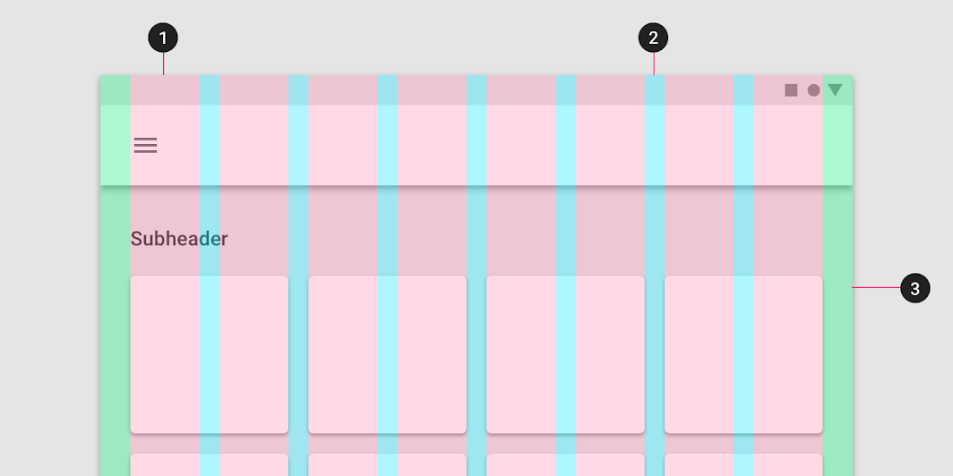
Grid systems, the underlying skeletons of design, come in various forms: manuscript, column, modular, and hierarchical. Each type brings unique advantages to interface design. The anatomy of grids consists of margins (the space around the grid), columns (vertical grids), gutters (the space between columns), modules (the spatial units formed by intersecting rows and columns), and spatial zones (groups of modules that help structure content). Understanding these components is key to unlocking their potential.
In the digital design world, grids also interact with breakpoints in responsive design. Breakpoints are the points at which a website's content and design will adapt in a way that best suits the viewer's device. This flexibility is essential in a world where content is viewed across an array of screens, from smartphones to large monitors.
If you want to learn more about grids, check out these articles:
The Magic of Grids: The Role in Interface Design
Grids are not just aesthetically pleasing; they bring order to chaos, improving readability and content organization. They create a consistent layout across different screens or pages, enhancing the overall user experience.
Furthermore, grids are fundamental for responsive and adaptive design. By defining how elements should rearrange themselves at different screen sizes, grids ensure that designs are as effective on mobile devices as they are on larger screens.
Without realizing it, users have come to expect grid-based design. It guides them naturally through the digital landscape, creating a sense of familiarity, even on new websites or apps. Hence, it's safe to say that the use of grids is an unspoken rule in interface design.
In the Footprints of Grids: Modern UI Design Trends
In the evolving landscape of design, grids play an influential role, especially noticeable in popular styles like Material Design, Flat Design, Minimalist, and Brutalist web designs.
Material Design, Google's design language, heavily emphasizes the use of grid-based layouts. It's akin to a flexible grid of paper sheets, with elements behaving as if they're physical cards placed on this grid. Flat Design, on the other hand, leverages grids to present elements neatly and uniformly, emphasizing usability.
Meanwhile, Minimalist design uses grids to create a clean, uncluttered interface. Even Brutalist design, known for its raw, unpolished look, utilizes grids to maintain structure amid its purposeful visual chaos.
Finally, the increasing importance of mobile interfaces has put grids center stage, as they ensure designs remain effective, regardless of screen size.
Grids in Action: Practical Applications in Interface Design
Grids work silently behind the scenes in both web and mobile app design, creating structure, enhancing readability, and ensuring consistency across different screens.
For web interfaces, grids guide the placement of navigation menus, headers, text blocks, images, and more, enabling quick visual scanning. In mobile app design, grids help to organize icons, text, images, and other interactive elements within the limited screen space, ensuring accessibility and ease of use.
By studying successful grid-based designs, we can learn how grids can be used innovatively to create user-friendly interfaces. Looking at case studies also gives us a practical understanding of how grids contribute to the overall user experience.
Navigating the Grid: Challenges and Solutions
While grids bring numerous benefits, using them effectively can present challenges. For instance, rigid adherence to grids can sometimes limit creativity, resulting in designs that feel overly structured or monotonous. Balancing the need for order and freedom requires a nuanced understanding of grids and their purpose.
Moreover, as screens become increasingly diverse in size, managing responsive design can be complex. To overcome this, designers need to understand breakpoints and how to use them effectively.
Lastly, creating a grid that supports all content types is a challenge. Designers should remember that the grid serves the content, not the other way around. Thus, flexibility and adaptability are key when designing grid systems.
The Art of Grids: Tips and Best Practices
Starting with a mobile-first approach ensures that your design will scale well to larger screens. Always consider your content before defining your grid. It helps ensure your grid system enhances your content rather than obstructing it.
Remember, user experience should be at the center of design. Grids should guide users naturally through your interface and make interactions intuitive. Finally, always ensure accessibility. Consider how color contrasts, font sizes, and element spacing on your grid affect users with different abilities. Grids should help, not hinder, accessibility in your design.
Reflection and Continual Learning: The Grid in Interface Design and Beyond
As we conclude our deep dive into grids and interface design, we're reminded of the dynamic interplay between order and creativity that grids facilitate. Their structure helps us design user-friendly interfaces, balancing the freedom of design expression with the coherence demanded by user experience. Despite the challenges they may present, a well-understood and well-utilized grid system is a powerful tool in a designer's arsenal.
To continue your exploration of interface design and design tools, especially Figma, we recommend the following resources:
- Combining Figma With Other Tools For a Higher-Quality Design
- Figma Prototype: What is it and why use it for design?
- Figma's 2023 Little Big Updates: Elevating Your Design Process
- Best Practices for an Effective Design System in Figma
- The Future of Web Accessibility: Unpacking WCAG 3.0, APCA, and the Role of Design Tools
Stay curious and keep experimenting. As grid systems evolve with digital technology, so too must our understanding and application of them in interface design.