In the world of design, accessibility has become an increasingly important consideration. The goal of designing for accessibility is to create products and experiences that can be used by as many people as possible, regardless of their abilities or disabilities. With technology advancing rapidly, designers must keep up with the latest accessibility standards to ensure their products are accessible to everyone.
In 2023, designing for accessibility is more important than ever before. The COVID-19 pandemic has highlighted the importance of digital accessibility, with many businesses having to shift their operations online. As a result, designing for accessibility has become a critical consideration for businesses that want to stay competitive in the digital age.
The benefits of designing for accessibility extend beyond just meeting legal requirements. Inclusive design can improve the user experience for everyone, not just those with disabilities. For example, creating designs with clear and concise language can make them easier to understand for people with cognitive disabilities, but it can also make them more user-friendly for everyone. Additionally, designing for accessibility can increase a business's reach and customer base, as it enables them to reach a wider audience.
Designing for accessibility is a crucial consideration for businesses and designers in 2023. By creating inclusive designs, businesses can not only increase their reach, but also improve the user experience for all. Let's dive into the world of accessibility in design and how it can help shape a more inclusive future.
Keeping Up with Accessibility Guidelines and Standards
WCAG Updates
In the ever-evolving digital landscape, it's crucial to stay informed about the latest Web Content Accessibility Guidelines (WCAG) updates. These guidelines are designed to make online content accessible to a wider range of users, including those with disabilities. Familiarize yourself with WCAG 3.0 (also known as Silver) and its new criteria, which focus on user-centered design, and apply them to your projects.
ARIA
Accessible Rich Internet Applications (ARIA) is a set of attributes designed to improve the accessibility of web applications and content. Learn how to effectively use ARIA attributes to enhance the functionality and access
Prioritizing Color Contrast and Legibility
Color Contrast Ratios
Color contrast is essential for ensuring that text and interactive elements are easily distinguishable by users with low vision or color blindness. Use tools to check color contrast ratios, and aim for a minimum of 4.5:1 for regular text and 3:1 for large text. This will ensure that your design is accessible to a wide range of users.

Font Selection and Size
Choose legible fonts that are easy to read on various screen sizes and devices. Sans-serif fonts are often a good choice due to their simplicity and readability. Also, maintain a proper font size hierarchy with a minimum of 16 pixels for body text, which helps users with low vision read content more easily.
Designing for Keyboard Navigation
Focus Indicators
Not all users navigate websites and applications using a mouse or touch interface. Many rely on keyboard navigation, so it's essential to design with this in mind. Provide clear focus indicators that highlight which interactive element is currently selected, allowing users to understand where they are on the page.
Logical Tab Order
Ensure that your design allows for easy navigation using only a keyboard, following a logical tab order. This means that users should be able to move through your content and interact with elements in a predictable sequence, which is especially important for those using assistive technologies like screen readers.

Adopting Responsive and Adaptive Design
Different Devices and Screen Sizes
In 2023, users access digital content on a wide range of devices with varying screen sizes and resolutions. To provide a seamless and accessible experience for all users, your design should be responsive and adaptive, ensuring that it works well on various devices and screen sizes.
Flexible Layouts
Create flexible layouts that can easily adapt to different screen sizes and orientations. Use relative units like percentages instead of fixed units like pixels, and consider employing CSS Grid and Flexbox to achieve a more fluid layout. This will help ensure that your design remains accessible and visually appealing across different devices.

Providing Alternative Text and Descriptive Labels
Screen Reader Support
Users who rely on screen readers need alternative text for images, diagrams, and other visual elements to understand the content and context. Always provide meaningful alternative text that accurately describes the visual element, ensuring that these users can fully experience your design.
Clear Communication of Function
Make sure to provide descriptive labels for form fields, buttons, and interactive elements. These labels should be clear and concise, explaining the element's purpose and function. This helps users with cognitive impairments, as well as those using assistive technologies, understand how to interact with your design.
Must-Have Figma Plugins for Accessibility
Among the vast selection of Figma plugins, some stand out for their ability to help designers create more accessible designs. In this blog post, we have compiled a list of must-have Figma plugins that can assist in designing for accessibility. By incorporating these plugins into their workflow, designers can improve the user experience for all users, regardless of their abilities or disabilities.
1. Stark: Color Contrast Checker and Simulator
Stark is a Figma plugin that helps you ensure your designs meet accessibility requirements for color contrast. With this plugin, you can quickly check color contrast ratios, identify potential issues, and even simulate various types of color blindness. This allows you to create more accessible designs that cater to a diverse range of users.
2. A11y - Focus Order: Keyboard Navigation Visualization
A11y - Focus Order is a Figma plugin that allows you to visualize the keyboard navigation order of your design. By clearly seeing the order in which users will navigate through your design using a keyboard, you can easily identify any issues and make adjustments to create a more accessible user experience.
3. Visual Contrast: Everything Clearly with APCA
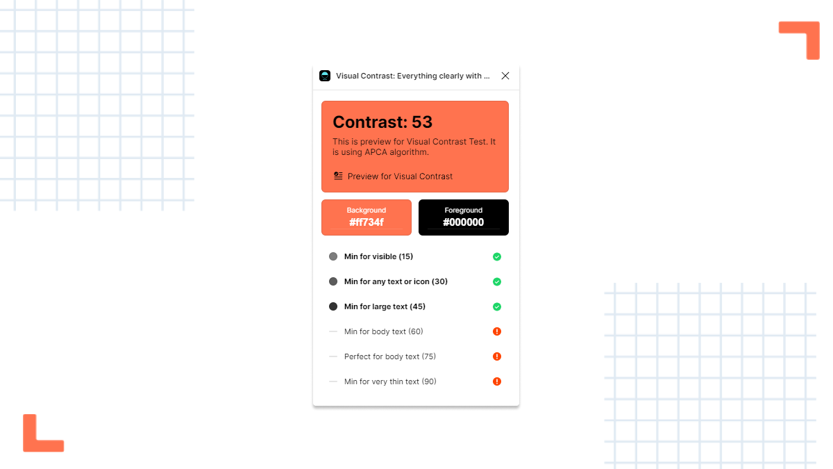
Visual Contrast is a Figma plugin that uses the Advanced Perceptual Contrast Algorithm (APCA) to evaluate color contrast instead of the traditional WCAG method. APCA is a newer, more accurate algorithm that considers additional factors like text size, weight, and surrounding colors to provide a better representation of how users perceive contrast.
Besides from evaluating a frame’s color contrast, if the plugin detects any unclear or low-contrast colors in your design, it will suggest alternative colors that meet accessibility requirements. This makes it easy to address contrast issues and create designs that are both visually appealing and accessible to all users.

By incorporating Visual Contrast into your Figma workflow, you can create more accessible designs by taking advantage of the APCA algorithm and the plugin's other helpful features.
In conclusion, accessible design is not only a matter of compliance, but also a reflection of empathy and inclusivity. By creating accessible designs, we ensure that a diverse range of users, including those with disabilities, can fully engage with digital content. As designers, it's our responsibility to stay up-to-date with the latest guidelines, tools, and techniques in the field. By continuously learning and updating our skills, we can create more inclusive and accessible experiences for everyone. Let's champion accessible design together and make the digital world a more inclusive place for all.
Check out some of our other articles:
