In the vast realm of UX/UI design, icons serve as silent narrators, guiding users and enriching the overall aesthetic of a digital interface. Their subtle presence can simplify complex tasks, making interfaces feel intuitive and user-friendly. But while their visual simplicity often appears straightforward, the process behind selecting the perfect icons is layered with nuance and requires keen insight. Icons are more than mere embellishments; they are pivotal in ensuring clear communication, bridging cultural gaps, and enhancing the interactive experience. Making the right choice, therefore, is crucial. This guide aims to navigate the intricate world of icon selection, emphasizing the importance of understanding their role in your project and ensuring that they resonate with your target audience, both functionally and culturally.
Understand the Context of Your Project
Embarking on the journey of selecting icons begins with a deep understanding of your project's context. Start by identifying your target audience. Are they millennials accustomed to a digital interface, or older individuals who might prefer more traditional symbols? Grasping their cultural backgrounds is equally crucial; an icon that's clear as day in one culture could be perplexing in another.
Furthermore, define the role icons will play in your design. Are they primarily informational, pointing out crucial features or sections? Perhaps they're decorative, enhancing the visual appeal without conveying essential information. Or maybe they're actionable, guiding users towards specific tasks like downloading or sharing. By establishing the core purpose of your icons within the project's ecosystem, you ensure they'll be effective, relevant, and resonate with the users' expectations and experiences.

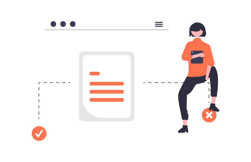
The Dos and Don'ts of Icon Selection
Icons act as a visual language, but just like any language, miscommunication can arise from poor choices. Here are essential guidelines to navigate this terrain:
Dos:
- Consistency is Key: Whether it's style, color, or size, maintaining uniformity across icons ensures a smooth user experience.
- Prioritize Legibility: Opt for simplicity. Overly complex icons can become unintelligible, especially at smaller sizes.
- Test Icons with Real Users: Their feedback can reveal unforeseen interpretations or confusions.
Don'ts:
- Avoid Overloading with Icons: A cluttered interface can overwhelm users, making navigation more difficult.
- Don't Ignore Cultural Differences: For instance, an owl represents wisdom in some cultures but can be a symbol of death in others.
- Steer Clear of Ambiguity: If an icon's meaning isn't immediately clear, it's likely the wrong choice.
A poor icon choice can lead to user frustration, increased support inquiries, or even users abandoning your platform altogether. For instance, if an ecommerce site uses ambiguous icons for crucial actions like "checkout," sales could decline. Icons that seem trendy but are not intuitive might alienate users, undermining the overall user experience.
The Power of Visual Metaphors
Visual metaphors are powerful tools in the world of icon design, allowing complex ideas to be distilled into easily recognizable symbols. Here's how to harness them effectively:
- Universal Recognition: Choose metaphors that are widely understood. For instance, a magnifying glass universally denotes "search."
- Stay True to Function: Ensure that your metaphor aligns with the action or information it represents. A cloud icon might indicate online storage or weather, depending on context.
- Avoid Overused Metaphors: While some symbols are universally recognized, they can become clichéd. It's a balancing act between familiarity and freshness.
However, visual metaphors come with challenges. A metaphor that makes perfect sense in one cultural or age group might not translate well in another. For instance, while a floppy disk is often used as a "save" icon, newer generations unfamiliar with floppy disks might find this confusing.
Ultimately, the goal is to achieve instant recognition, ensuring that users can interact with your platform seamlessly, aided by metaphors that communicate effectively and elegantly.
When and When Not to Use Icons
In UX/UI design, the adage "less is more" often rings true, and this is particularly pertinent when deciding on icon usage.
When to Use Icons:
- Navigation Elements: Icons can streamline and simplify menus or tabs, making navigation intuitive.
- Informational Tooltips: For brief explanations or hints, an icon can be more effective than text.
- Action Indicators: Icons like arrows for downloading or gears for settings can instantly convey purpose.
When Not to Use Icons:
- When Text is Clearer: If a single word can convey the message better than an icon, opt for text.
- If Icons Add Clutter: Overuse can make an interface feel chaotic.
- For Critical Actions: Important functions, like payment submissions, might need explicit text instructions to avoid user errors.
Custom Icons vs. Stock Icons
Every project has unique requirements and constraints. When it comes to icons, the dilemma often lies in choosing between custom designs or readily available stock icons.
Custom Icons:
Pros: Tailored to your brand, offering a unique identity and ensuring perfect fit for your design.
Cons: More time-consuming and potentially costlier.
Stock Icons:
Pros: Readily available, often less expensive, and can be easily integrated.
Cons: They might not perfectly align with your brand's aesthetic, and there's the risk of seeing the same icons on other platforms.
Whether opting for custom or stock, the choice should resonate with your project's ethos and goals, ensuring a cohesive and user-friendly experience.
Adapting Icons for Different Devices and Screen Sizes
In our multi-device world, ensuring icons display correctly across varying screen sizes and resolutions is paramount. Icons should remain legible, whether viewed on a 27-inch desktop monitor or a 5-inch smartphone screen.
Scalability: Prioritize vector icons as they maintain clarity when resized.
Spacing: On touch devices, ensure icons have ample space to avoid accidental taps.
Responsive Design: Consider icons that adapt or change based on the device. For instance, a menu icon might expand to show text labels on larger screens but remain compact on mobile.

Evaluating Icons & Iterative Design
Continuous evaluation is the cornerstone of excellent design. For icons:
A/B Testing: Launch two versions of icons and assess which performs better in terms of user engagement and understanding.
Feedback Loops: Gather feedback from users and stakeholders regularly. What might seem intuitive to a design team might be confusing for users.
The iterative process, revising based on feedback, ensures icons evolve to meet user needs and expectations, thus optimizing the overall UX/UI.
Conclusion
Icons, though subtle, play an influential role in the user journey. Their choice can spell the difference between an intuitive, engaging experience and a confusing, frustrating one. As with all elements of design, they require thoughtful consideration, rigorous testing, and the flexibility to adapt and change. We hope this guide equips you with the insights to make informed decisions in your next project.
Dive Deeper with These Reads:
- 5 Best Practices for Designing in Figma
- The Figma Complete Guide: Useful Tools, Prototyping and Good Practices
- Atomic Design: Building Scalable Design Systems
- How to Share Figma Prototypes with Clients and Teammates
- Unlocking the Magic of Icon Design: Grids, Keylines, and Beyond
Stay informed, and always prioritize your users in every design choice!