Icons are more than just aesthetic elements; they are the integral touchpoints that aid user navigation, express brand personality, and enhance overall user experience. Grasping the foundations of icon design, such as the harmonious blend of grids, keylines, and basic shapes, helps create visually consistent and intuitive interfaces. This post uncovers the essentials of icon design, helping you navigate the complexities of strokes, padding, icon sizes, and more. Prepare to delve into the realms of Material Design and iOS icon grids, understanding their unique traits and applications. Welcome to your one-stop guide to mastering the art of icon design!
Diving into the Basics of Icon Design
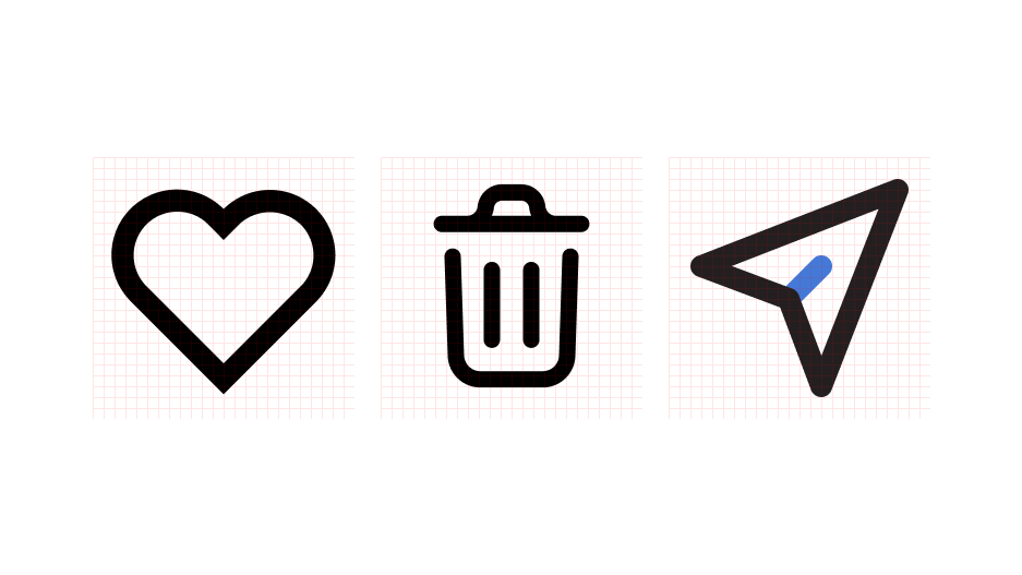
Icons serve as visual cues that help users understand and interact with interfaces. They should not only be attractive but also meaningful and easy to comprehend. From simple utility icons like 'Home' and 'Search' to complex ones representing specific app features, each icon carries a significant role.
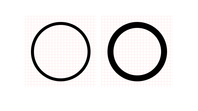
Stroke
A stroke defines the outline or path of an icon. It sets the tone for the icon's overall appearance and readability. Using the right stroke weight is crucial to maintain visual consistency across different platforms and devices.
Padding
In the world of icon design, less is more, and space matters. Padding refers to the space around the icon's elements. Proper padding ensures that the icon doesn't appear cramped and helps maintain its integrity when scaled.
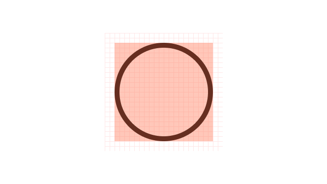
Live Area
The live area of an icon is the region where the main visual elements of the icon reside. This area should be impactful and well balanced to ensure that the icon is clear and recognizable, even at smaller sizes.
The Art of Icon Sizes: One Size Doesn't Fit All
Designing an icon isn't a one-size-fits-all approach. It's important to remember that your icons need to function well at a variety of sizes and resolutions, from the smallest favicon to the largest app launcher icon. The industry standard icon sizes can range from 16x16 for toolbars and menus, 32x32 for application program interfaces (APIs), up to 1024x1024 for app stores. Remember, as the icon size changes, details should be scaled accordingly to maintain clarity and recognizability. This process is known as "Icon Optics."
Grids, Keylines, and Basic Shapes: Crafting Iconic Symmetry
Icon grids are design scaffolds that help maintain consistency and alignment. They are the unseen structure that shapes an icon, ensuring proportionality and symmetry across different icons. By snapping elements to a grid, designers can achieve pixel-perfect accuracy.
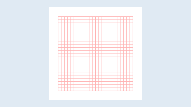
The Pixel Grid: Crafting Precision
Pixel grids serve as crucial guides in icon design, offering a precision tool to draw in specific increments. Traditionally, a 1px increment has been the standard in digital design, allowing for clear and sharp renderings. More recently, the adoption of a .5px increment has risen, providing additional flexibility in design nuances.
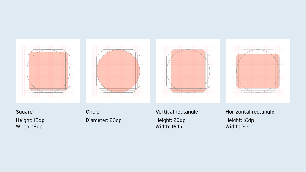
Keyline shapes: The Invisible Guides
Keyline shapes play a foundational role in icon design. They provide basic template shapes that serve as a starting point for any icon. The four most common keyline shapes you will encounter are the circle, square, portrait rectangle, and landscape rectangle. These shapes offer a broad range of design possibilities, from simple to complex icons.
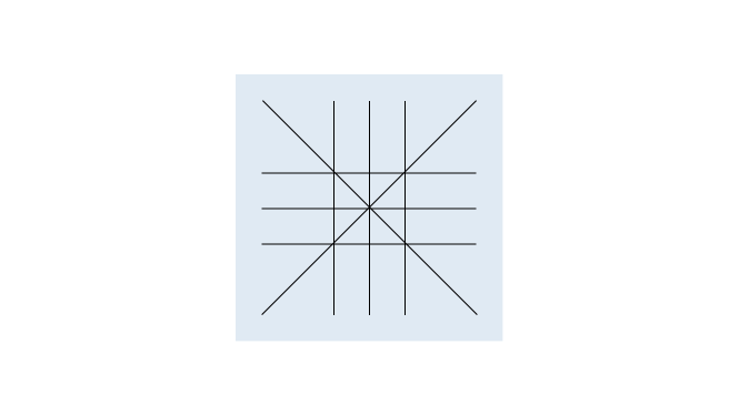
Orthogonals: Perspective and Alignment
The concept of orthogonals, borrowed from perspective drawing, offers another dimension to icon design. Orthogonals are keylines that intersect the center point of the icon, creating additional vertices for use. These lines commonly slice the canvas at 90° and 45°, establishing symmetry and balance. When finer adjustments are required, increments of 15° and 5° can provide the necessary refinement.
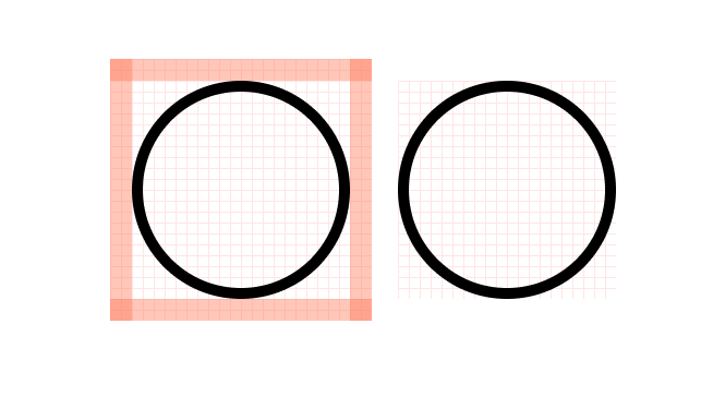
Safe Area/Trim Area: The Boundary of Creativity
The safe area, or trim area, of an icon is the space where main graphic elements should be placed to avoid being cut off or clipped during production. Staying within this area ensures that important elements of the icon remain visible and intact across different mediums.
Dissecting Material Design and iOS Icon Grids
Material Design Grids
Material Design, an innovative design language from Google, has reshaped how icons are crafted. This system utilizes a quad grid, keylines, and basic shapes to create visually appealing and functionally effective icons. Each aspect, from the use of geometric shapes to the incorporation of the golden ratio, is meticulously curated to create a unified visual language.
Check out this Material Icon maker for Figma.
The Apple Way: iOS Icon Grids
Apple's iOS icon grids follow a unique and distinct approach, focusing on specific size classes and pixel-perfect rendering. They utilize predefined shapes like circles, squares, or rounded rectangles as a base, ensuring consistency across the Apple ecosystem. The focus on simple, recognizable symbols ensures instant recognizability, even at smaller sizes.
The Grid Duel: Material Design vs iOS
While both Material Design and iOS grids aim for consistency and recognizability, their methods vary. As a designer, understanding these nuances can help you choose the right grid system for your specific project, ensuring your icons look and perform their best across platforms.
Icon Design: A Symphony of Elements
Icon design is a symphony of elements where every stroke, padding, and grid play their parts. Mastering this art requires understanding and balancing these elements, and it's equally essential to adapt to the unique characteristics of different platforms like Material Design and iOS.
While the principles we've discussed provide a solid foundation, they are not hard rules. Icon design is a dynamic field, where experimentation within guidelines can lead to innovative and compelling designs. Don't be afraid to push boundaries and bring your creative visions to life.
Closing Note: Journey to Iconic Excellence
With the insights shared in this post, you're well on your way to mastering the art of icon design. Continue to explore, learn, and experiment. Remember, every great icon began as a simple sketch!
For those eager to delve deeper into the world of design, the following articles offer further insights into Figma, a key tool in contemporary icon design and beyond:
- Combining Figma With Other Tools For a Higher-Quality Design
- Figma Prototype: What is it and why use it for design?
- Is Figma the Best Tool to Make a Design System?
- Creating High-Fidelity Prototypes in Figma: A Comprehensive Guide
- 8 Figma Plugins Everyone Should Know About
Whether you're aiming to perfect your icon design skills, keen to create high-fidelity prototypes, or curious about the world of Figma plugins, these articles will expand your knowledge and sharpen your design expertise.