Halloween is an expected festivity by children and business owners. We all like Halloween, maybe because it reminds us of our early trick-or.treating days. With this said, we can convey that businesses take advantage of Halloween by boosting their marketing campaign with designs related to this holiday. We are near this iconic day, and we already know that tons of boring and repetitive companies will use basic ads. This is the chance for business owners, marketers, and designers to create the perfect Halloween aesthetic and have an original and fresh product.
Best tips to achieve the perfect Halloween aesthetic
Here you have 4 useful and easy-to-follow recommendations to make your marketing campaign spooky by achieving the best Halloween aesthetic.
1. Color choices
Orange and black are definitely the primary Halloween colors. They are present in everything, including decorations and costumes. T, they also are risk-free options for your marketing strategies.
Bright orange is frequently linked to vigor and excitement. The practice of carving pumpkins is where the use of orange at Halloween comes from. The traditional Jack-o-lantern, without which the celebration would feel incomplete.
There is no need to introduce the scary aspect of the color black. Additionally, it's a color that most people often associate with night, making it ideal for your Halloween ads. Of course, in conjunction with the appropriate visuals. Otherwise, there are many more meanings associated with black, such as class and elegance.
Green and purple are other appropriate color choices. Due to the color purple's association with witches. Green also conjures up images of a witch's cauldron filled with the classic boiling potion.
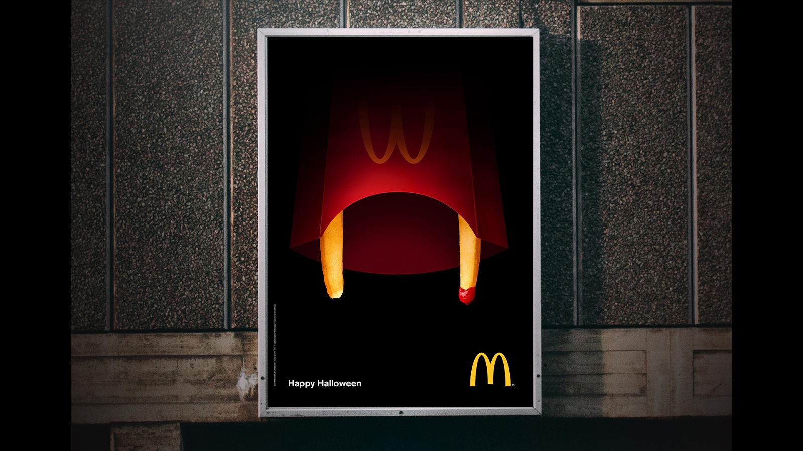
Even before you read "Happy Halloween", the orange-and-black color palette and the eerie illustrations in the design can alert you that the ad is about Halloween marketing. Your Halloween advertisements and posts should appear just like that. The idea should quickly be communicated through the colors. At that point, your clients will pause and take a closer look.
You're in luck if one of the previously suggested colors also happens to be the color of your brand. If not, select your Halloween colors using your brand's colors as a guide.
For instance, if the color of your brand is yellow, orange and yellow mix well together but don't provide much contrast in most use cases. Purple, on the other hand, contrasts yellow effectively. That way you won be leaving your brand colors aside.
2. Font choices
Different moods are connected to specific colors. However, color alone won't build your Halloween aesthetic unless you also use fonts and symbols. If you use the appropriate fonts and colors, you've already made progress.
You can use frightening fonts with bones instead of strokes or reddish, old fonts. For Halloween, anything that makes you slightly scared will be ideal. Let's speak about various typefaces you can utilize in your Halloween designs.
- October Crow: It combines medieval and spooky vibes. Its best usage would be for headlines or important chunks of text. It goes perfectly with purple, orange, and bone color.
- Goat: Goat gives a classic and mythical energy. Its gothic design goes well with old haunted houses and castles. It will make your product unique. It's ideal for short titles referring to medieval or antique stuff. Apart from its vintage look, this font (if making good color choices) can be frightening. Combine it with dark red and black and you'll have a demon typography.
- Nosferotica: This is a safe but useful option. Nosferotica is subtle and chill, however, it has a little dark vibe that makes it sinister. I recommend this font if you want to keep it simple. If you are willing to make a strong Halloween aesthetic this will be a lame and weak choice
You may easily locate a wide selection of Halloween fonts by running a quick search. Select a style that doesn't look overly cliché, such as the blood-dripping or pumpkin-embedded varieties. After all, you don't want the font type to detract from the design's images. If you are interested in font combinations check out this post.
3. Do not forget about imagery
When the typefaces and colors are chosen, imagery provides the perfect final touch. This triad can effectively convey the tone that your design is trying to communicate. The Halloween aesthetic is pretty much built.
Most people immediately associate a variety of symbols with Halloween. These consist of:
- Bats
- Jack-O-Lanterns
- Graves
- Witches and potions
- Spiders and webnets
- Skeletons and skulls
- Ghosts
- Blood
You can use them as generic elements in your designs by grabbing these icons and adding them as symbols.
Alternatively, you can choose a healthy Halloween image from one of your favorite stock photo websites and then modify it with your copy and a few aesthetic tweaks to fit your brand. Find ideas and inspiration on Pinterest.
You can utilize illustrations that gently combine these Halloween components while maintaining a visual theme consistent with your business character.
You may also hire an on-demand design company like The Design Project to generate unique images or visuals for your Halloween advertising campaign.
4. Stay on brand
You can keep your brand's identity and business persona while using Halloween aesthetic elements. It only takes a few powerful visual components for people to engage with your brand right away. This might even be your slogan, logo, or brand mascot.
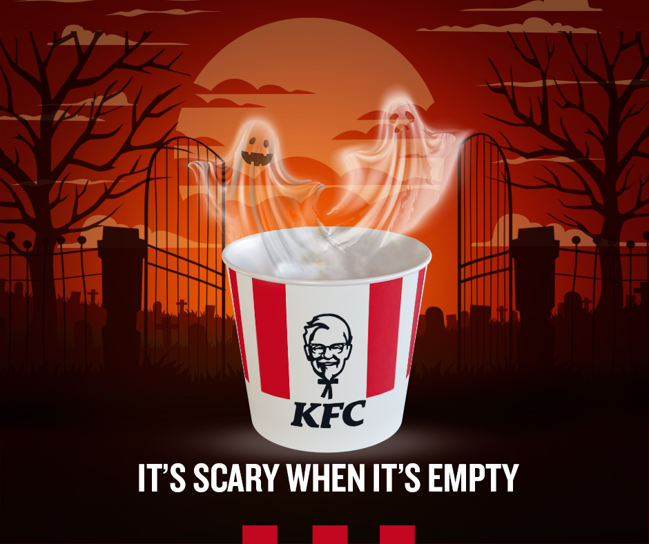
We all know KFC and their iconic buckets and, obviously, colonel sanders. KFC’s marketing team has found a way to give Halloween aesthetic vibes (orange color, ghost illustrations, full moon, graveyard setting…) while still keeping their brand identity. However, we can assume these designers haven't read this post, their font choice isn't a Halloween type. However, you can always choose the classic fonts, after all, they made an excellent ad. They were able to do a Halloween ad without making it scary, they even include a funny phrase to make it more casual and ironic.
Final thoughts
Halloween is just around the corner. Even though we love costumes and candy, we must avoid unoriginal and boring advertising. With the tips stated earlier, You will be able to achieve a unique and fresh Halloween aesthetic.
