There is a key to website design that isn't very known. You always hear about images, colors, and graphs but what about Google font pairing? this is a crucial element of UX and UI design. Good google font combinations can be the reason users stay on your site. In this post, you'll find a guide on this concept and some of the best types
What is google font pairing?
How many times have you entered a site with terrible font choices and left instantly? this makes sense since a poorly designed site might mean it's not the best option. Google font combinations are a great way to attract users’ attention. It doesn’t take a designer to understand when a pair of fonts are wrong. A poor font pairing isn't only visually unattractive but it'll also send a wrong message.
Font combinations and context
Context is key to Google font pairing. Fonts denote different themes, ideas, and emotions. Some are loud, some are classy, some are playful and some others are quiet. When pairing fonts, you must embrace the message, idea, and vibe you are trying to transmit. Let's see an example of poor google font pairing.
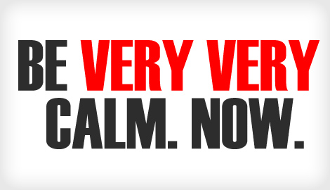
I mean… should I even say why is this not working? The “designer” that created this choose a loud and all-caps font to give out a calm and pacific message. The color choice is also pretty energetic and strong.
Contrast
The first rule on Google font pairing is to create contrast. You must avoid conflicting fonts that are remarkably different from each other. Conflicting fonts are usually pairs that are really distinctive from each other. These combinations create visual disharmony. Also, fonts can not look too similar. Similar fonts usually have the same visual effect. What we want to achieve is the best of both worlds. A good Google font pairing must be complementary and distinctive. A good recommendation is to use fonts from the same family and that have the same height.
The top 8 options for Google font pairing
There are many types of fonts. However, pairing these isn't easy. The best place to find the types of fonts is Google Fonts. Now, well check out the top Google font combinations.
1. Six Caps + PT Serif
Six Caps is a caps-only font that will go perfectly with titles. It has classy and distinctive energy that fits with serious and somewhat formal designs. PT Serif can also work on headlines, but it'll fit great on a body text. It also has a serious vibe. This google font combination goes well with luxurious brands, giving a formal text structure. Be extra careful with color choice. Keep it monochromatic so you can create an actual harmony.
2. Alegreya Sans + Literata
Literata is a classy and simple option. Alegreya Sans is a sans serif font, also pretty simple but with a special attractiveness. This is a friendly-looking and simple pair. Ideal for expressing homemade vibes and really suitable for personal blogs. However, if you are looking for uniqueness or trendiness this option isn't for you-
3. Source Serif Pro + Source Serif Pro
Yes… I said that very similar fonts do not pair well. However, a versatile and essential font like Source Serif Pro will allow you to make variations. Use bold, italics, size, and color to make it distinct. Remember that fonts from the same family are great combinations. With this type, you'll be able to create great harmony. Source Serif Pro is a classic and refined type of font. It's very light and has an italic touch that makes it really eye-friendly. I recommend it for any type of blog post that has many words, it'll make entire paragraphs way more attractive and eye-catching.
I believe the Serif family is one of the most useful ones, check out this post for more information.
4. Belleza + Source Sans Pro
Source Sans Pro is a functional and classic font. Beleza has a unique feminine beauty that gives a refined touch to the combination. This combo is ideal for fashion blogs. Simple but trendy. This pairing is uniquely balanced and light. However, you must be careful with the size and color, if you don't, it won't have any harmony.
5. Yellowtail + Lato
This Google font combination is suitable for any type of text. It is a neutral pair that with a good color and size choice it'll become remarkable. It has fun, handmade energy.
6. Open Sans Condensed + Lora
Open sans gives a powerful and formal vibe, while Lora has a distinctive beauty that will make a good contrast with the other font. They give out masculine and feminine energies. My recommendation is to use Open Sans in caps and maybe bold and use Lora in italics. I suggest this combination be used in a business site or any blog.
7. Rubik + Roboto Mono
Rubik is a thick and eye-catching font, on the other hand, Roboto Mono has a clean and tidy vibe. Rubik should be used in titles and Roboto Mono on body text. These two make a great combo for reading, so it's ideal for blogs. If you are into modern minimalism, this pair is right for you.
8. Merriweather Sans + Merriweather
I will say it how many times I want: the same families create great harmony. You can switch the serif and sans serif versions of Merriweather into headline and body. However, the sans serif version is much more eye-catching and it'll call anyone's attention to a headline, and the serif version is really readable in big paragraphs. This google font pairing is clean and energetic.
Final Thoughts
Google font pairing choices can be the reasons users trust and like your website. This element is key to web design. In this post we talked about the importance of google font combinations, how can we achieve it, what should we avoid, and what to do. Always remember to create contrast and pay special attention to context. There are plenty of pairing options, in this post we listed and described the 8 best ones. After all, color, images, and animations are important, but font pairing is just as substantial as these.
