Different fonts can communicate other things. In design, every little aspect of creation matters.
You probably have heard about Serif and Sans Serif fonts and may know the differences between them, but do you know how they can influence your brand's communication?
In this article, we will see the differences between Serif and Sans Serif fonts and how different companies use them to empower their messages. Also, we will share with you some tips to give you the tools for choosing the best font type for your case.
What is a Serif?
It is impossible to understand the difference between a Serif and a Sans Serif font without first talking about what a Serif is.
A Serif is a decorative line that is added to some letters at the beginning or/and at the end.
It is believed that these decorative lines were born with a purpose in the past. Long ago, when letters were engraved on stones to create stamps, these little lines were added to the letters because of the chiseling of stone.
The difference between Serif and Sans Serif
The first big difference between a Serif and a Sans Serif font is pretty apparent and in the name: one has a serif while the other does not.
As we mentioned before, Serif fonts are the predecessor of sans serifs, but that does not mean that every Serif font is older than the Sans Serif fonts. Every day, new types of letters are being created on the internet in both categories, and something made a long time ago is recreated nowadays for decorative purposes.
The other difference between Serif and Sans Serif fonts is the message they will send to the receiver. Different colors generate different reactions, and different fonts have similar effects. While Serif fonts are commonly used in more traditional and old-fashioned businesses, Sans Serif tends to be the perfect option for those new and modern companies.
Serif or Sans Serif? Which one is the right option?
First of all, we have to clarify this: there is no better or worse font type here. It is all about choosing the correct one for the message you are trying to send to a particular audience.

Serif
If you are looking for a traditional and solid appearance, Serif fonts can be a good option. If we think about where we can find this type of letter is probably in conventional newspapers, classic books and magazines, or traditional stores.
Serif fonts can create a sensation of tradition and trustworthiness, so it is common to find this font in law firms, hospitals, and insurance companies.
As you may know, several fonts are with Serif. We can distinguish three big groups: old-style, transitional and modern. The following list will show some of the most popular fonts from each group.
Old style: Garamond, Palatino.
Transitional: Times New Roman, Baskerville.
Modern: LTC Bodoni 175
Sans Serif
Modernity and minimalism. Those two words can describe Sans Serif fonts and businesses that use them.
In general terms, a Sans Serif font represents the opposite of a Serif font for a business. If you want a minimalist, modern and dynamic appearance, you should probably choose a Sans Serif font. With the boom of e-commerce and fintech, we are getting used to seeing more and more Sans Serif logos in new brands. Almost every digital device uses Sans Serif fonts as the default typeface. I am writing this in a Sans Serif font, and you will be reading it in The Design Project also with a Sans Serif font.
There are three groups of Sans Serif fonts: Grotesque, neo-grotesque and humanist.
Grotesque: Akzidenz-Grotesk.
Neo grotesque: Helvetica.
Humanist: Open Sans.
How do fonts impact a logo?
As we mentioned above, the fonts you choose for a logo will help (or not) the construction of your brand's image. Choosing between a Sans Serif or a Serif can be a determinant of the personality of your business. Let's see some examples of how this works.

Tesla is probably one of the most modern and avant-garde companies we can find nowadays. With a message of futurism and technology innovation, using a Sans Serif font in their logo is a perfect choice.

You probably know this business that has over 100 years in the market. A Serif font is not a coincidence; in this case, it's a decision to mark their trajectory and recognition.

The New York Times is one of the most popular newspapers in the world. This company was created 170 years ago and still works nowadays. Tradition and trajectory are two main characteristics of the newspaper, and the extreme Serif we can find in the logo guarantees it.
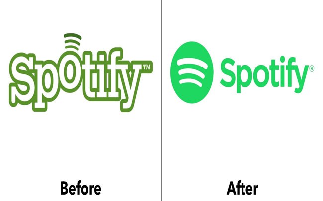
Rebranding is very common in companies. Less than ten years ago, Spotify had a pretty different logo than the actual one. In the old one, we can see that they use a Serif font, making it incoherent with the innovation in music that they want to sell. Their new and actual logo is more representative of a company that revolutionized the music industry.
So, should I choose a Serif or a Sans Serif?
Like many other things in design, fonts are not an exact science. Knowing how different fonts work is essential to making a good decision because there are no correct or incorrect answers. Do not think that you can not create a modern logo with a Serif font (without going any further, look at our logo carefully) or a traditional logo with a Sans Serif.
In this article, we show you the main differences between Serif and Sans Serif fonts so you can have a general idea of it, but investing the right time and getting some professional advice when choosing the items for your logo is essential for creating a solid brand identity.
