Slate
A modern social betting app that makes friendly wagers seamless and fun.
- Visual Identity
- Branding
Project Summary
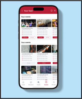
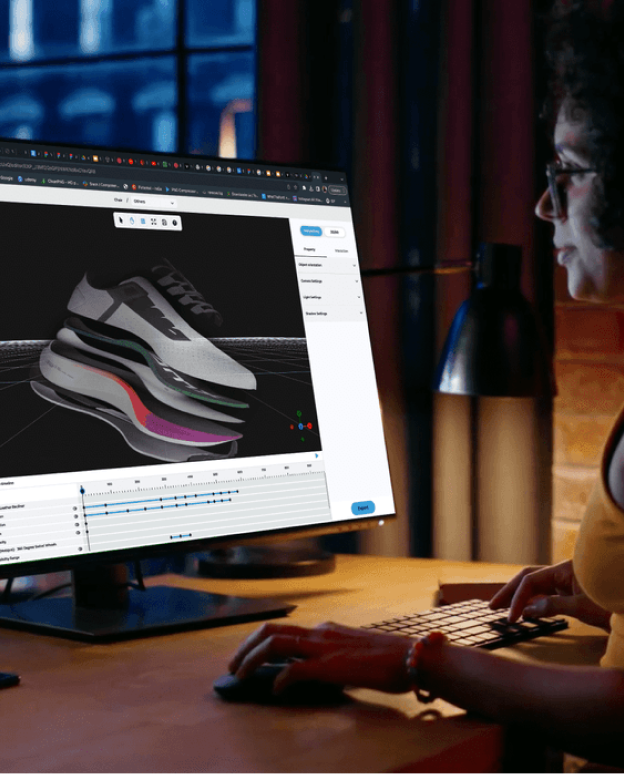
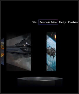
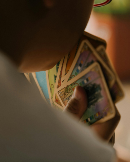
Slate is a social betting platform that transforms friendly competition into a seamless and exciting experience. With an inclusive and innovative approach, it lets users “raise the stakes” in both sports and non-sports settings, making every challenge more engaging.
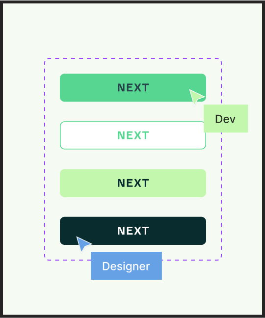
After the rebranding, Slate evolved into a bold and modern identity with a sleek, geometric logo that merges an "S" with a lightning bolt for instant recognition.
Results
The improved brand clarity and consistency strengthen user trust, making Slate feel more intuitive, inclusive, and engaging. This transformation sets the foundation for a seamless UX/UI experience, better market positioning, and stronger user adoption at launch.
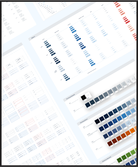
Design works in numbers
Redesigned Identity
Recognizable Logo
Color & Typo
The color palette flows from deep Midnight to vibrant Minty Green, balancing confidence, versatility, and modern playfulness with neutral black and white for a timeless foundation. Midnight brings sophistication, Minty Green adds energy, and lighter variations enhance flexibility, creating a cohesive, dynamic, and approachable identity for Slate.
For typography selection, we chose Poppins, a versatile variable font that allows us to maintain consistency and cohesion within the same type family.
Primary Color
Midnight
Primary Color
Deep Blue
Primary Color
Grape
Primary Color
Mint
Neutrals
Black
Neutrals
White
Secondaries
Gum
Secondaries
Sky
The Customer
Slate approached us to refine its brand identity before launch. The app was fully functional but lacked a distinctive visual appeal. They wanted to stand out from traditional wagering platforms, appeal to a broader audience beyond just men, and create a modern, versatile identity.


Thank you!
See more of our work
Design ServicesEnd-To-End
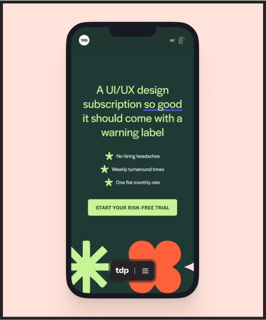
TDP Rebrand

AI / B2B / HealthTechProduct Design / Early Stage
xCures
AI / B2B / Enterprise SolutionsProduct Design / Enterprise
Scalestack
AI / B2C / LifestyleBranding Design / Marketing / Early Stage
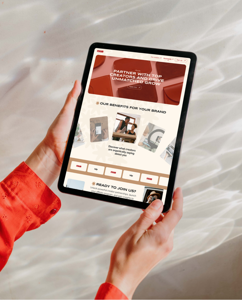
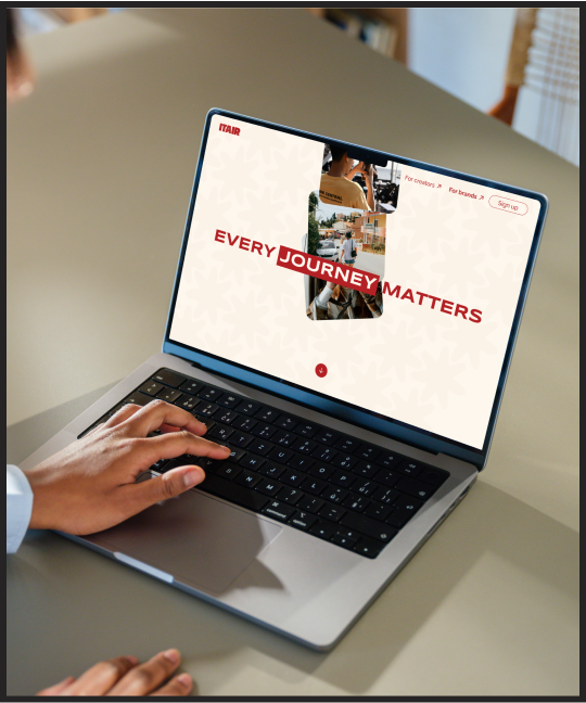
Itair Website
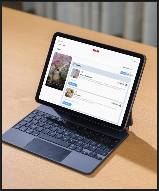
AI / B2C / LifestyleProduct Design / Early Stage
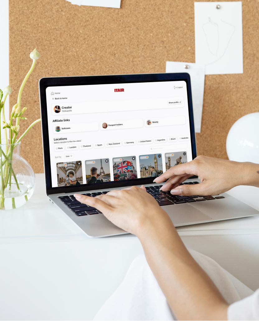
Itair Product
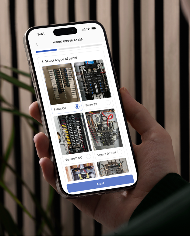
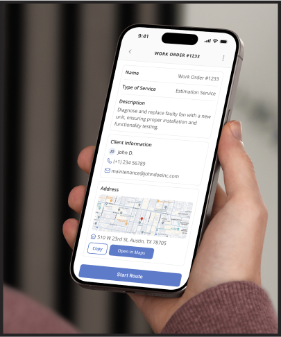
B2B / Public SectorProduct Design / Early Stage
Fairing Solutions
B2B / SustainabilityProduct Design / Late Stage
Banyan Infra.
B2B / Enterprise SolutionsProduct Design / Late Stage
Monte Carlo
B2C / Public Sector / SustainabilityProduct Design / Early Stage
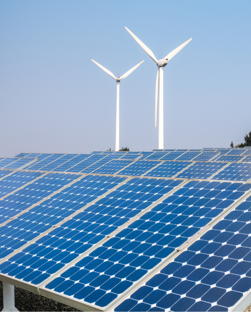
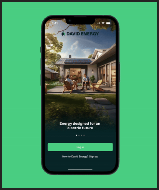
David Energy

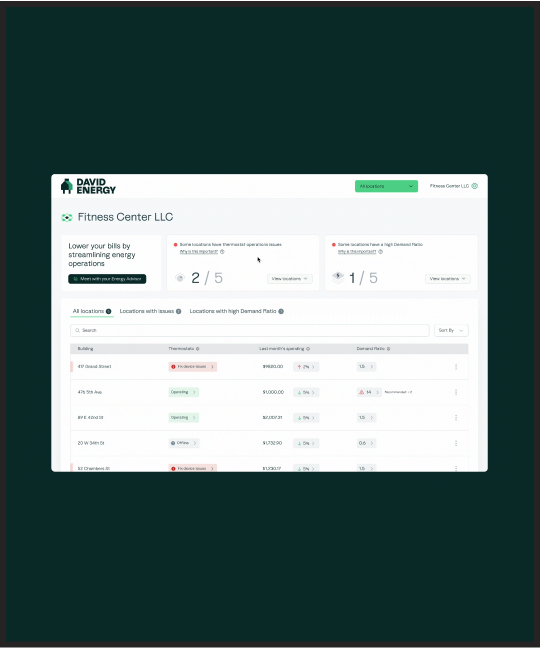
B2C / Public Sector / SustainabilityProduct Design / Early Stage
David Energy
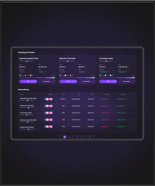
Web 3.0Product Design / Early Stage
Metera

B2C / Public Sector / SustainabilityDesign System / Early Stage
Volt Design System

AI / B2C / LifestyleProduct Design / Early Stage
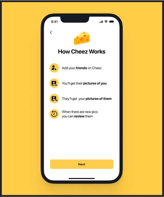
Cheez

AI / B2C / HealthTechProduct Design / Early Stage
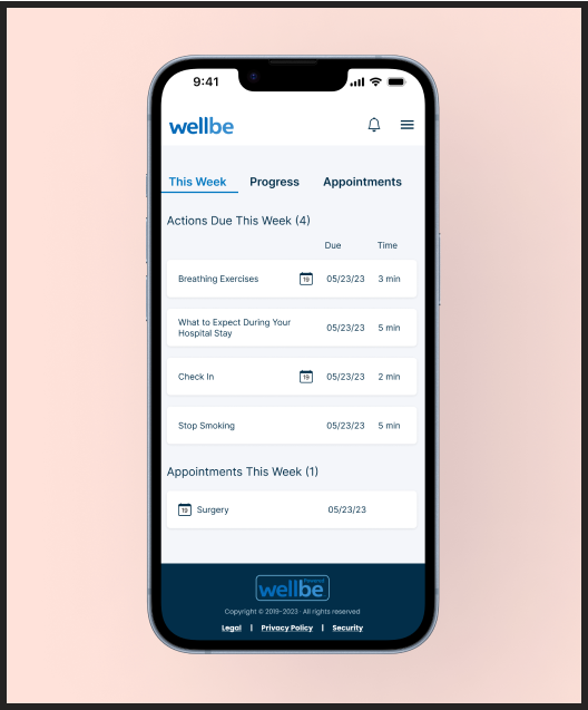
WellBe

AI / B2C / HealthTechProduct Design / Early Stage
Eleanor Health

B2B / Enterprise Solutions / Public SectorMarketing / Early Stage
Mesh Marketing
B2B / Enterprise Solutions / Public SectorProduct Design / Early Stage
Mesh ID

AI / B2B / HealthTechProduct Design / Early Stage
Atropos
AgriTech / B2B / SustainabilityDesign System / Late Stage
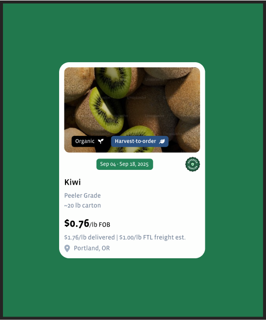
Full Harvest DS
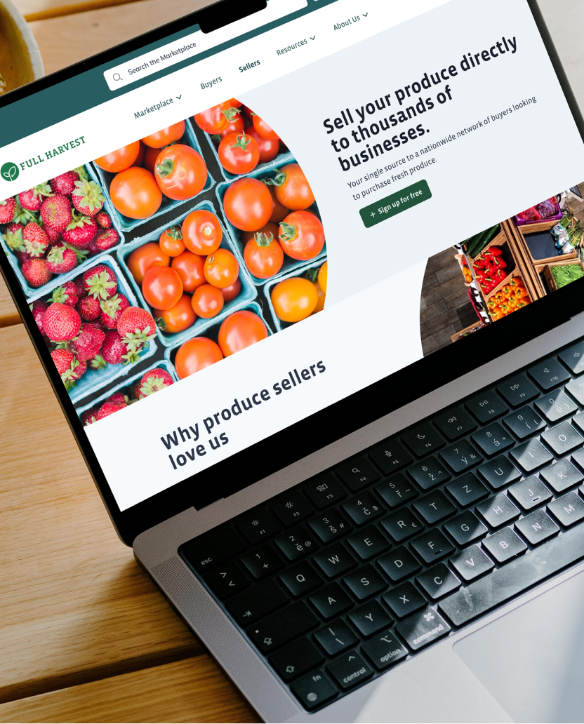
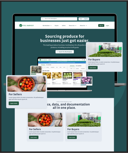
AgriTech / B2B / SustainabilityMarketing / Late Stage
Full Harvest MKT
B2C / LifestyleProduct Design / Early Stage
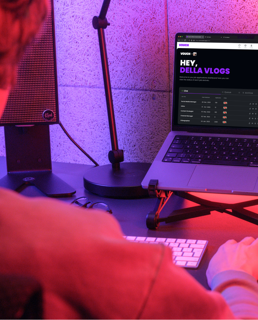
Vouch
B2C / HealthTechProduct Design / Early Stage
SpotLyfe
B2C / EdTechDesign System / Early Stage
Navengage

B2C / MobilityProduct Design / Early Stage
Volley Automation

B2C / Lifestyle / RetailProduct Design / Early Stage
GolfForever
B2C / Lifestyle / RetailProduct Design / Early Stage
The Well
B2C / RetailProduct Design / Late Stage
Avataar

B2CProduct Design / Early Stage
OXIO

B2C / HealthTech / LifestyleProduct Design / Late Stage
Big Health

AI / B2CProduct Design / Late Stage
OSlash

AI / B2B / LifestyleProduct Design / Early Stage
Woven
B2C / LifestyleProduct Design / Early Stage
NextGem
AI / B2C / HealthTechProduct Design / Early Stage
Altoida
B2B / Enterprise SolutionsProduct Design / Early Stage
JupiterOne
AI / B2CProduct Design / Early Stage
Sojourn
AI / B2CProduct Design / Late Stage
SOUQ
AI / B2B / Public SectorProduct Design / Late Stage
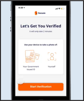
Socure

B2C / LifestyleProduct Design / Early Stage
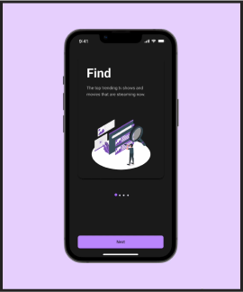
Streamzy

B2B / Public SectorProduct Design / Early Stage
Anno.ai
B2B / Enterprise SolutionsProduct Design / Enterprise
Purespectrum
B2B / Public SectorProduct Design / Early Stage
Conserv
AI / B2BProduct Design / Early Stage
Brev