
An intuitive search tool for the workplace—found right on your browser
OSLASH enables faster workflows by transforming your most important links and snippets into shortcuts that can be effortlessly accessed by the whole team—from anywhere. This awesome product saved end-users tons of time… but OSLASH knew they wanted to build something more fluid and intuitive. That’s when they enlisted TDP’s to help optimize core features and improve the UX/UI of their dashboard.
TDP’s UX and UI redesign immediately improved user engagement for OSLASH
Try us risk free for 7 days, if you don't love us, get your money back.

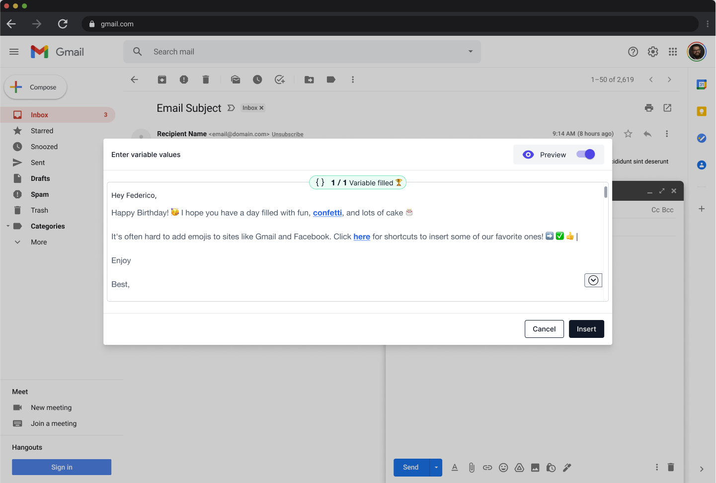
It improves workflows and ensures links never get lost again by transforming URLs into shortcuts that make them: Easy to remember Easy to share Easy to access from anywhere - Raised * $7.5M - Top investor: Accel
OSlash wanted to fix the friction caused by different layouts and inconsistent conceptual models. Also they were looking for making the workflows faster by eliminating confusion and frustration.
Our experience designing B2B and B2C products helped us understand how to transform data-heavy dashboards into user-friendly UIs. This expertise meant we could help OSLASH optimize their user interface and vastly improve the UX as a whole.
Make the UX easy, clear and fast using data-backed B2B design strategies.
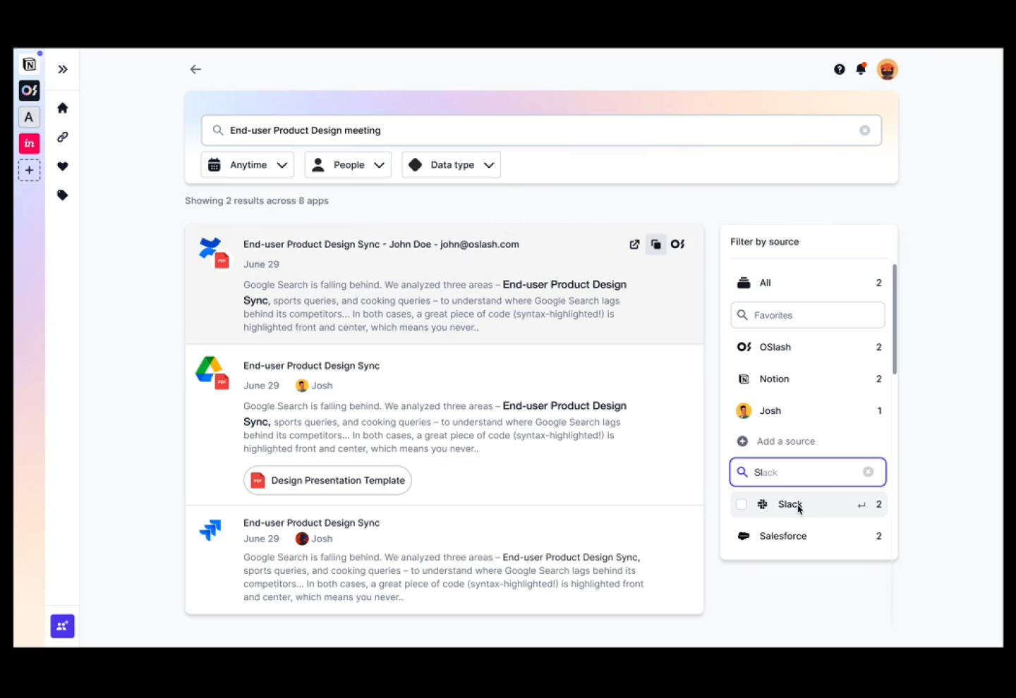
Redesign the UI into a card layout displaying different data types (like File, Doc, Messages, Meeting, etc.)
Create new visual elements and re-factor pre-existing UI components.

With our proven process, adaptability, and down-to-the-details design strategies, TDP helped revitalize the OSLASH app and immediately improve user engagement. With a new visual language that spoke directly the end-users most crucial processes, the layout redesign allowed users to create shortcuts and snippets faster than ever before.
