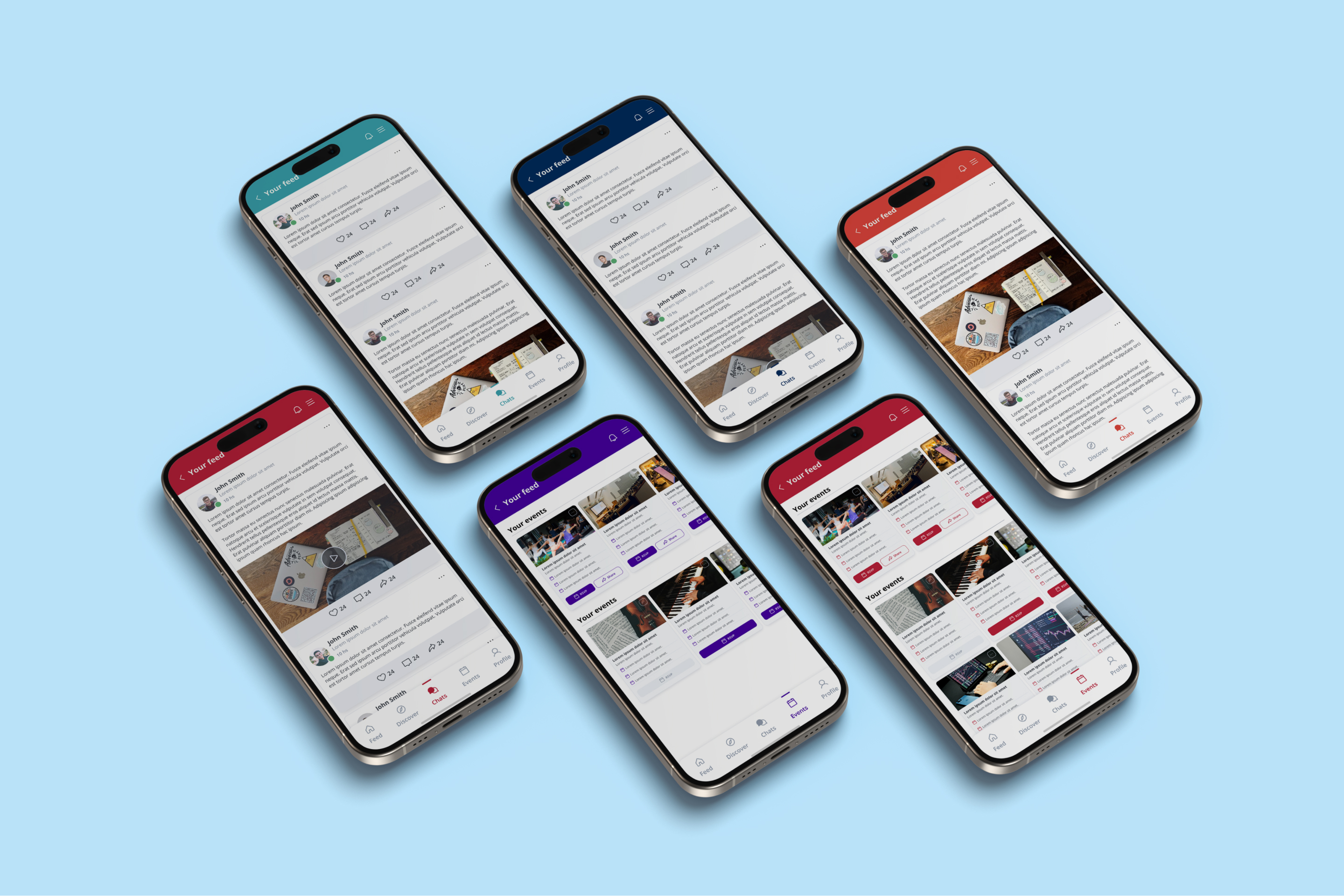

A modern mobile app focused on student engagement.

Navengage sought our assistance in developing a Design System that was adaptable for white labeling, allowing customization for various schools.
Develop a set of design components that could be easily customized, such as color schemes, typography, and UI elements.
Implementing a framework that allowed for easy adaptation of school-specific branding while maintaining a consistent look and feel.
Ensuring the design system was scalable for future updates and easy for developers to implement across different platforms.

We kicked off by breaking the UI down into smaller, reusable pieces using atomic design. The big task was making sure everything still felt consistent while letting schools customize their look. Atomic design made the development simpler and let us create unique styles. We made components that schools can easily adjust, combining simplicity with a personal touch.


We focused first on mastering the basic elements, such as setting typographic styles, selecting versatile colors, choosing icons from a library, and defining essential actions needed across all screens like buttons, pills, and tabs


We crafted a handy set of UI components and templates that can be tweaked to fit different school styles. We included specific guidelines for typography, color palette, grids and layouts, enabling customization to reflect each school's unique identity. The whole system is built to be flexible and easy to scale up, making updates and maintenance a breeze.
