Banyan Infrastructure is a B2B SaaS company that streamlines financing for renewable energy projects.

Banyan Infrastructure is an end-to-end software platform, built to simplify, scale, and streamline sustainable infrastructure finance. It empowers banks, lenders, and developers to accelerate deal transactions, optimize portfolio outcomes, and maximize liquidity, all while promoting sustainable climate solutions.
Banyan Infrastructure faced the challenge of needing a comprehensive design system for their rapidly expanding platform but lacked the capacity to tackle the project internally due to more urgent priorities. To address this, they decided to outsource the project to our design agency. We were given a tight deadline of three months to develop an entire design system that would ensure consistency, scalability, and alignment with Banyan's unique identity and goals.
Atomic design is a structured approach to product design that organizes components into a hierarchical system based on their complexity. Introduced by Brad Frost, this method includes six levels: tokens, atoms, molecules, organisms, templates, and pages. The idea is that any alteration at one level influences all subsequent levels.
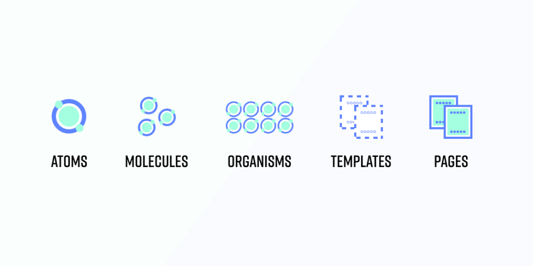
Tokens are the most fundamental units in design, representing core values such as colors, fonts, spacing, and other properties. They serve as the building blocks that ensure consistency across a design system. These tokens are context-independent and named to convey a shared semantic meaning within a group of items.
Atoms are the basic, indivisible units that maintain their integrity and meaning. They serve as the fundamental building blocks in the atomic design framework.
Molecules are more complex structures made by combining atoms. They form interactive UI elements like form inputs, button sets, navigation bars, and dropdowns, enhancing functionality.
Organisms are sophisticated UI components composed of various molecules and/or atoms, and sometimes other organisms. They represent distinct, functional sections within a user interface, playing a crucial role in the design system.
Templates act like wireframes in the atomic design process. They provide structural blueprints with placeholder elements, setting up the framework for page layouts before actual content is added.
Pages are the culmination of the atomic design process. Templates are populated with real content, resulting in fully realized web pages that users interact with. These pages represent the finished product, showcasing the design in its final form.
We kicked off by breaking the UI down into smaller, reusable pieces using atomic design. The big task was making sure everything still felt consistent while allowing Banyan Infrastructure to maintain its unique identity. Atomic design made the development simpler and let us create unique styles. We made components that Banyan can easily adjust, combining simplicity with a personal touch to support sustainable infrastructure finance.
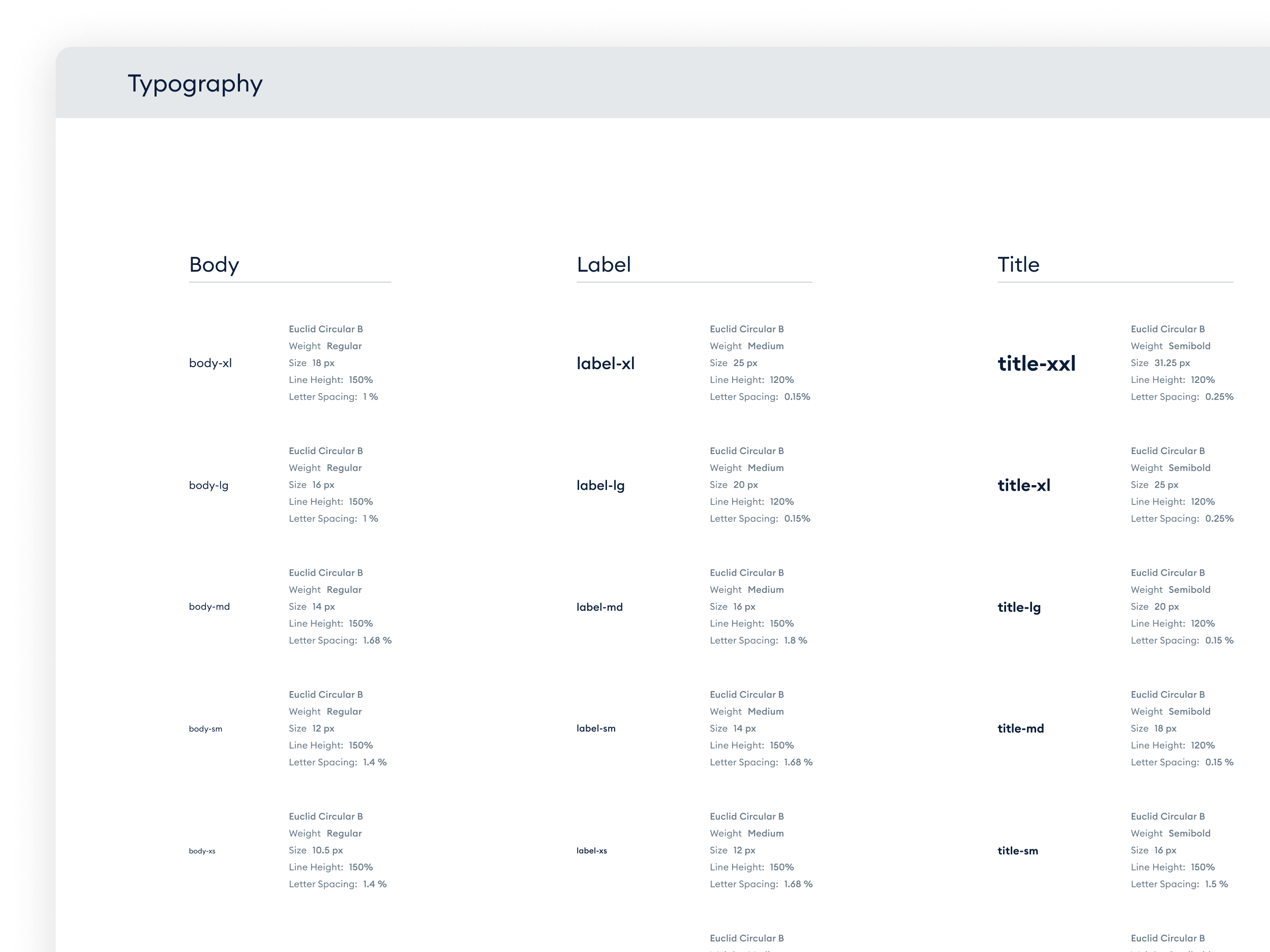
To create Banyan's design system, the Material Design method served as an inspiration, categorizing fonts into body, label, title, headline, and display. This structured approach ensured consistency and clarity across the platform. Approximately 5-6 sizes were added in each category, making the typography highly scalable to meet Banyan's diverse needs.
The existing color palette for Banyan Infrastructure was refined, organizing an excess of blue shades into a cohesive system. During this process, it was identified that a broader range of semantic colors was needed, and the design system was lacking two additional accent colors specifically for data visualization. Furthermore, all data colors were carefully tested to ensure they passed color blindness accessibility standards.
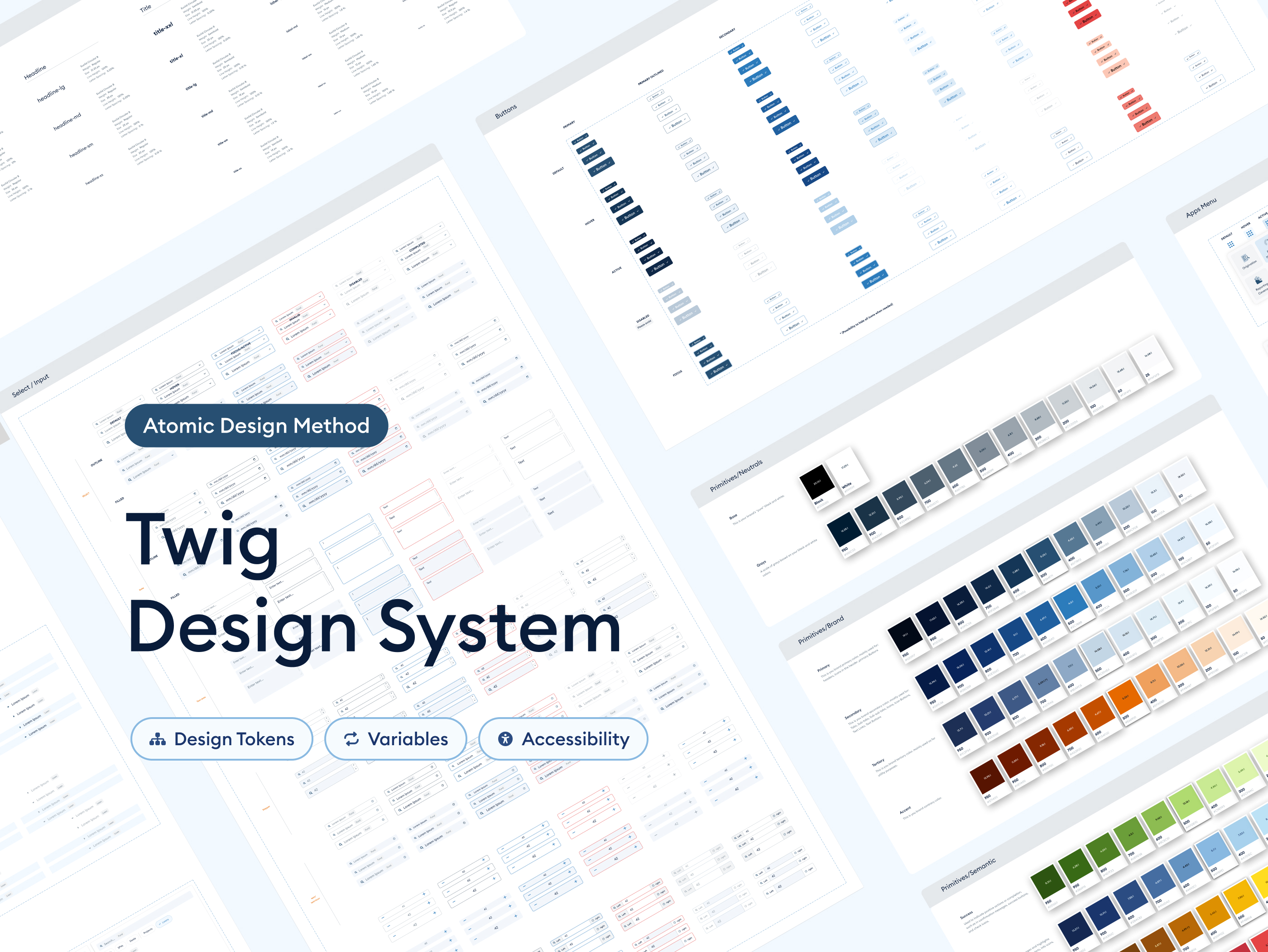
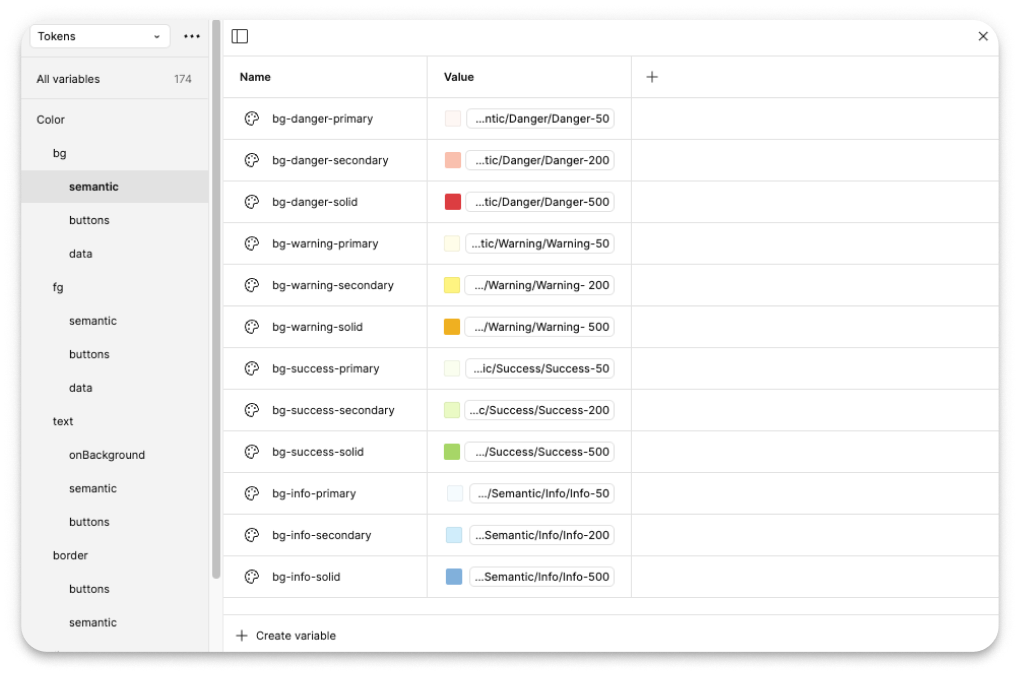
Color tokens were introduced into Twig, providing a standardized method for managing colors across the platform. This approach ensures consistency, simplifies the implementation process, and makes it easier to maintain and update the color scheme as needed.
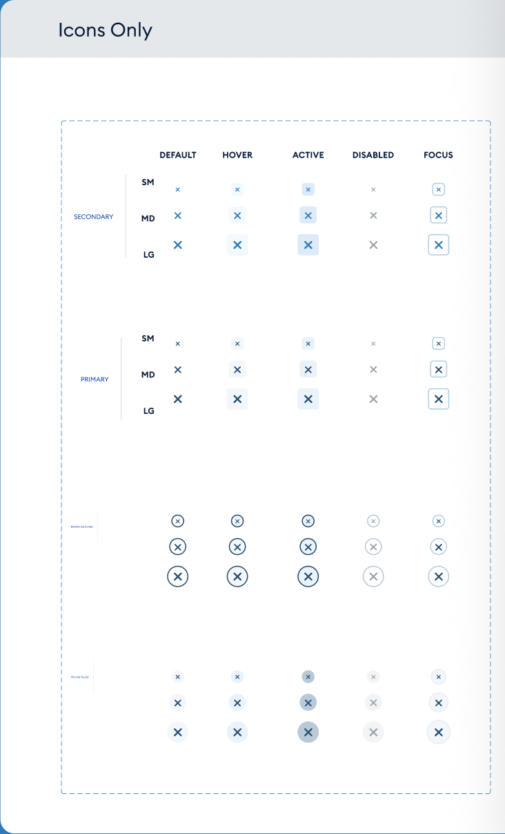
“Font Awesome” was integrated into Twig design system to enhance visual appeal and functionality.
This comprehensive icon library ensured consistency and ease of use across applications, providing a familiar and visually cohesive experience for users.
Custom buttons were created for Twig, Banyan's design system, and prototypes with hover effects were added to ensure interactive and responsive user experiences.
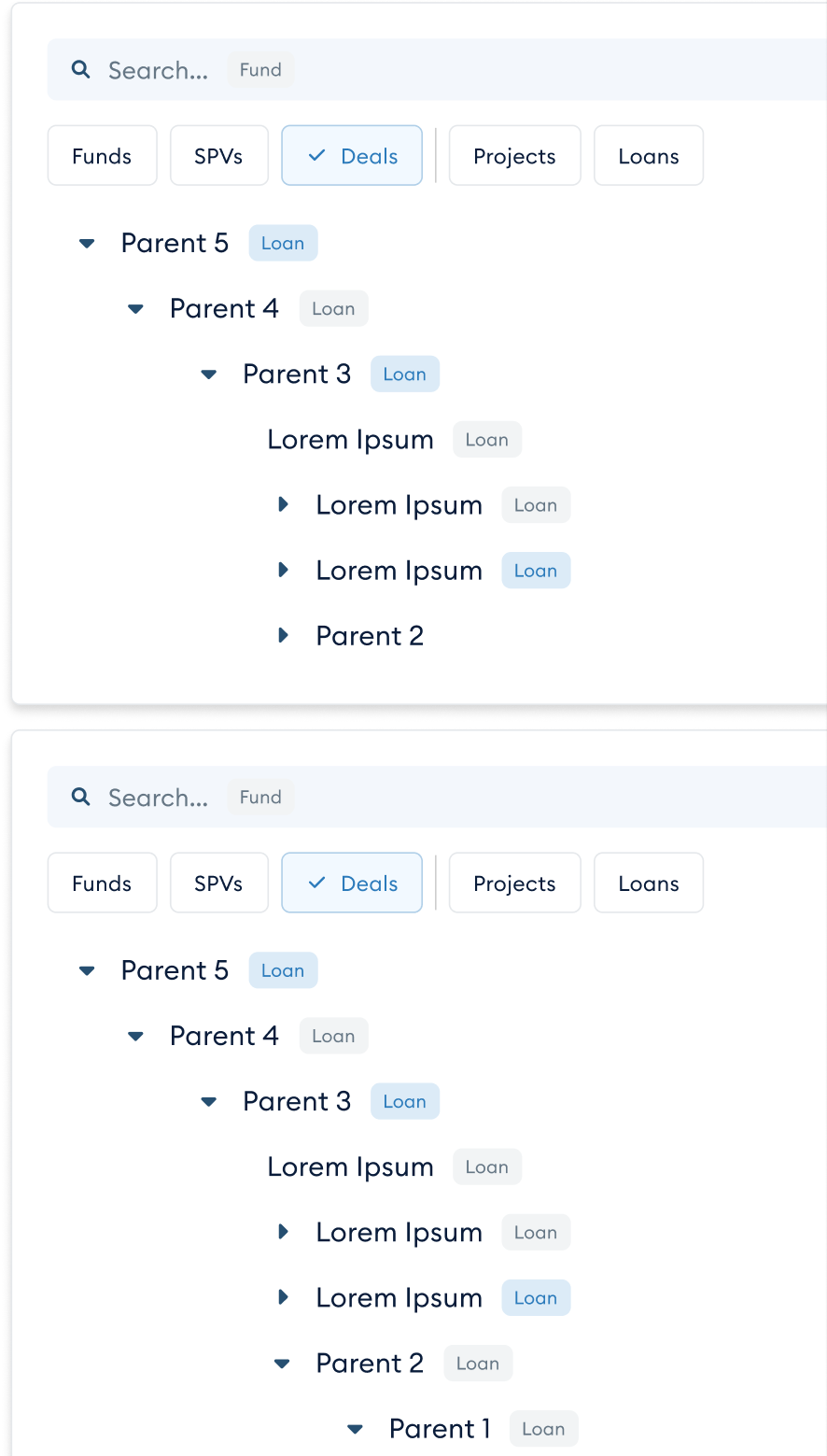
Use the Input component to collect various data types like strings, numbers, dates, emails, and passwords. Multiple inputs can be combined for easy-to-use and aesthetically pleasing forms, maintaining visual consistency with the Twig design system.
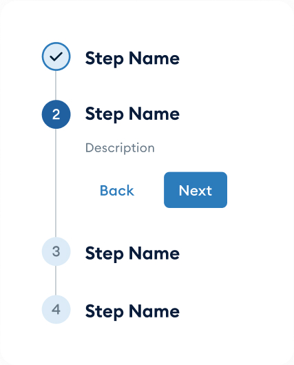
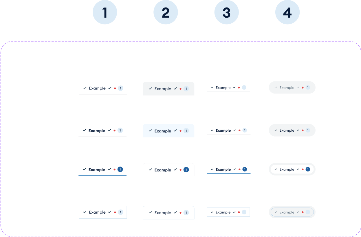
Seamless and streamlined navigation across Banyan's four applications is quite important to ensure an interconnected experience, so a 4-level tabbing system was essential. As designers, we created a solution that was both functional and visually appealing. This system clarified the hierarchy, making the overall user experience much smoother and more intuitive.
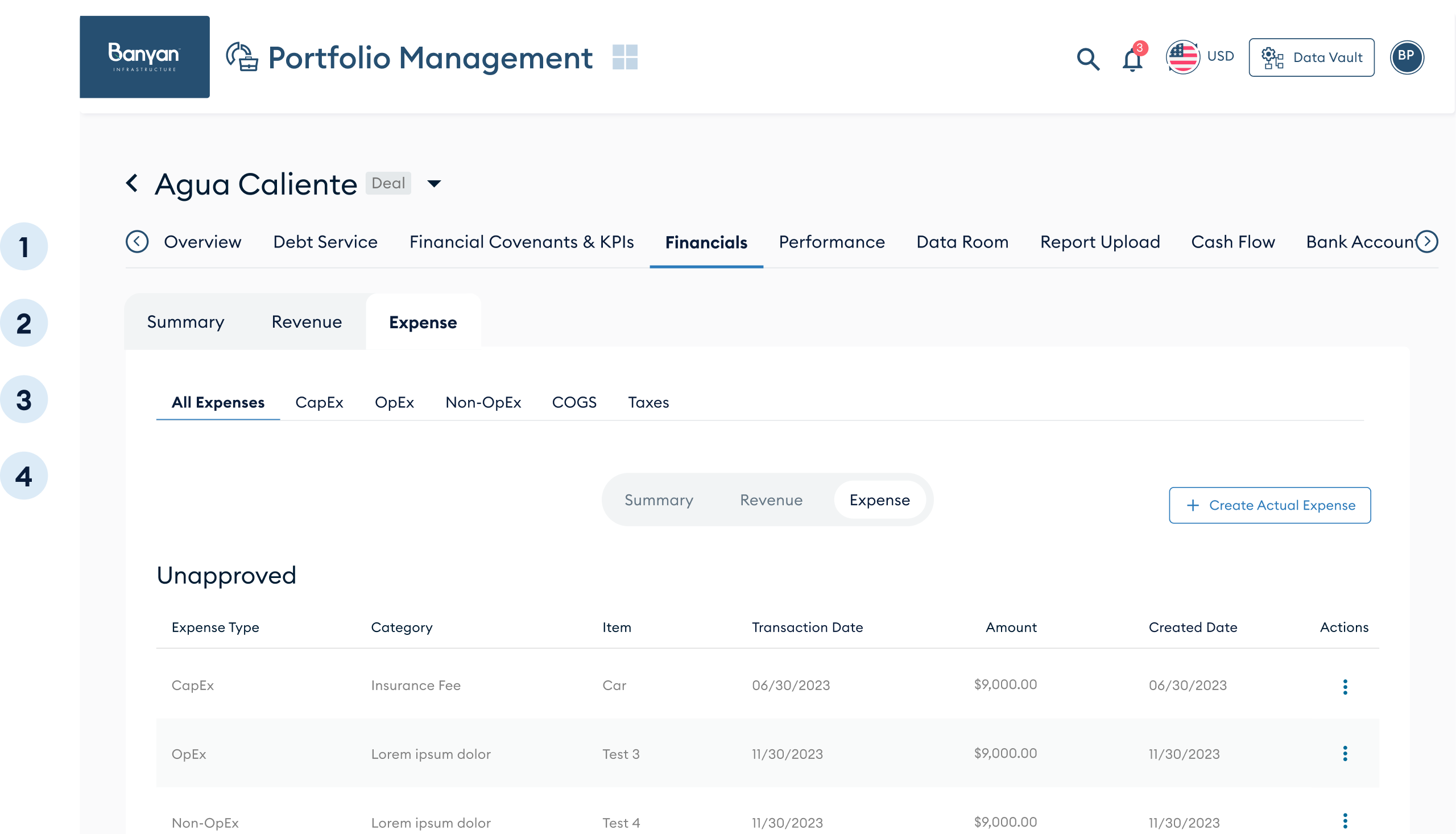
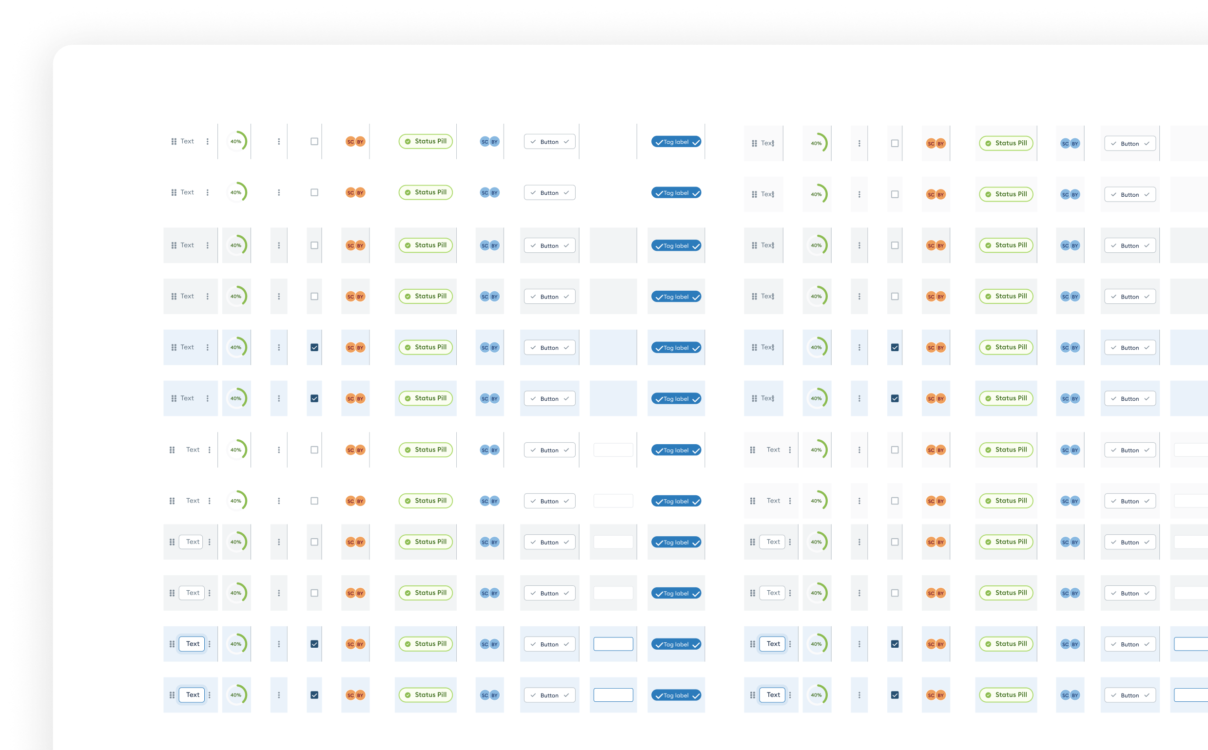
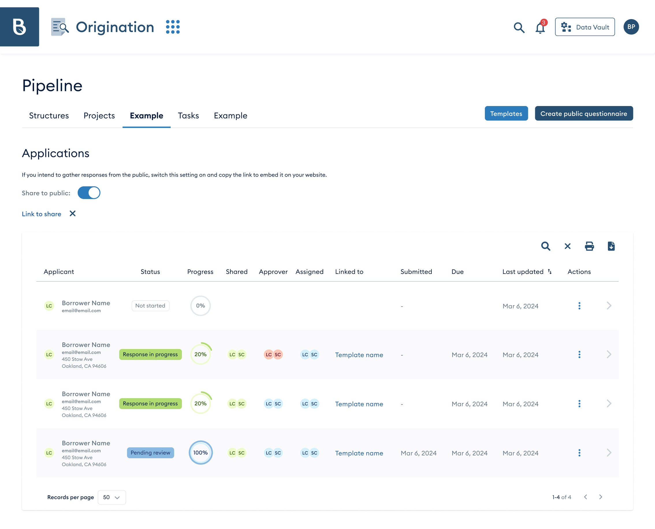
Tables are a huge part of Banyan's platform, so we developed a highly flexible and easy-to-use component to ensure seamless data management and presentation.
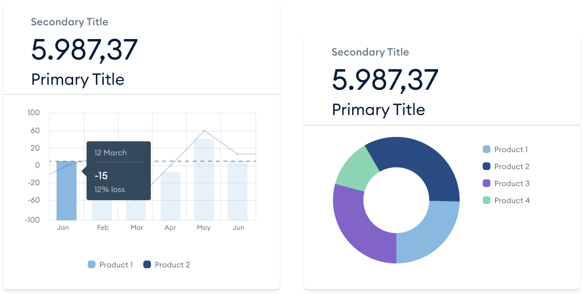
Charts play a vital role in Banyan's platform, so we designed a versatile, user-friendly component with hover states for all variants, ensuring smooth and interactive data visualization.
