Design ServicesEnd-To-End
TDP Rebrand
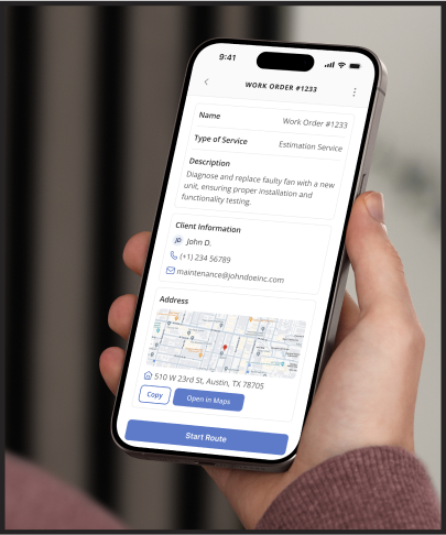
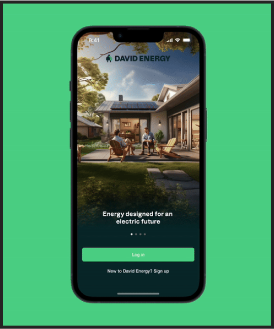
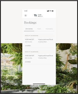
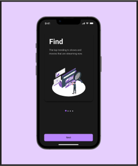
A mobile app that keeps patients and their loved ones connected to their recovery - and to each other.

Alumni App · Videra Health · iOS & Android · HIPAA Compliant · B2B2C · White Label
Videra Health needed a mobile app for behavioral health patients in recovery — connected to their care facility, compliant by design, and built to earn a daily habit.

Videra Health needed a mobile app for behavioral health patients in recovery — connected to their care facility, compliant by design, and built to earn a daily habit.
Most recovery apps feel like EHRs on mobile. Dense, impersonal, clinical. Patients don't want to feel like a patient every time they open it — they want to feel like a person in a community.
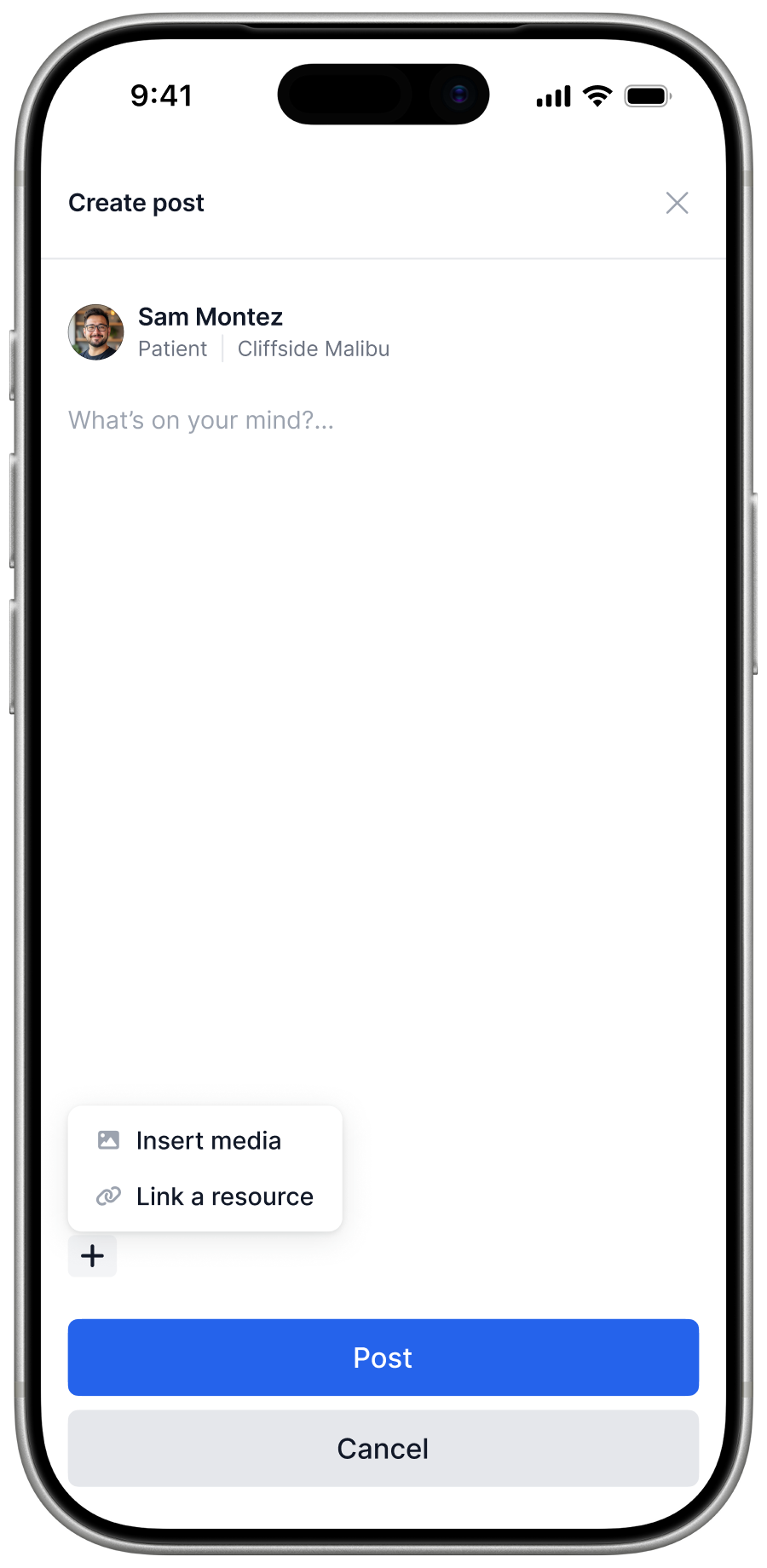
No P2P messaging. Invite-only access. Data minimization at every step. Each privacy rule is a potential UX blocker — unless you treat constraints as design inputs from day one, not afterthoughts.
Journaling, checking the community, RSVP'ing to an event — if it takes three taps more than it should, patients stop. Daily health habits live and die on milliseconds of hesitation.
Every behavioral health facility has its own identity. The design system was built to be fully swappable — facilities replace the brand tokens, everything else stays consistent.
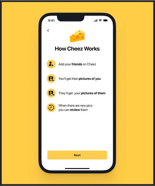
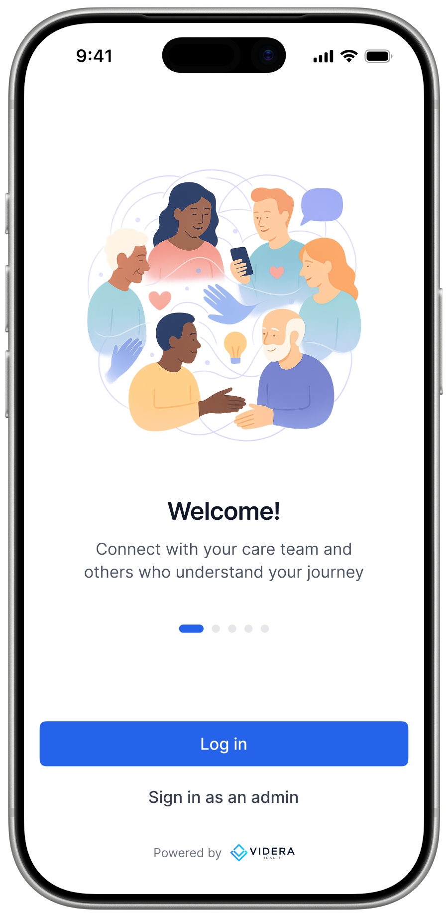
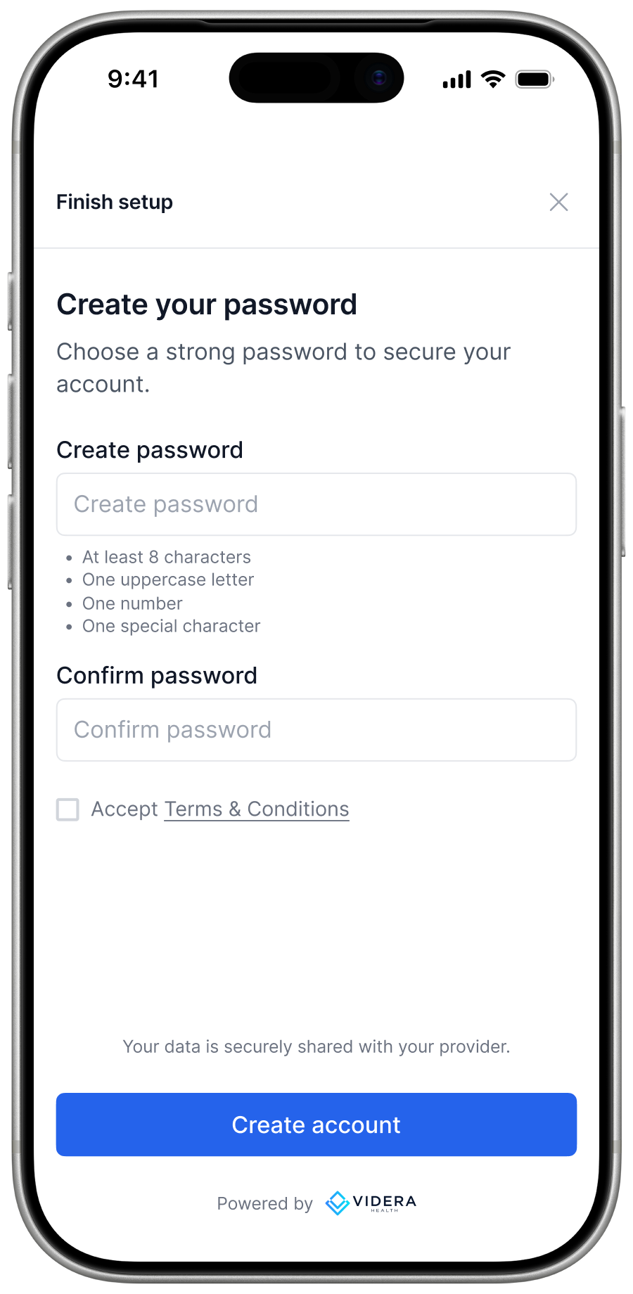
Patients don't download and find a sign-up form — they're invited. Magic link entry, two distinct auth paths, and a brief onboarding carousel that earns trust before the first tap.
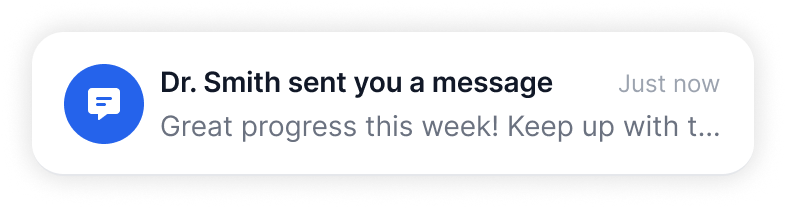
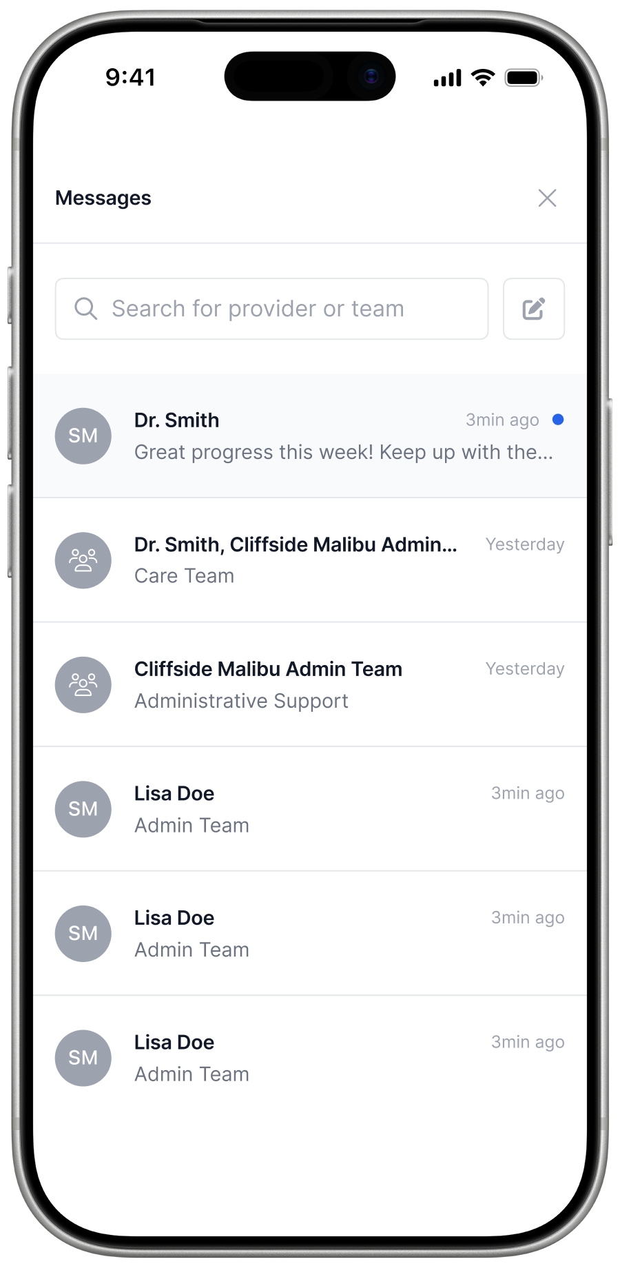
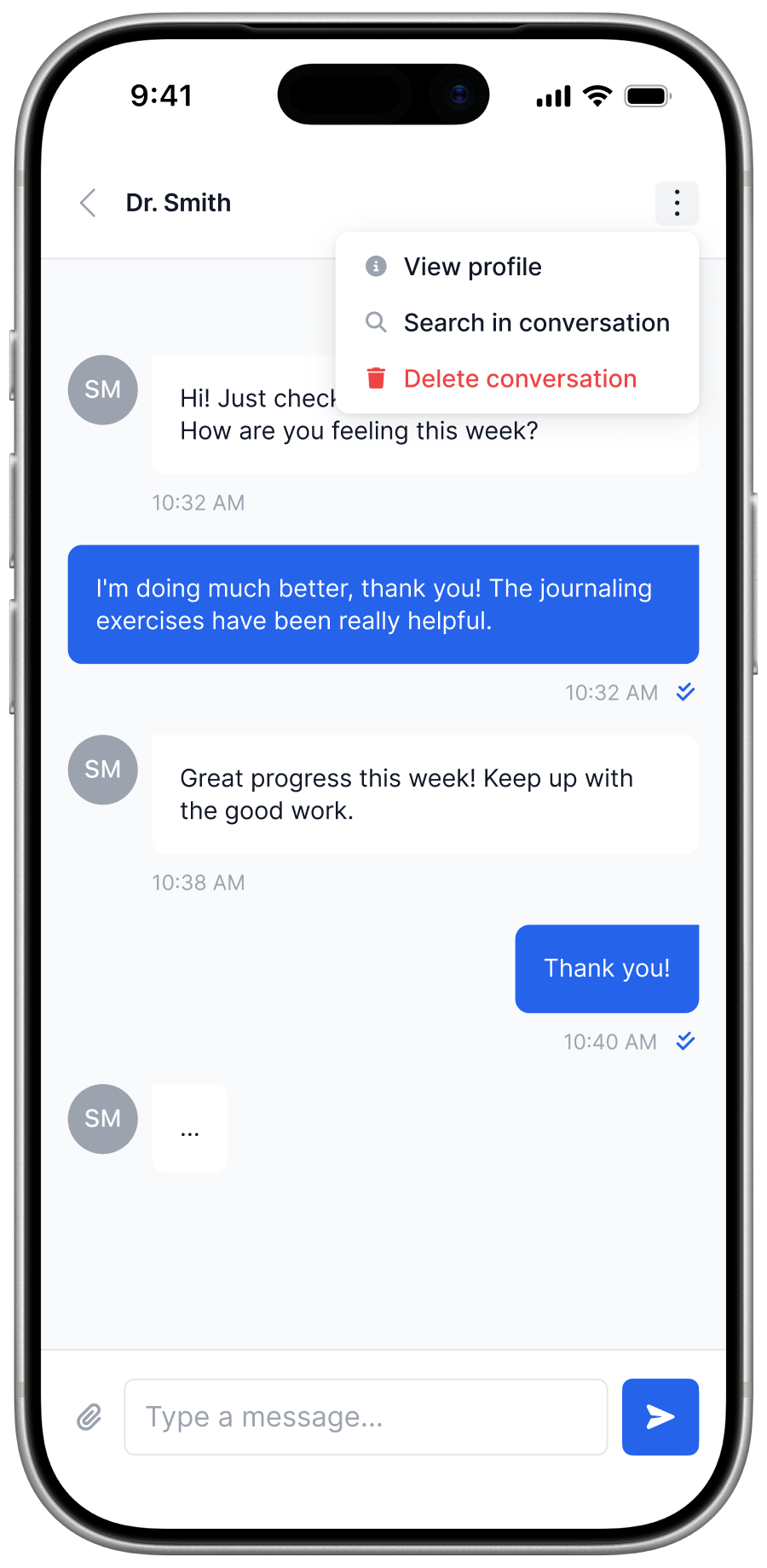
No patient-to-patient contact — that's the constraint. The design challenge was making a 1:1 care team channel feel like genuine support, and an automated Help Bot feel like it's actually listening.
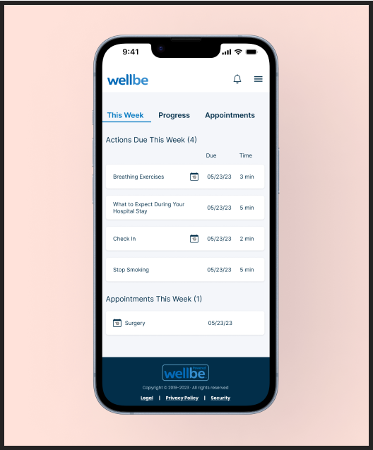
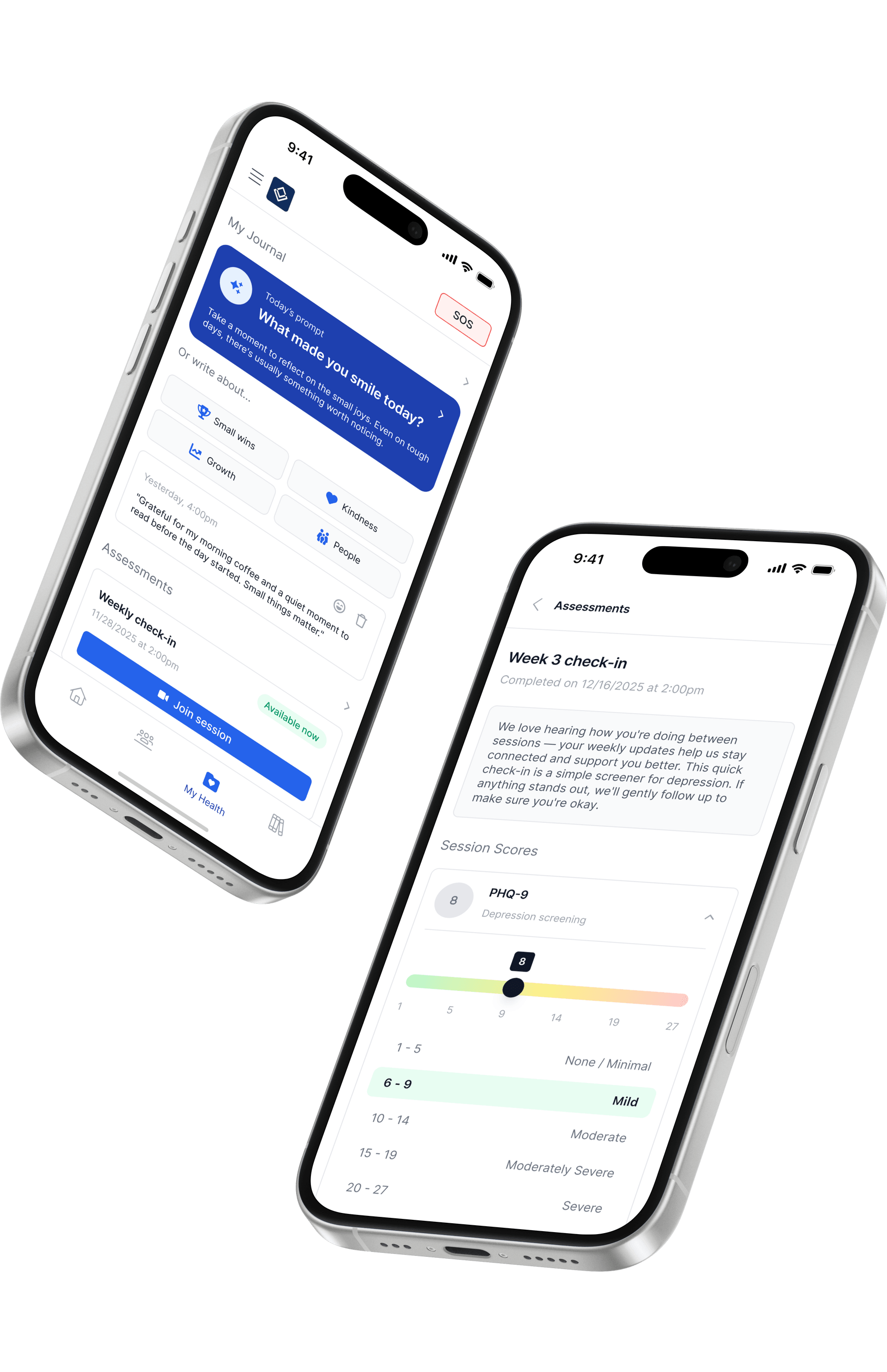
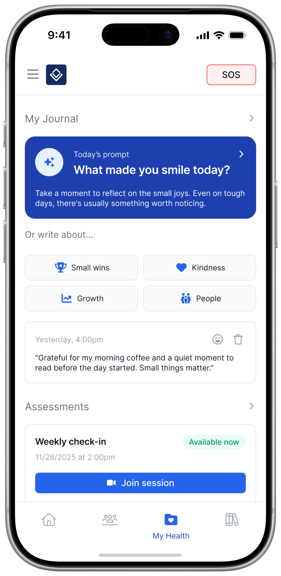
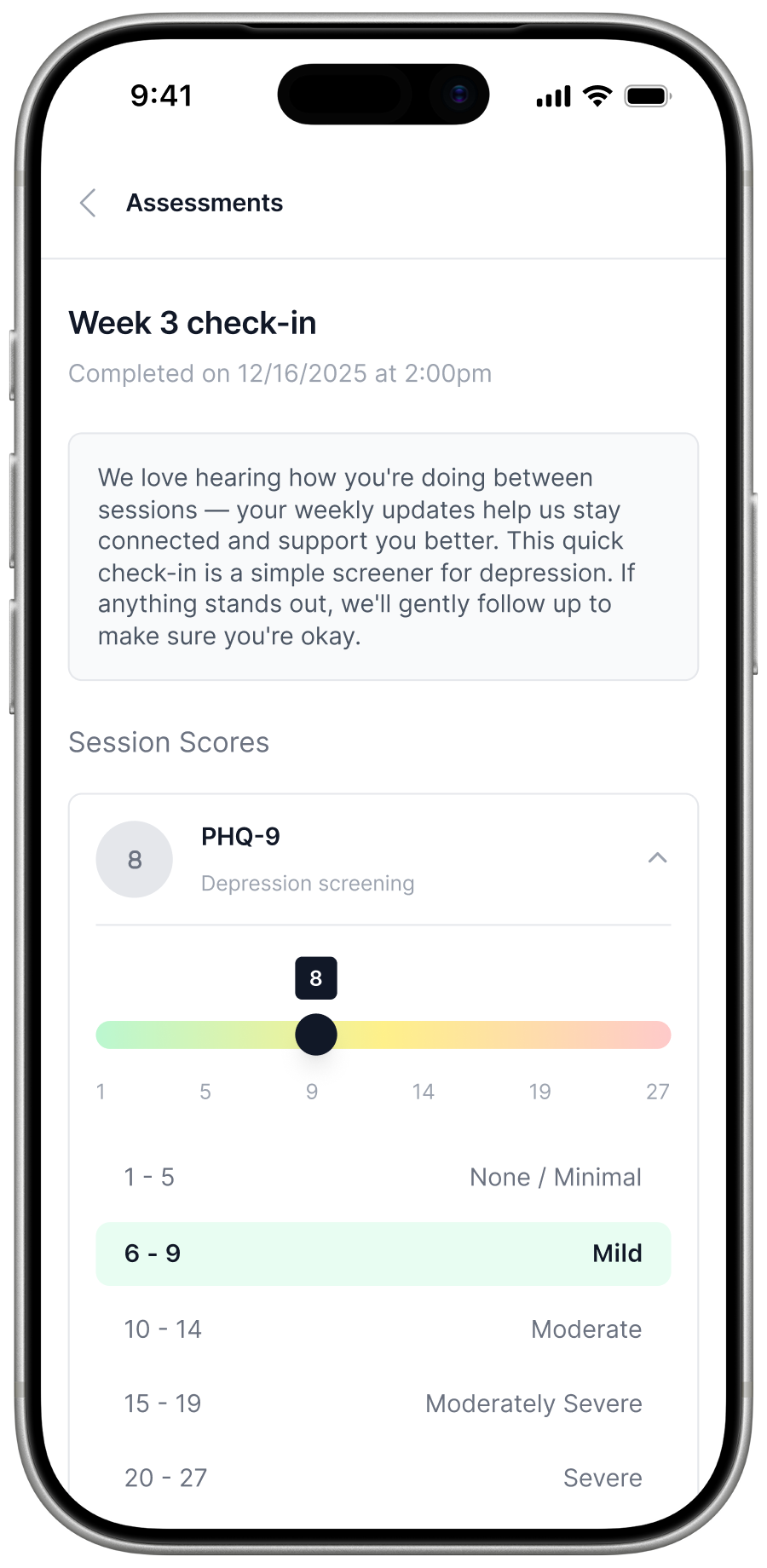
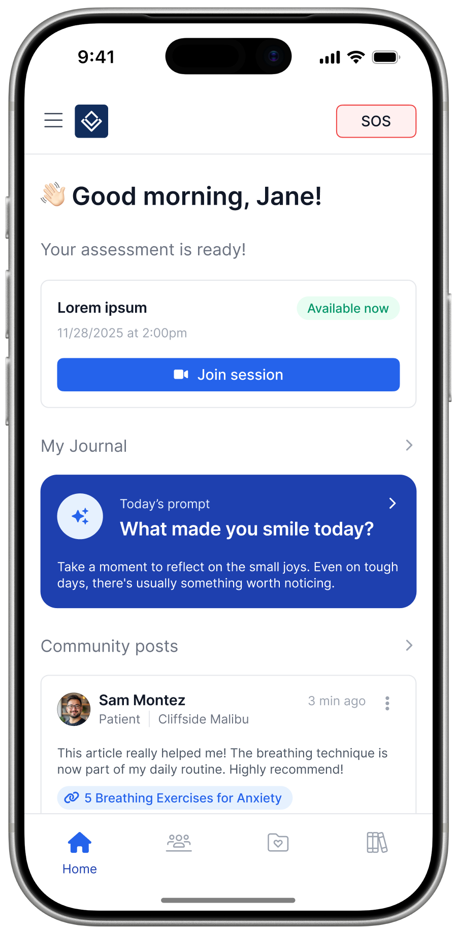
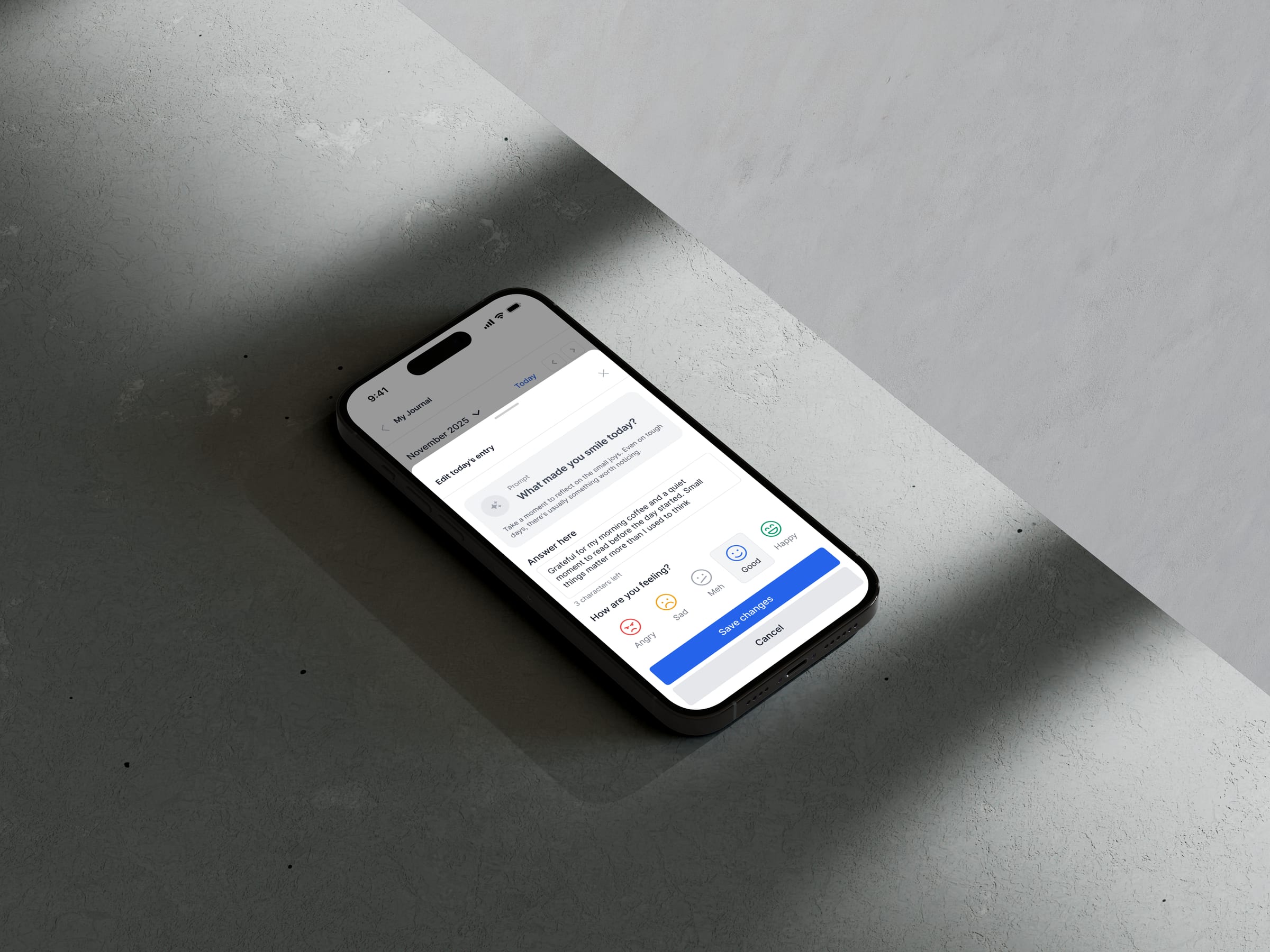
Daily prompts, mood check-ins, calendar streak dots. Assessments surface on schedule. One screen, one action.
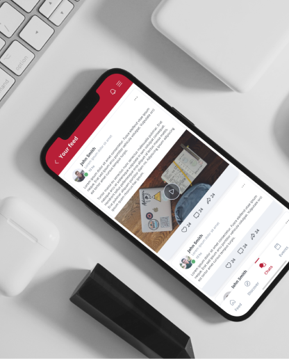
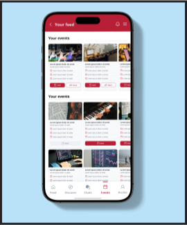
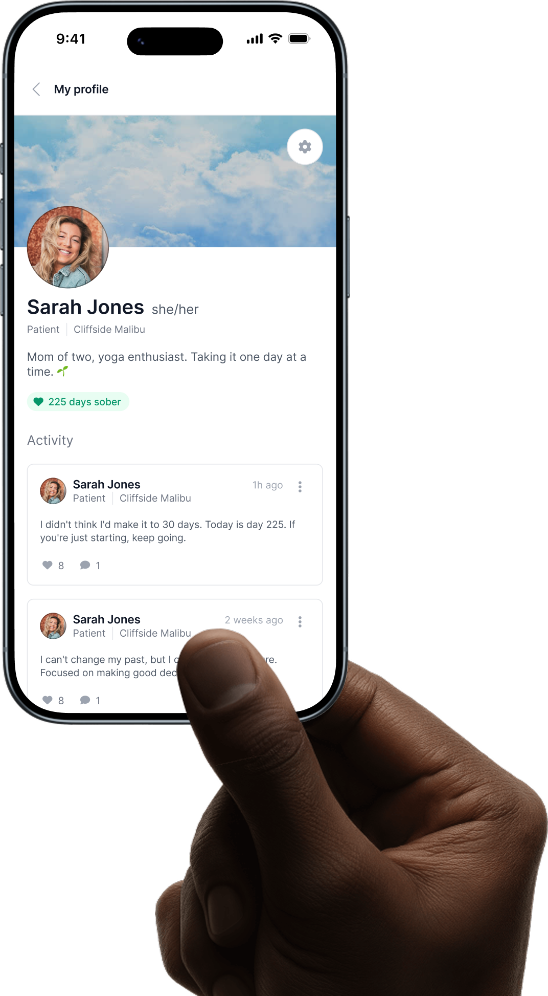
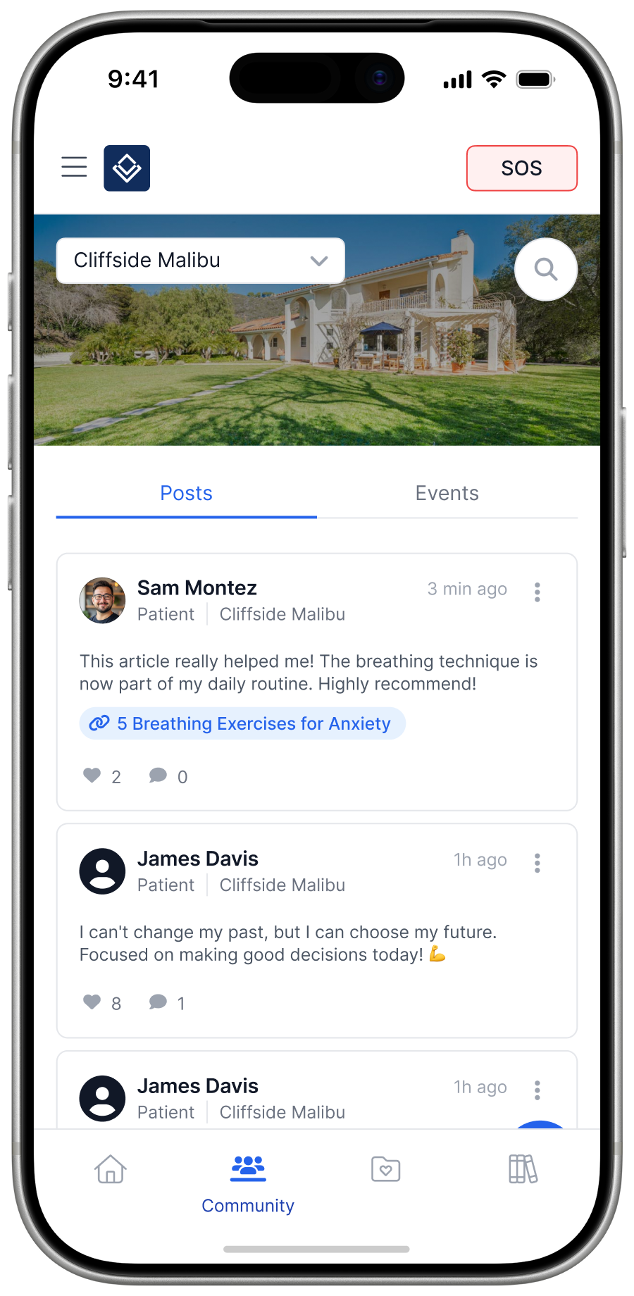
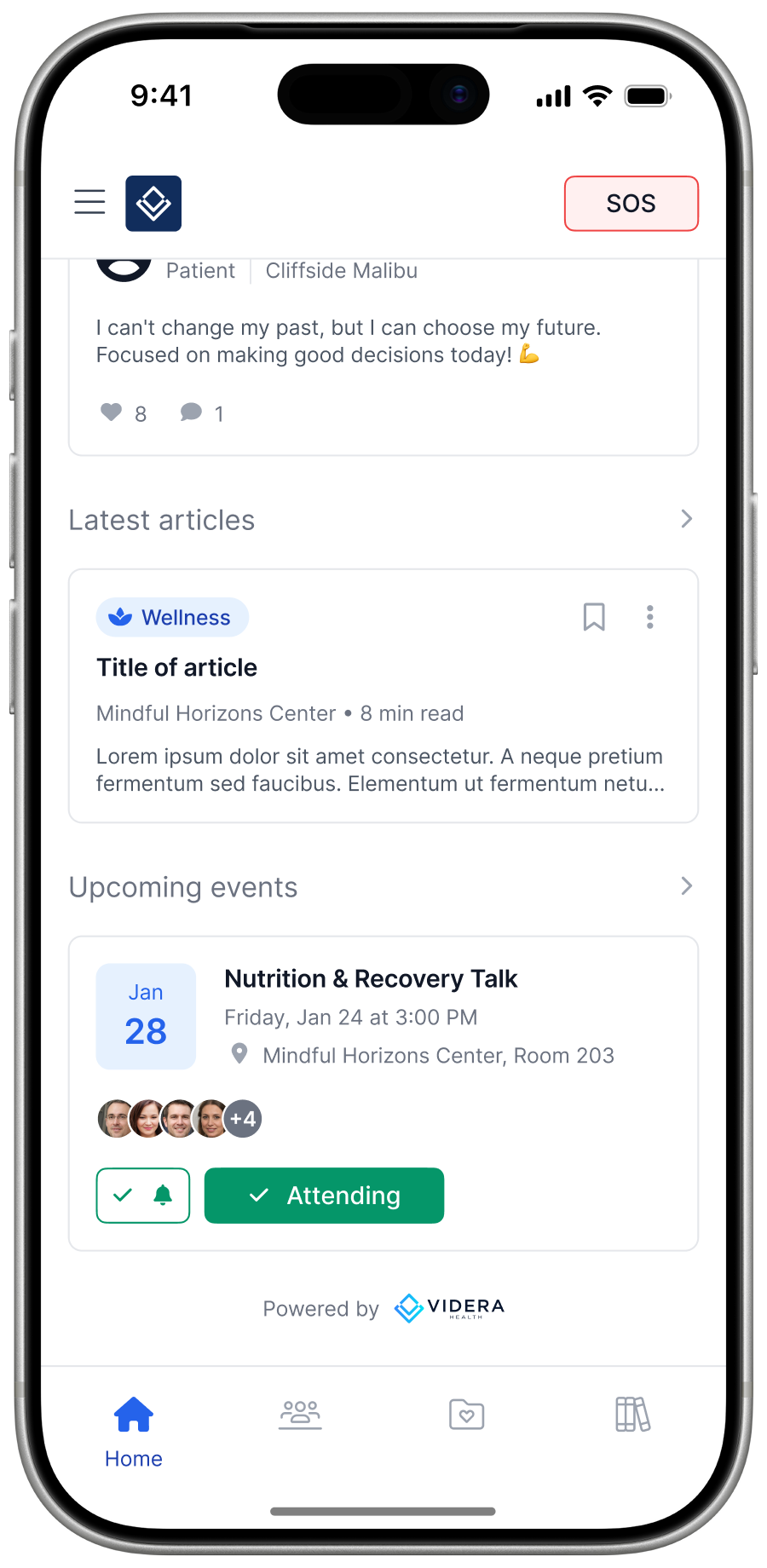
A social feed that feels like a community, not a bulletin board. Posts, reactions, events with RSVP — seeded and moderated by the care team, driven by the patients.
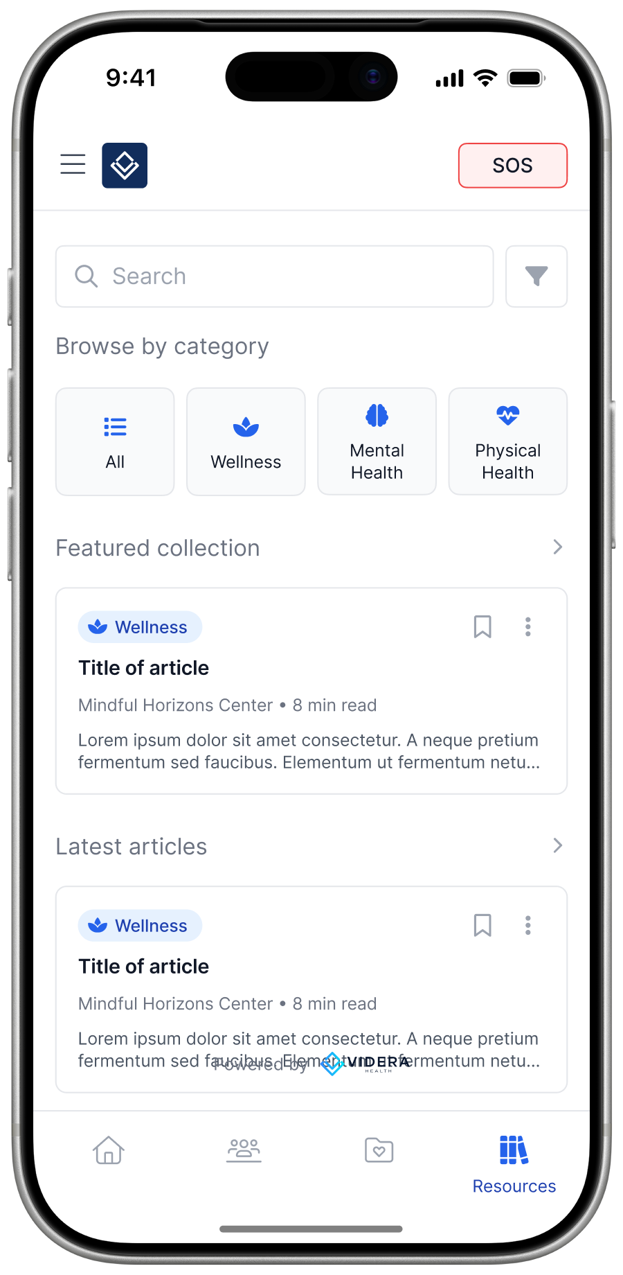
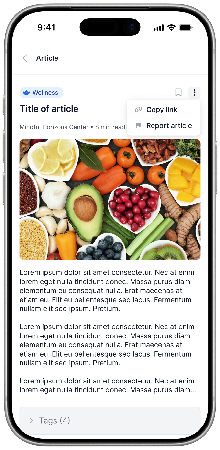
Searchable categorized library. Articles, tools, videos. Providers add custom facility-specific content.
The first thing patients open each day. A sober counter that makes progress visible, a journal nudge that doesn't nag, and a community feed that makes the next 24 hours feel less alone.
We mapped the overlap between three constraints: the facility's clinical workflow, the patient's daily reality, and healthcare compliance. Where those three met is where the product could live.
Before a single screen, we defined the shortest path to a daily-use app: login, journal, community, one-way messaging. Anything that wasn't required to open the app on a Tuesday morning was cut to phase two.
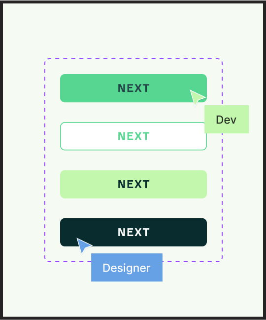
One module at a time: designed in Figma, reviewed with the client, iterated, approved, moved to Ready for Dev. No parallel threads, no half-shipped modules. The rhythm was the point.
Each module shipped with annotated Figma frames, engineering stories written to spec, and HTML prototypes for ambiguous interactions. Developers never had to guess.
A patient experience designed to hold up across facilities, platforms, and years of recovery — not just a launch.
Alumni App — designed by The Design Project for Videra Health