Automating data visualization makes a designer's job much more manageable when he or she has to deal with massive data sets. Consuming large sets of data is not always as straightforward as other practices can be. Sometimes, data sets are so large that it is impossible to discern anything useful from them. That is where data visualization comes in.
Given that the process of creating data visualization is rarely straightforward, designers cannot simply take a data set with thousands of entries and create a visualization from scratch. Sure, it is possible, but no one wants to spend dozens or hundreds of hours plotting dots on a scatter chart. That is where data visualization tools come in.
The expansion of smartphones, growing Internet use, rapid advancements in Machine Learning, and the rising adoption of cloud computing technologies as well as the Internet of Things are driving the global data visualization market. In addition, the increasing inclination for smart factories and the ever-widening use of visual analytics, information visualization, and scientific visualization in both small and large organizations are also contributing to the data visualization market growth.
Data Visualization 101
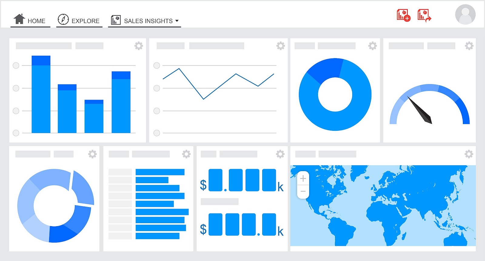
Data visualization is the process of graphical representation of data in the form of geographic maps, charts, sparklines, infographics, heat maps, or statistical graphs. Data presented through visual elements are easy to understand and analyze, enabling the effective extraction of actionable insights from the data. Relevant stakeholders can then use the findings to make more efficient real-time decisions.
Data visualization tools, incorporating support for streaming data, AI integration, embeddability, collaboration, interactive exploration, and self-service capabilities, ease the visual representation of data. These tools provide designers with an easier way to create visual representations of large data sets. When dealing with data sets that include hundreds of thousands or millions of data points, automating the process of creating a visualization, at least in part, makes a designer’s job significantly easier.
These data visualizations can then be used for a variety of purposes, such as dashboards, annual reports, sales and marketing materials, investor slide decks, and virtually anywhere else information that needs to be interpreted immediately.
Common Elements in All Great Data Visualization Tools
The top data visualization tools on the market have a few things in common. First is their ease of use. There are some incredibly complicated apps available for visualizing data. Some have excellent documentation and tutorials and are designed in ways that feel intuitive to the user. Others are lacking in those areas, eliminating them from any list of best tools, regardless of their other capabilities.
Secondly, the best tools can also handle huge sets of data. The very best can even handle multiple sets of data in a single visualization. In third place, the best tools also can output an array of different chart, graph, and map types. Most of the tools below can output both images and interactive graphs. There are exceptions to the variety of output criteria, though. Some data visualization platforms focus on a specific type of chart or map and do it very well.
Finally, there are cost considerations. While a higher price tag does not necessarily disqualify a tool, the higher price tag has to be justified in terms of better support, better features, and better overall value.
5 Trending Data Visualization Tools
In this section, we will present some of the data visualization tools that promise to be the best for the upcoming year.
1. Tableau
Tableau has a variety of options available, including a desktop app, server and hosted online versions and a free public option. There are hundreds of data import options available, from CSV files to Google Ads and Analytics data to Salesforce data. Output options include multiple chart formats as well as mapping capability. That means designers can create color-coded maps that showcase geographically important data in a format that’s much easier to digest than a table or chart could ever be.
The public version of Tableau is free to use for anyone looking for a powerful way to create data visualizations that can be used in a variety of settings. From journalists to political junkies to those who just want to quantify the data of their own lives, there are tons of potential uses for Tableau Public. They have an extensive gallery of infographics and visualizations that have been created with the public version to serve as inspiration for those who are interested in creating their own.
2. Infogram
Infogram is a fully-featured drag-and-drop visualization tool that allows even non-designers to create effective visualizations of data for marketing reports, infographics, social media posts, maps, dashboards, and more. Finished visualizations can be exported into any type of format. Interactive visualizations are also possible, perfect for embedding into websites or apps. Infogram also offers a WordPress plugin that makes embedding visualizations even easier for WordPress users.
3. Dundas BI
Dundas BI offers highly-customizable data visualizations with interactive scorecards, maps, gauges, and charts, optimizing the creation of ad-hoc, multi-page reports. By providing users full control over visual elements, Dundas BI simplifies the complex operation of cleansing, inspecting, transforming, and modeling big datasets.
4. ChartBlocks
ChartBlocks claims that data can be imported from anywhere using their API, including from live feeds. While they say that importing data from any source can be done in just a few clicks, it is bound to be more complex than other apps that have automated modules or extensions for specific data sources.
The app allows for extensive customization of the final visualization created, and the chart-building wizard helps users pick exactly the right data for their charts before importing the data. Designers can create virtually any kind of chart, and the output is responsive—a big advantage for data visualization designers who want to embed charts into websites that are likely to be viewed on a variety of devices.
5. Zoho Reports
Zoho Reports, also known as Zoho Analytics, is a comprehensive data visualization tool that integrates Business Intelligence and online reporting services, which allow quick creation and sharing of extensive reports in minutes. The high-grade visualization tool also supports the import of Big Data from major databases and applications.
Bottom Line
If you use one of these data visualization tools, the level of your work will be more efficient and you will certainly get better results.
Discover additional viewpoints on the subject by reading articles from our colleague bloggers.