Graphic design and branding both require color palettes. You can express various emotions and personalities based on your combination. While using a wide variety of colors in your designs might be exciting, monochromatic color palettes, or palettes made from only one color, can make your content just as impactful. Continue reading for advice on how to use monochromatic design in your graphic design.
Monochromatic Color: Introduction
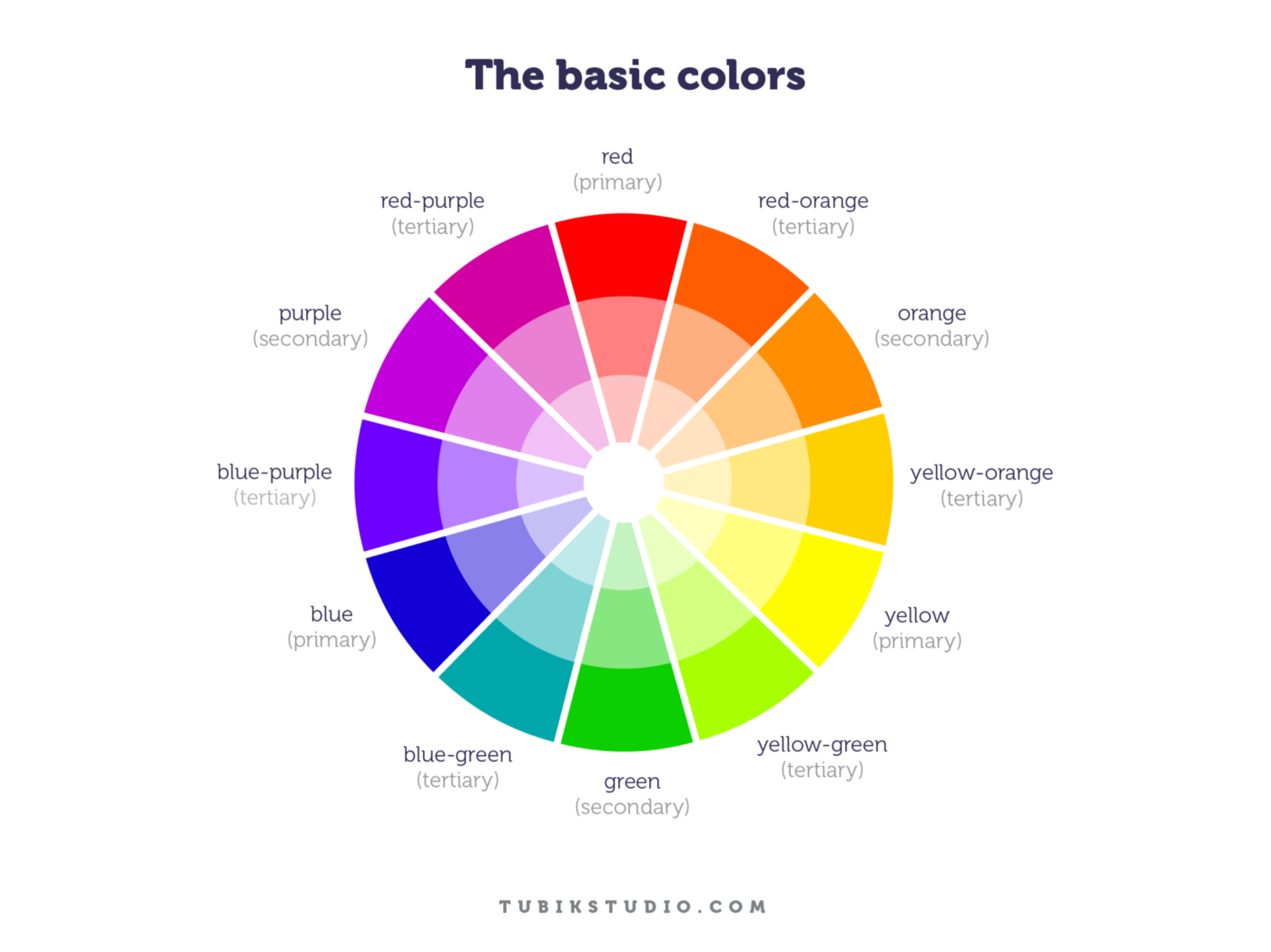
Let's review the terminology used to describe single-color palettes before we begin. The predominant color family consists of hues or pure colors. There are 12 hues on the conventional color wheel, each of which is made up of a primary, secondary, and tertiary color. Red, yellow, and blue is the three primary colors. Green Ora, violet, and orange are the secondary ones. Like red-orange or yellow-green, tertiary colors fall between main and secondary color categories.
The Greek term monochromes, which means "having one color," is where the word "monochromatic" originates. A monochromatic palette consists of a single main color presented in a variety of tones, tints, and hues.
White is used to providing tints to colors. This modifies the lightness of a color. Tints include pastel tones like candy pink and ocean blue.
Black is used to modify colors in order to generate shades. This alters the darkness of a color. Dark tones like cherry red can still be vibrant.
Black and white are both colors that can have gray added to them to create tones. This modifies the vibrance of color. Pure colors are strong, vibrant, and saturated. A color gets dulled when gray is added to it. You may achieve those quiet, neutral color palettes and earth tones in this way, despite the fact that it may not sound pleasant.
Choosing a Monochrome Palette
We may now use our knowledge of hues, tones, and tints to be more creative. Here's how to build a monochromatic design's single color palette.
Be careful when choosing your base color.
The base color serves as the foundation for your design. You need your monochromatic design to be focused on the original color in a palette.
Remember that the color you select will affect how your audience perceives the finished design. In truth, marketing has a large amount of data on color psychology. For instance, green denotes harmony and growth, purple can be opulent or magical, and red indicates strong and dynamic.
While it's vital to consider your target audience and make a decision after some thought, it's also OK to go with your gut. Alternatively, try out your favorite color! Your favorite one may do wonders for your brand if you can identify with it personally.
A dominant color from the color wheel, such as red, blue, or green, is not required to be your base color. You can pick a shade like royal blue, a tone like sandy brown, or a tint like baby pink.
Once you've chosen your color and increased your palette, keep in mind that the pigment with the fewest amount of black, white, and gray will likely stand out in your design the most. For instance, primary blue might "shine" more than its marine, sky, and matte relatives.
Think about using fluorescent colors.
Those colors on the color wheel which are fluorescent are notably brighter variations of the standard hues. Consider neon yellow, electric blue, bright green, and flamingo pink. Neon colors are relatively simple to transmit on screen since they shed and reflect more light. Just keep in mind that printing neon colors cost more, so ask your printer if they have fluorescent pigments or unique Pantone swatches. Be prepared to see your vibrant digital colors fade if you try printing your neon hues on a conventional printer. But if the majority of your audience is online, it might be a great option.
Think of using grayscale.
Black and white are "shades," not colors, according to the rules. You can select to utilize a black-and-white or grayscale palette in place of any of the primary colors.
Add more colors, tones, and tints to your palette.
One hue can be used well without becoming constrictive. You are free to express your creativity and include several brand identities.
Designs from one color can be bold and expressive. Utilizing more white, black, and pure hues from the color wheel will help you achieve this. This method is louder and more lively since it uses a high-contrast layout.
Additionally, you can lower the volume by using a more neutral and modest color palette. For a low-contrast appearance, use more hues, tones, and tints. Because of the greater variety of colors and shades, the result might be serene, subtle, or even artistic.
A few elements of design are simpler for viewers to notice when using a monochromatic palette since it simplifies the color selection process. Therefore, it is much more crucial to exercise caution when it comes to contrast, dominance, and unity.
Contrast is the rendering of elements in such a way as to create excitement and visual appeal. Strong contrast indicates focus. It's not possible to employ contrary colors to generate contrast while utilizing a monochromatic palette (like red and green). Instead, focus on using size and texture contrast, such as placing large forms adjacent to small ones or rough textures next to smooth hues. Utilize current trends in design to set your work apart from others. If you're utilizing a neutral, low-contrast palette, this is extremely useful.
Dominance describes the visual weight of an element. Give your major element dominance by positioning it in the composition's visual foreground, whether you're utilizing a moderate or high-contrast color palette.
When a design has unity, all of its components efficiently communicate with one another. The spectator may more easily understand a cohesive design, which makes it simpler to understand both the medium and the message.
Final thoughts
While graphic design gets more trendy, we seem to think that more is better, however, simplicity can transmit much more than abundance. Monochromatic design is a useful resource to create unique but simple design products. In this post, we talked about the essentials of this matter. With the points stated earlier, you'll be able to understand how to create a product of this kind, I suggest you look into some examples to help with the inspiration and creative process.
