Data visualization software is key for data scientists. Their job is to analyze, interpret, and visualize large datasets on a daily basis. This is the reason why it is essential for them to have the right data visualization tools at their disposal.
It can be challenging for people who do not work closely with data every day to grasp what they are trying to say if all they show them are words on a spreadsheet full of numbers without any context that can be understood.
Data visualization tools permit data scientists to communicate their findings more effectively, which is key given that it allows them to share their insights with other people who may not be familiar with these kinds of concepts.
In this blog, we will take a look at some of the best data visualization software for data scientists and how they can increase the efficiency of this type of job.
What Is Data Visualization Software
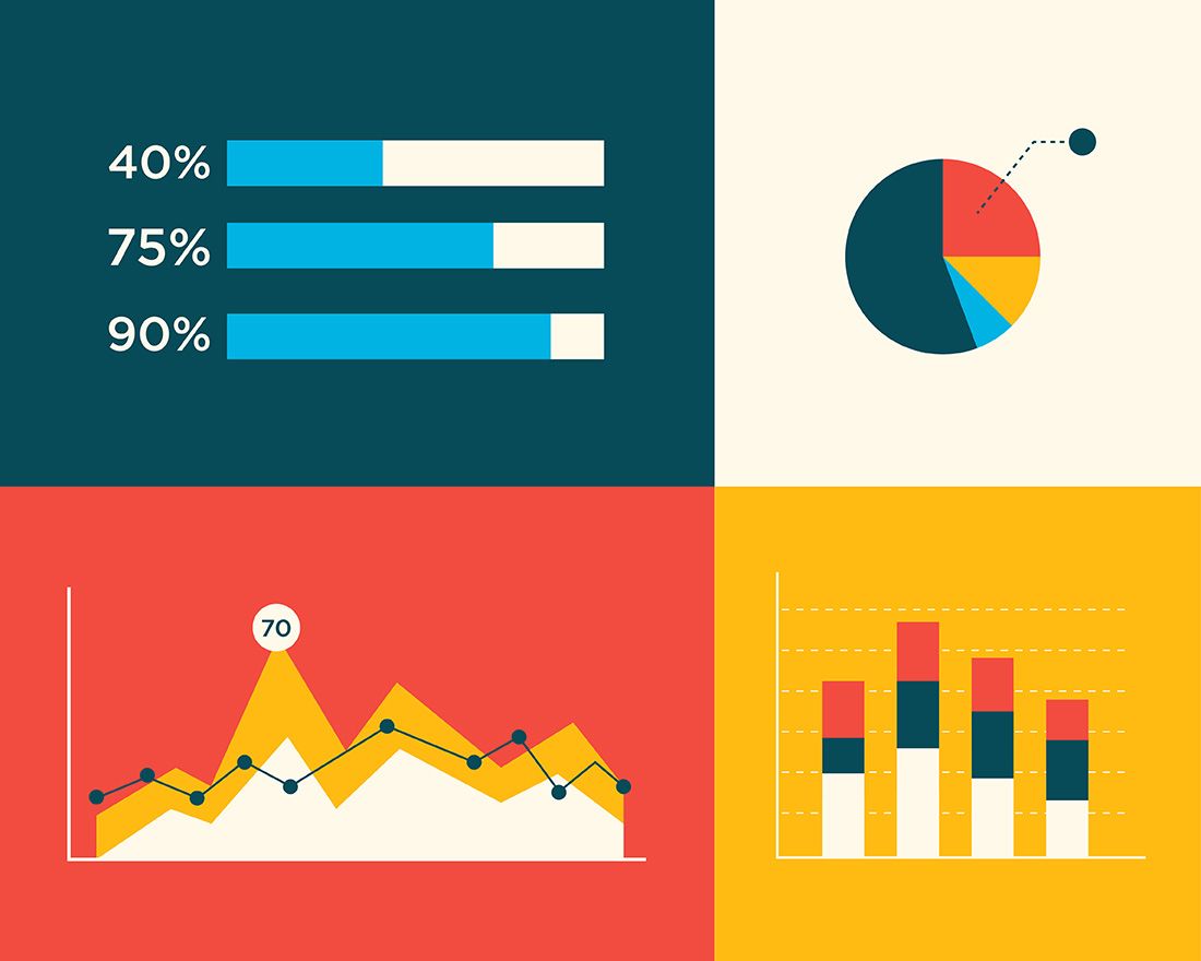
Data visualization software's main function is to provide data scientists and designers with an easier method to create visual representations of large data sets. When dealing with data that include hundreds of thousands or millions of data points, automating the process of creating a visualization, at least in parts, makes a designer’s job quite more manageable.
These data visualizations are then used for a variety of purposes, such as dashboards, annual reports, sales and marketing materials, investor slide decks, and almost anywhere else information that needs to be interpreted directly.
The best data visualization tools on the market have a few things in common. First is their easiness of use. There are some extremely complex apps available for visualizing data. Some have excellent documentation and tutorials and are designed in ways that feel intuitive to the user. Others are lacking in those areas, eliminating them from any list of “best” tools, regardless of their other capacities.
The best tools can also handle huge sets of data. In fact, the best one can even handle multiple sets of data in a single visualization. The best tools also can output an array of the different chart, graph, and map types. Most of the fine tools can output both images and interactive graphs. There are exceptions to the variety of output criteria, though. Some data visualization software focuses on a specific sort of chart or map and does it remarkably well.
Finally, there are cost considerations. While a higher price tag does not necessarily disqualify a tool, it is true that the higher price tag has to be justified in terms of better support, better features, and better overall value.
3 Great Data Visualization Software In 2022
In this section, we will cover some of the best tools of this year and the past ones that can give you significant benefits.
1. Tableau

Tableau has a variety of options available, including a desktop app, server, hosted online versions, and a free public option. There are hundreds of data import options to be used, from CSV files to Google Ads and Analytics data to Salesforce data.
Output options include multiple chart formats as well as mapping capability, which means that designers can create color-coded maps that showcase geographically relevant data in a format that is much more effortless to digest than a table or chart could ever be.
The public version of Tableau is free to use for anyone looking for a strong way to create data visualizations that can be used in a variety of settings. It is a wonderful tool that is capable of being used by many different kinds of people, from journalists to political junkies, to those simply interested in quantifying the data in their own lives. They have an extensive gallery of infographics and visualizations that have been created with the public version to serve as inspiration for those who are interested in creating their own.
These are the advantages of Tableau. First of all, it comes with hundreds of data import options, then mapping capability, a free public version available, and lots of video tutorials to walk you through how to use the platform. On the other hand, the benefits that Tableau does not come with are the following. These are the non-free versions, which are quite expensive ($70/month/user). Plus, the public version does not let you keep data analyses private.
2. QlikView

QlikView is not just another data visualization software, but it is a data discovery platform that empowers users to make faster, more informed decisions by accelerating analytics, revealing new business insights, and increasing the accuracy of outcomes.
It was an intuitive software development kit that has been used in companies around the world for many years. It can integrate various types of data sources with visualizations in color-coded tables, bar charts, line graphs, pie charts, and sliders.
It has been developed on a “drag and drops” visualization interface, allowing users to smoothly add data from many different sources, such as databases or spreadsheets, without having to write any code. These characteristics also make it a relatively simple tool to learn and grasp.
3. Plotly
Plotly is one of the many well-developed data visualization tools, and it is used to create interactive graphs, charts, and maps. You can also use Plotly to make a visualization of a dataset, then share the link of that visualization with your readers on social media or on your blog.
Graphs made on Plotly are interactive and have a unique URL, so they are comfortable for you to share. Readers can explore how you created them by hovering over data points and viewing information about them. They can also explore all the data interactively instead of trying to decipher your code, which makes it perfect for sharing both interactive plots and datasets with your audience.
Plotly’s interface is easy to use, so you can create beautiful graphs in less time than ever. Furthermore, Plotly features a large library of open-source visualization types, allowing you to choose from a combination of plots and maps.
Final Thoughts
Data visualization software is one of the greatest tools for a data scientist as much as for other disciplines. Learning how to use them will have the best consequences and results for your work.