Not everything that appears in a chart is true, though it may seem it is. Data visualization can be molded into what its maker wants, so you should not trust everything that you see. In this article, we will give you a hand to start knowing how to differentiate truthful from misleading data visualizations.
Given the increasingly data-driven world that we currently live in, charts have started appearing everywhere from news feeds to activity trackers. Some are beautifully visualized but more often than not the quality can be lacking and the results confusing or even misleading. We use visualizations to compress data in order to create an intuitive understanding of trends. We will go through some of the basic mistakes that can be made when presenting data visualization.
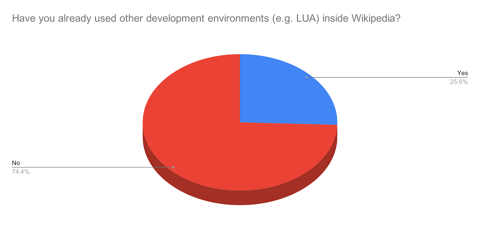
You just have to know that elements of a visualization can be modified in ways that can either emphasize or diminish the impact of the data. It is possible to emphasize granularity by varying the number of gridlines or ticks, create bias by carefully crafting labels, or evoke subconscious emotions by changing colors.
8 Types of Misleading Data Visualization
In this section, we will present some data visualization charts that can be true as well as cannot, it is only a matter of knowing how to read and thus differentiate them.
1. Bar Charts
Bar charts use length as their visual cue, so when someone makes the length shorter using the same data by trimming the value axis, the chart dramatizes discrepancies. Someone wants to show a bigger change than is actually there, so you might want to double-check on those.
2. Absolutes
It is true that everything is relative. You cannot say a town is more unsafe than another because the first one had two robberies and the other only had one. What if the first town has many more times the population that of the first? It is often more beneficial to think in terms of percentages and rates rather than absolutes and totals.
3. Axis Cropping
The X and Y axis is the key to comprehending the scale and relationship of a plot. An axis can be cropped for the X or Y dimension or both to show a subset of the data. Depending on what program and type of plot this could happen accidentally as well as intentionally. We are all most probably able to find plots in that cut data to make their point look more valid than it is.
Sometimes there is a good reason for cropping. If the idea of a visualization is to tell a story, this can be an incalculable tool to emphasize a change. Yet, there are multiple examples where it is used to confuse people by overly exaggerating the relational scale making differences look larger than they are in reality, made even worse when the numbers on the axis are omitted entirely. Cropping a graph’s axis can hide all sorts of problems.
4. Axis Scaling
When comparing diagrams, it is important to comprehend if they are both set to the same scale. The axes are often automatically scaled to best fit depending on which visualization program is being employed. With more than one chart that does not have identical data, an inch in one chart could be equal to 10 and in the other, it could be 30, so be careful with them. The default behavior of visualizations often introduces the problem automatically. Just remember the importance of having apples to apples when comparing plots and looking at the axes.
5. Binning
Histograms are very useful ways to understand the distribution of data. In some ways, it trades absolute accuracy for general understanding by calculating the number of data points that are within a certain range. This is known as binning, a bin value of 10 will split from zero to the maximum into 10 buckets. There are several formulas that can be used to determine the bin size such as the Sturges formula, the rice rule, and Freedman-Diaconis Choice all are good places to start.
6. Pie Charts
Pie charts generally are a dreadful way to show complex data. Our brains do not deal well with trying to compare slices when there are more than three or so. In order to make matters worse, many often lack proper labeling or confusing effects that look cool but in reality, are illegible. The dislike of pie charts is widely shared and many articles have been written on the subject. Even the order of the slices can play mental tricks.
7. Extra Dimension
When you see a three-dimensional chart that is three dimensions for no good reason, question the data, the graph, the designer, and everything based on the chart, though It does not absolutely mean a visualization is lying just because it exhibits one of the previously mentioned qualities, just be mindful about them when you have to use one of them.
8. Axis Plots
Charts can actually have two independent vertical axes on the left and the right. Sometimes this kind of chart can be used to show a correlation between two plots, but the relationship may be tenuous if not none existing. By using the axis cropping and axis scaling mentioned above, small inclines can become cliffs and non-conforming data can be chopped to draw false correlations and comparisons. Using two axes can be helpful when drawing accurate correlations between two sets of information, but when someone is doing it, be sure to look at the axis for scale and comprehend any other modifications that may have been made.
Final Thoughts
On this page, you will find the most common resources used currently to represent data through data visualization charts. Take into account that not every chart will be misleading, but now you have the information to tell which ones can be someone's true, but not the entire truth. So, be careful with it.