You’ve crafted sleek interfaces, structured your content, and streamlined navigation—but users still feel overwhelmed. The issue? Simplicity isn’t just about design; it’s about how much effort users need to think. When cognitive load is too high, frustration sets in, and engagement drops. To keep users moving forward, you need to design for clarity, ease, and seamless interactions.
Reducing Cognitive Load in Product Design
What is Cognitive Load?
A survey of 2,000 streaming service subscribers revealed that 51% felt overwhelmed by the volume of content, leading to frustration and decision fatigue.
NY Post
Why Should It Matter to Designers?
Overloading users with too much information leads to frustration, decision fatigue, and drop-offs. Designing with cognitive load in mind helps users complete their tasks efficiently, improving engagement and conversion rates.
Improving the usability of a website has the potential to boost conversion rates by up to 200%, while a fully optimized UX design can improve conversion rates up to 400%
Forrester
How to Reduce Cognitive Load in UX, UI, and Marketing?
UX: Designing for Ease of Use
A well-designed user experience reduces friction, minimizes effort, and guides users seamlessly through their journey. The goal is to eliminate unnecessary cognitive strain, allowing users to focus on their tasks without confusion or frustration.

- Offload Tasks: Reduce unnecessary effort by minimizing manual inputs and decision-making.
- Show relevant images instead of excessive text.
- Autofill or remember user inputs.
- Set smart defaults and remove redundancy.
- Provide step-by-step guides, video demos, and interactive tutorials.
- Use progress indicators for multi-step processes.
The average user's attention span is about 8 seconds.
The Treetop
- Leverage Mental Models & Familiar Patterns: Reduce learning curves by aligning with user expectations.
- Research how users interact with similar products:
- Use standardized labels and section names.
- Onboard users if you're introducing a new pattern.
- Ensure common actions follow familiar placements (e.g., cart icon for checkout).
- Stick to known UI conventions (e.g., a magnifying glass for search, a cart icon for checkout, red asterisk for required, swipe to delete) unless there’s a strong reason to change (e.g., swiping motions in Mobile)
17% of users who abandoned the process during checkout thought the process was too complicated or too long.
Baymard Institute
Tips on Research
- Analize competitors: Take note of navigation structures, button placements, and user flows that seem intuitive and widely adopted.
- Usability Testing: Observe real users interacting with similar products. Identify pain points, successful patterns, and areas where users struggle or get confused.
- Check User Feedback: Read app reviews, forums, and support tickets to uncover common frustrations and expectations.
- Analyze Heatmaps & Session Recordings: Tools like Hotjar or FullStory can reveal where users click, scroll, or drop off, providing insights into their expectations and mental models.
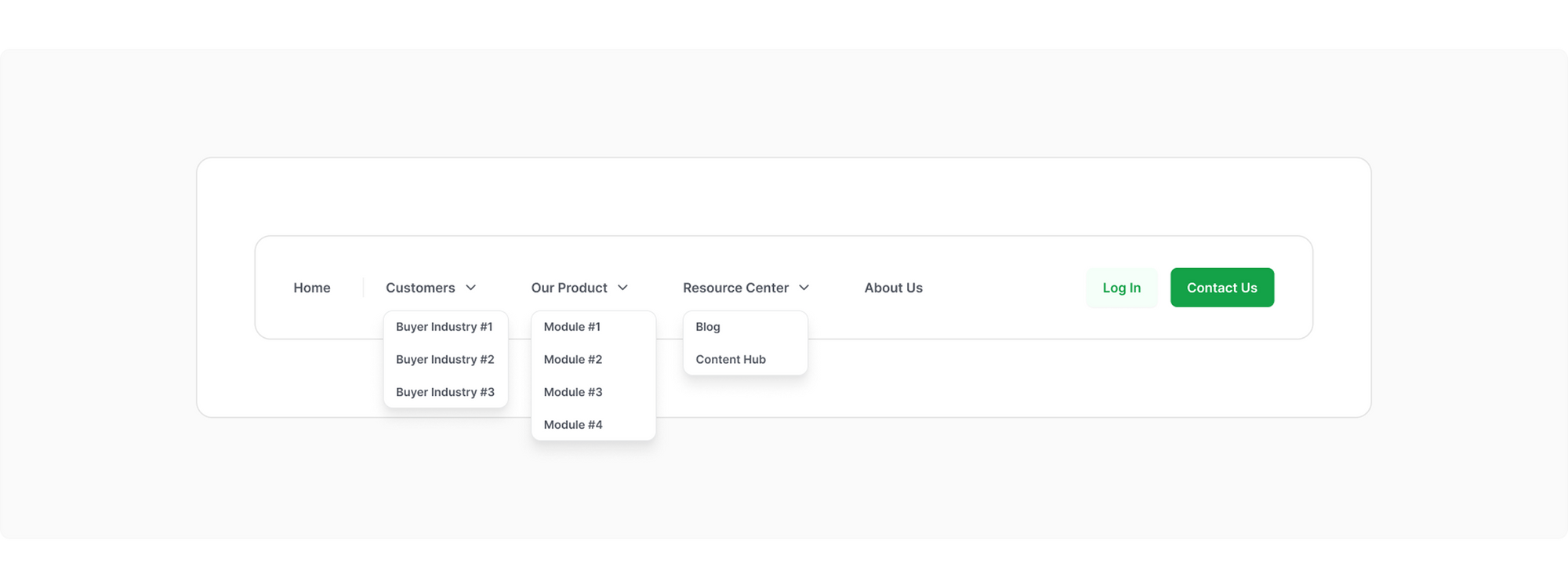
- Simplify Navigation: Ensure users find what they need quickly.
- Use a well-organized, logical menu.
- Group related elements meaningfully.
- Use clear, standard terminology (e.g., "Home," "Contact").
- Limit menu options (7 or fewer items per level).
- Enable breadcrumbs for deeper navigation structures.
Simplified navigation can increase sales by up to 10%
DC Creative Partners
Using an effective nav for the buyer journey generates 50% more sales-ready leads at a 33% lower cost.
HubSpot
- Reduce Decision Fatigue: Guide users toward better choices.
- Offer pre-selected options to simplify choices.
- Provide comparison tables to ease decision-making.
- Use defaults that cater to most users’ needs.
- Offer smart recommendations based on behavior.
- Prevent unnecessary choices (e.g., too many payment options).
69.57% of shopping carts are abandoned, with overwhelming product choices often cited as a key reason.
Baymard Institute
- Minimize Memory Load: Keep relevant information visible.
- Display essential info instead of making users recall it.
- Keep key actions within view (e.g., sticky buttons).
- Offer inline help instead of hidden FAQs.
- Use tooltips and hover states to provide more details.
- Let users review inputs before submission.
Users recall only 10% of information they read but 65% of information paired with visuals.
Medina, Brain Rules
UI: Designing for Visual Clarity
An intuitive UI reduces the effort required to understand and interact with an interface. Thoughtful use of space, hierarchy, and feedback ensures that users can navigate efficiently without feeling overwhelmed.

- Eliminate Visual Clutter: Reduce distractions and unnecessary elements.
- Utilize white space effectively.
- Remove redundant links, irrelevant images, and excessive fonts.
- Keep interfaces visually clean with simple typography.
- Limit the number of fonts (ideally two per product).
- Reduce decorative elements that don’t add functional value.
Effective use of white space increases comprehension by up to 20%.
HubSpot
- Enhance Visual Hierarchy & Chunking: Help users process information faster.
- Prioritize key elements using size, color, and placement.
- Break down complex information into digestible chunks.
- Use visual rhythm (e.g., alternating background colors).
- Highlight primary actions with strong contrast.
- Place the most important information where users naturally look first.
61.5% of users leave due to bad navigation, outdated design, and poor content structure.
Good Firms
- Ensure Consistency Across Platforms: Keep experiences predictable.
- Standardize icons, buttons, and colors.
- Ensure layouts remain functional on different screen sizes.
- Use consistent typography and spacing.
- Maintain button placement across screens.
- Sync UI behaviors across web and mobile versions.
85% of Gen X users expect seamless multi-device compatibility in UI designs.
SAP Blogs
- Provide Clear Feedback & Affordances: Help users understand interactions.
- Ensure clickable elements look interactive with states.
- Provide real-time feedback (e.g., toasts, error messages, loading spinners).
- Use microinteractions to confirm actions.
- Show loading states for long processes.
- Offer undo options for destructive actions.
77% of Gen X users prioritize UI design efficiency and ease of use
SAP Blogs
- Minimize Distractions: Keep users focused.
- Reduce the number of choices (Hick’s Law).
- Limit pop-ups, ads, and excessive animations.
- Present information in manageable chunks (Miller’s Law: ~7 items max).
- Avoid auto-playing videos and animations.
- Use subtle animations to guide focus, not distract.
59% of websites use distracting or overly aggressive ads, pop-up banners, or overlay sign-up dialogs on the homepage that lead to negative reactions from users.
Baymard Institute
Marketing: Crafting Messages That Stick
Marketing messages should be clear, concise, and easy to process. When information is presented in a structured and digestible way, users are more likely to engage, understand, and take action.
How can ChatGPT help?
When writing content, copy each section and use this prompt:
Rewrite this content to make the copy clear, concise, and engaging. Follow these copywriting principles:
- Clarity & Simplicity – Use straightforward, easy-to-understand language. Avoid jargon. Keep sentences short. Make each sentence impactful.
- Messaging Focus – Highlight one key message per section. Get to the point quickly. Answer 'What’s in it for me?' upfront to engage readers immediately.
- Readability & Structure – Use short paragraphs and bullet points. Break up dense text. Ensure each section has a clear, scannable heading.
- Persuasive & Engaging Tone – Balance familiarity with novelty. Use conversational but compelling language. Make the copy feel personal and relevant to the audience.
- Action-Oriented Writing – Keep CTAs clear, direct, and persuasive. Guide the reader toward the desired action without friction.
- Copy Formatting for Impact – Use bold text, highlights, or emphasis strategically to draw attention to key points. Ensure the structure enhances readability.
Apply these principles to refine the copy and make it more engaging, persuasive, and easy to digest.
If you want more creative output, you could add:
If needed, simplify the wording while maintaining the original intent. Feel free to suggest alternative phrasing that makes the message more engaging."
Or, if you want more formatting improvements, you could add:
Ensure headings and formatting improve readability. Add bold text or highlights where necessary.
Or, if you want more formatting improvements, you could add:
How can I make this message clearer and more engaging while maintaining its key idea?
Reducing cognitive load isn’t just about making things "simpler"—it’s about making interactions more intuitive, efficient, and user-friendly. Whether through UX, UI, or marketing, minimizing friction improves user retention, engagement, and satisfaction. Use this checklist to audit your designs and ensure you're making things easier—not harder—for your users.