Isometric design is getting more and more popular every day. Entrepreneurs and marketers want to add this design technique to their communication at any cost, but do you really understand what is an isometric design?
In this article, we are going to see what is an isometric design, the differences from the traditional 2D design, why they are so popular, and if they are suitable or not for your brand.
What is isometric design?
Isometric design is a facet of graphic design that developed a way of presenting visual elements by representing three-dimensional objects in two-dimensional planes. It is a very smart way of creating three-dimensional drawings without converging perspective lines.
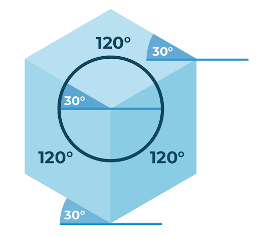
In isometric designs, all surfaces are at 90° or 30° angles, which are very easy to set up and clear for the viewer. Also, every isometric design is combinable because they are all compatible with each other.
An isometric design is based on techniques that an experienced designer can handle without any problem. These designs are created over an isometric grid that ensures that lines will never converge. Every isometric design must follow this grid, in which vertical lines remain vertical, and horizontal lines slope at 30°, creating the 120° rule that proclaims that the angle between the X, Y, and Z axes must be 120 degrees.
Credits: Blue compass
3 rules to understand isometric designs
There are 3 rules that are mandatory to create an isometric design ad that will help you to understand better how this technique works.
- Parallel lines will never converge
In a prospective design (which is based on how humans see) parallel lines converge at the vanishing point. In isometric designs, as the axes angles are equal, the parallel lines never converge.

Credits: Blue compass
2. 120° rule
As we explained before, the 120° rule is the soul of isometric designs. This technique works by always respecting this rule: vertical lines remain vertical while horizontal lines slope at 30°, so X, Y, and Z together add up to 120°.
Credits: Blue compass
3. Keep it simple
Embrace minimalism. Isometric designs use several angles and it can be confusing if you add many elements. You have to resist the temptation of adding an excess of information just because you gain new spaces in the design, if not it can be much less clear than a traditional 2D design.
Why are they so popular?
Isometric designs are the key to adding realism to your designs, and this is very useful to develop the branding and marketing of a brand in a better way. Nowadays, many marketers and entrepreneurs use isometric designs to develop more efficient communication with their potential clients.
Isometric designs allow you to show more details of your product with less clutter, which opens the marketing strategy to other aspects that you weren't able to reach before.
Flat designs vs isometric designs
Flat designs are the predecessors of isometric designs, and although they are a great option to deliver information visually, their main difference is the lack of depth.
Simpler is not always better. In some cases, a flat design can conditionate your communication with a lack of information and cause confusion in your audience. Isometric design will help you avoid this. Dominating the depth plane is going to give you the possibility of adding new information and clarifying the one you already have.
Where to use isometric designs
Although there are no strict rules of where you can or can not use isometric designs there are some cases in which the implementation of this technique can add a lot of value to your communication. You can always ask your designer if isometric designs will be useful in your case. In this list, we will share with you those situations in which isometric designs are a big yes.
- Logos: isometric designs are a great option to enrich your logos. This will give you a lot of new options to combine and play with the elements of your logo, that a 2D design will not give you.
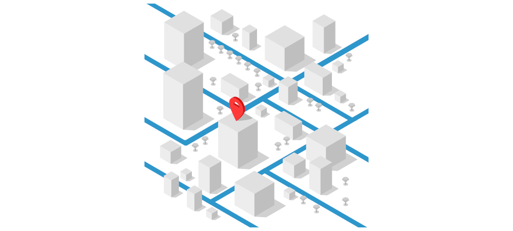
- Maps: 2D maps are quite old and confusing. Creating your maps with an isometric design will make a more clear communication to your clients. For example, if you have a store inside a shopping mall, a map created with an isometric design will be more understandable than a 2D map, depth is the key.
- Hero images: Hero images are those pictures that are at the top of a web page and are displayed front and center and in full width. The size and position of these images give us an undeniable premise: hero images are very important on your web page.
Hero images are the first thing that a user sees on your webpage, so creating your very own one for your brand with isometric designs will definitely be more attractive than a random image from the internet.
Is it suitable for your brand?
As we mentioned before, isometric designs are great in some situations but they simply don't work in other ones. It is very important to have a clear idea of when to use this technique and when to avoid it. It is not about using all of your communications and overwhelming users with complicated ideas that do not clarify anything.
There are no such things as brands that can use isometric designs and other ones that do not, but communications in which isometric designs will be useful and communications in which isometric design will be unnecessary and counterproductive.
This is why it is very important to count on a good designer that can give you some advice if it is a good situation to implement the isometric design or not. Also, a professional will be able to implement this technique correctly and take advantage of all the elements to enhance the communication of your brand.
