Data visualization is one of the vital components of data analysis, given that they have the capability of summarizing large amounts of data efficiently in a graphical format. There are many chart types known, each with its own strengths and use cases. One of the most misleading parts of the analysis process is choosing the right way to represent your data using one of the visualizations. This blog will dig deeper into everything that needs to be known about data visualization.
What is data visualization?
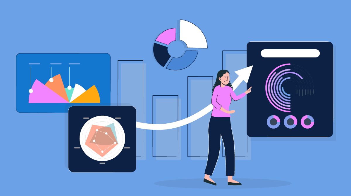
Data visualization is a graphical representation of high volume data. It uses charts, graphs, and maps to easier understand patterns and complex information.
Among data visualization resources, an infographic or visual can help us analyze data and hidden patterns in a much more manageable way. These are the common roles that data visualization includes:
- Showing change over time and a part-to-whole composition
- Looking at how data is distributed
- Comparing values between groups
- Observing relationships between variables
- Looking at geographical data
The kinds of variables that you are analyzing and the audience for the visualization can also affect which chart will work best within each role. Certain visualizations can also be used for numerous purposes depending on these factors.
Visuals can be used for two purposes. In the first place, there is exploratory data analysis, which is used by data analysts, statisticians, and data scientists to better understand data. As it is rightly called, it is used to explore the hidden trends, and patterns in data.
In the second place, there is descriptive data analysis. Once the analysts understand the data and find their results, the best way to convey their ideas and findings is through visuals. This is used to craft a story that will appeal to the viewer, offering deeper insights.
What does a data visualization specialist do?
A data visualization specialist's main responsibility is transferring and organizing raw data into a visual format that is easy to read and understand such as charts, graphs, and data maps just to name a few.
Among their day-to-day activities, data visualization specialists handle:
- Data visualization tools such as Google Charts, Tableau, D3.Js
- The creation of charts, graphs, and infographics
- The identification of relevant trends through data analysis
What are the key benefits of data visualization?
When companies handle huge amounts of data on a daily basis, data visualization is the process that helps make the most out of user input, insights and any other relevant information.
These are the 3 biggest benefits data visualization brings to the table:
Simplifies complex data
Visualizing data transforms overwhelming spreadsheets into easy-to-understand charts, graphs, and mental maps. These visuals empower teams to spot patterns and trends, without getting bogged down in the details. It's like having a helpful summary that reveals the most important aspects of the data.
Increases productivity
Use data visualization for efficiency! Making data more accessible, visualization saves time. Instead of spending hours poring over spreadsheets, a well-designed visualization enables teams to focus on other important tasks, like analyzing the data further or taking action based on the insights gained.
Bolsters better business decisions
Data visualization bridges that gap by presenting information in a clear and concise way. Allowing teams to see the bigger picture and make more informed decisions. For example, a visual representation of sales trends might reveal opportunities more clearly than a spreadsheet filled with numbers.
How to become great at data visualization
Strategic Color Utilization
If you use a consistent coloring scheme for your visuals, you should consider the following:
Even when color can add meaning and beauty to a chart, it is often best to use colors for highlighting important details and not merely for attractiveness. Too many colors will destroy the purpose of coloring, while using a single color or too many shades of one is more likely to confuse viewers.
Plus, take into account the visually impaired while designing visuals, you could, for instance, use contrasted colors. Also, use colors intuitively. For instance, for sentiment analysis, we can use yellow for positive emotions, and blue for negative ones.
Leveraging Size, Shape, and Format
It is recommendable that you use size, shape, and format to convey semantics. Using size, shapes like circles and squares may add semantic meaning and thus help viewers absorb the data easily. Also, sometimes arranging bar graphs in ascending order makes more sense, in the case of ordinal data, rather than arranging it alphabetically or randomly.
Effective Annotation Techniques
Furthermore, you should use legends, and words to properly annotate data. Use labels wherever required, but don’t clutter the graph with text. Use text data wisely. Place the visual data in a manner that is easy to grasp. You should also use interactive plots, which means racing graphs, interactive plots add value and help viewers engage with the data in greater depth.
Streamlining Visual Elements
Moreover, you have to remove junk from the chart. Remove the unnecessary junk from the chart that may distract the viewers. Don’t combine multiple views in a single visual to such an extent that it makes it difficult to comprehend. Use the scales to show the real picture. Label the data accurately, so you don’t over-label. Make sure that the labels are visible and properly oriented. Don’t add dimensions to visuals that may lead to skewness.
Crafting a Compelling Narrative
Finally, craft out a complete story. Focus on the bigger picture that you are trying to capture. Don’t provide inaccurate or misleading visuals. Use the visual tools wisely to tell more than the text would do.
3 Common mistakes to avoid while visualizing data
Between the common mistakes while visualizing data, we should avoid the three following:
1. Using a visual when it might not be needed
If data can be communicated effectively with statistics, we don’t need to create visuals. Visuals make it easier to analyze what numbers can’t convey. In consequence, you must choose wisely when to use a visual tool.
2. Think about what you are trying to convey
Correlation does not imply causation. We need to ensure results are backed up by proper research and experiments before jumping to causes.
3. Use of 3D visuals
Make sure that the 3D view does not hide a part of the data or distort the data. Use 3D graphics with utmost care. Don’t add orientations that may fool the viewer and destroy the purpose of visualization.
The most popular tools for data visualization
As data visualization increases in popularity. Many companies developed their very own data management tool to satisfy the market’s demand. But which ones are worth giving a try? There are 3 tools we believe provide the most comprehensive solutions at different skill levels and prices.
1. Tableau
Tableau is a powerful data visualization tool known for its simplicity and capabilities of creating dashboards with unique characteristics such as handling multiple users input simultaneously.
It is considered a click-and-drag solution, which means it is easy to use regardless of the user skill level. Anyone can make the most of Tableau, both beginners and experts. Keep in mind, Tableau is not free, companies need to pay a monthly fee to use it.
2. Google Chart
Google Chart is the most basic tool available to create charts and graphs based on available data. Many consider it to be really simple, making it perfect for first time users or companies that are starting to implement data visualization to make better decisions.
If the company uses other Google Cloud Services such as Google Drive or Google Sheets, Google Chart is a great way to streamline processes and avoid any compatibility issues.
While it lacks a wide range of customization and interactivity, Google Charts is a free service that provides the most basic tools needed in data visualization.
3. Power BI
Power BI is a group of data visualization tools developed by Microsoft that integrates with other products such as Excel. It is a popular choice for businesses that have deployed other Microsoft solutions such as Outlook or Teams.
What is the future of data visualization?
Data visualization is a big deal within the design field of work. Choosing the right chart for the job depends on the different types of variables that you are looking at and what you want to get out of them. It is possible that breaking out of the standard modes will help you gain additional insights. Experiment with not just different chart types, but also how the variables are encoded in each chart.
It is also key to keep in mind that you are not limited to showing everything in just one plot. It is usually better to keep each plot as simple and clear as possible, and instead use multiple plots to make comparisons, show trends, and demonstrate relationships between multiple variables.
At TDP, our experts craft impactful data visualizations to simplify our projects. Contact us to know more!