Users visit your site, look around, and leave without doing anything. Why? They don’t know where to act. We see it all the time with our customers.
In fact, many sites bury the CTA (Call-to-Action) or use weak, generic wording. Users don’t know what to do next, leading to missed opportunities. Without a clear CTA, even high-traffic sites fail to convert leads.
This guide will help you make small but powerful changes to your website that drive more sign-ups, sales, and engagement.
The Top 3 Places for Website Entry Points
- Above the Fold
This is the first thing users see without scrolling. Place a clear CTA here, like “Start Free Trial” or “Schedule a Demo”, depending on the action you want the user to take. - Within Key Content Areas
Place CTAs within product descriptions, feature breakdowns, or testimonials. These are the top places where people will feel more encouraged to take action. Example: “If you’re explaining benefits, add a ‘Get Started’ button directly under the benefit list.” - The End of the Page
Many users scroll to the bottom looking for closure. Add a final CTA here. Example: Create an anchor for users with “Ready to Get Started? Sign Up Now.”
Design Tips for High-Impact Website CTAs
If you want to go a step further, button and form design also matters.
- Forms can’t be that long. Just ask the necessary.
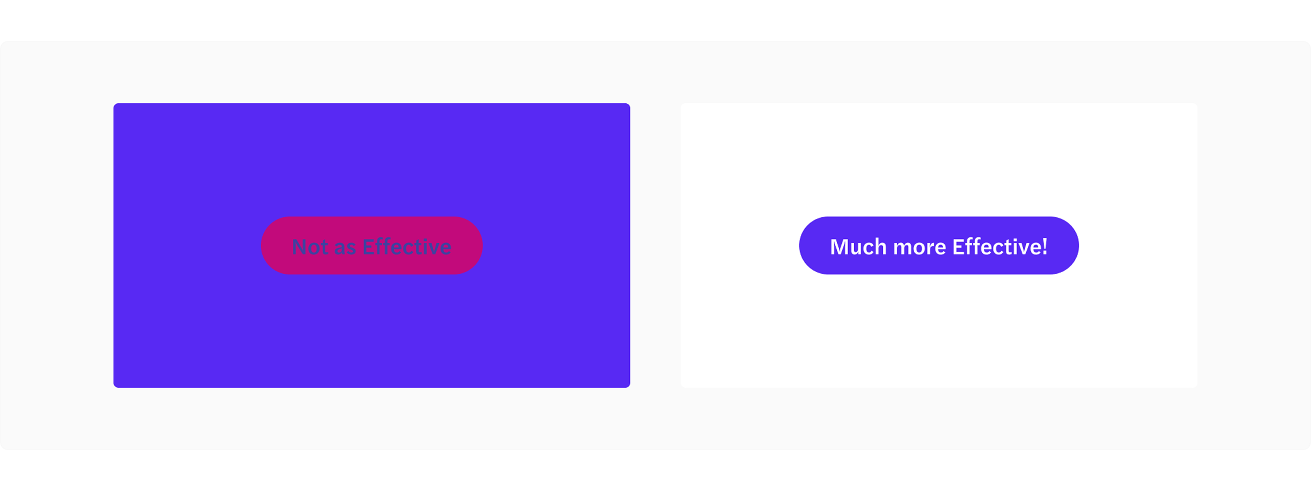
- Make sure the buttons are the most highlighted element in the screen. Users need to find it obvious that that’s where they can take action. A pro tip: Surround CTAs with whitespace to make them easy to see.
- Wording also matters. Avoid vague text like “Learn More.” Use direct phrases like “Claim Your Free Trial” or “Shop Now.” The user needs to be clear on what it is they’re doing.
Tip #1
Forms can’t be that long. Just ask the necessary.
Example: Instead of asking users to fill in First Name, Last Name, Email, Phone Number, Company, Job Title, simplify it to Name, Email, and Company (optional).
📌 Why? Shorter forms reduce friction and increase sign-ups.
Tip #2
Make sure the buttons are the most highlighted element on the screen.
Example: If your CTA button is blending in, adjust its contrast. Instead of a gray “Get Started” button on a gray background, use a bright blue “Get Started” button on a white background.
📌 Why? High-contrast buttons improve visibility and make it clear where users should click.
Common Website Mistakes to Avoid
- Hidden CTAs: CTAs buried in text or below the fold frustrate users.
- Too many choices: Stick to one primary action per page. We can have 2, but one of them needs to be the primary action.
- Slow Load Times: A slow website kills conversions. Optimize your page speed (use Google PageSpeed Insights).
Quick Wins for Websites
- We want users to be able to find the CTA at any point of their navigation. Add a sticky CTA that follows users as they scroll (e.g., a floating “Sign Up” button or a fixed top bar that contains it).
- Test headline + CTA combinations (e.g., “Join Free Today” vs. “Start a Free Trial”). An A/B testing will help understand which one works better. But before, let’s just place the 2. Some users might respond more to one or the other.
- Add trust signals (e.g., testimonials, reviews) near your CTAs to increase credibility.
Tip #1
Sticky CTA Buttons: A floating “Sign Up” button that stays visible as users scroll, ensuring they can take action anytime.
📌 Why? Shorter forms reduce friction and increase sign-ups.
Tip #2
Trust Signals Near CTAs:
Example: Place testimonials right below the CTA- “This tool helped us increase conversions by 30% in one month!” — Jane Doe, CEO of Growth Co.
📌 Why? Social proof builds trust and reduces hesitation.
Users shouldn’t have to search for where to click—your CTAs should guide them naturally, at the right moment, with the right message. Small tweaks in placement, design, and wording can make all the difference in turning visitors into customers. Now go optimize and watch your conversions grow! 🚀