
Campaign system Advisor photography, product proof, and a plainspoken trust claim in one composition.
Senior Experts, Amplified by AI.
Brand Guide v1.0 · May 2026Finvisor exists between two extremes.
Software-first platforms deliver speed, but lack strategic judgment. Traditional firms deliver expertise, but move slowly and rely on outdated systems.
Finvisor combines both: senior financial expertise, amplified by AI.
The brand exists to make that advantage impossible to miss.
Finvisor is not competing inside an existing category. It is naming a new one. The brand should reinforce that the choice between cheap software and an expensive firm is a false one.
Since 2014, Finvisor has supported startups and small businesses with accounting, CFO support, and other critical back-office operations. We combine experienced financial professionals with AI-powered systems and operational workflows to deliver accurate reporting, faster insights, and actionable guidance that helps founders and CEOs understand how their business is performing and what it will take to reach their next stage of growth.
Trust, expertise, and reliability are table stakes for any finance brand. Warmth and proactivity are where Finvisor differentiates. That is where the brand should lean hardest.
A senior person who doesn't need to oversell. Short sentences. Clear claims. No hedging, no jargon.
When in doubt, write the version on the left.
The Finvisor logo has been refined for better balance, stronger weight, and a more professional read. The chevron meaning is preserved (up and to the right, growth) and the wordmark now reads cleanly as Finvisor, not FinVisor.
Use the navy wordmark with the gold chevron on bone, off-white, or white backgrounds. This is the default for brand, sales, and client-facing materials.
Use the bone wordmark with the gold chevron on navy backgrounds. This is the preferred treatment for dark sections, covers, and presentation openers.
Use the standalone chevron only where the audience already knows the brand: favicon, app icon, small UI moments, social avatar, or internal product surfaces.
Use the circular favicon in browser tabs, saved shortcuts, app tiles, and tiny digital placements where the full wordmark will not hold.
Use circular lockups for social avatars, partner thumbnails, app-store style placements, and profile contexts where a square or round crop is required.
Two structural colors carry the brand: a deep navy that signals seriousness and trust, and a warm gold that signals warmth, optimism, and movement. Click any swatch to copy the hex code.
In product, color should support hierarchy, state, and financial meaning. Brand colors stay restrained so the interface feels operational, not decorative.
These five color families live exclusively inside the Finvisor product. Use them for data visualizations, chart graphics, and interface state indicators. They are never used in brand communications, marketing materials, presentations, or any surface outside the product UI.
Each scale runs from 50 (lightest) to 900 (darkest). The outlined chip in each row marks the primary use shade. Use it for UI elements on light backgrounds. Lighter tones work for tinted backgrounds and fills; darker tones for text labels on light surfaces. Click any chip to copy its hex value.
In the product UI, each state has a fixed color assignment. Consistency matters more than creativity, so engineers and designers should use these tokens without variation. Click any card to copy the primary hex.
For brand communications, Satoshi carries the system. In product, the team uses a more functional UI stack: Satoshi for branded navigation and key product surfaces, Geist for dense interface text, and Geist Mono for financial data.
Product type works like infrastructure, not expression: compact sizes, restrained weights, no decorative letterspacing, and color mostly reserved for hierarchy, state, and financial meaning.
Use for branded navigation, selected tabs, primary product labels, key headings, filters, chips, and product-specific actions. Most product usage is Medium 500, with Bold 700 reserved for page or chart titles.
Use for dense product interfaces: sidebars, cards, descriptions, metadata, table labels, and helper text. It carries most day-to-day UI at Regular 400 and Medium 500.
Use for currency, percentages, KPI deltas, axis labels, command keys, and values that need tabular comparison. Keep it Regular 400 by default; use SemiBold 600 for important positive or negative values.
Appears in maps, charts, and imported visualization patterns. Do not introduce it into new product UI unless the component or charting library requires it.
| Use | Size and line height | Weight | Typical color |
|---|---|---|---|
| Page and chart titles | 20 normal or 18 on 24 |
Satoshi 700 or Geist 600 | Navy #0C2939 or ink #1A1A1A |
| Section and card headers | 14 on 20 |
Geist 600 or Satoshi 700 | Ink #1A1A1A or Navy #0C2939 |
| Navigation and controls | 14 on 20 |
Satoshi 500 or Geist 500 | Navy, Navy Mid #2F627F, or muted gray #6E777D |
| Body, descriptions, metadata | 12 on 16, 11 on 16, or 11 on 18 |
Geist 400 | Muted gray #737373; ink for names and primary labels |
| Tags, chips, compact labels | 10 on 14 or 11 on 16 |
Geist 500 or Satoshi 500 | Gray for neutral states; semantic product colors for status only |
| Currency and KPI data | 14 on 20, 12 on 16, or 9 on 11.25 |
Geist Mono 400; 600 for emphasis | Ink for neutral data; green and red for deltas and exceptions |
Satoshi is the brand typeface. Geist and Geist Mono are product tools.Use them where the interface needs density, scanning, and numerical precision. New product work should avoid adding more families; retire legacy Inter usage when screens are rebuilt.
All type must meet WCAG 2.1 AA minimum: 4.5:1 ratio for body text, 3:1 for large text (18px bold or 24px regular and above). Target AAA (7:1) wherever possible. The combinations below have been tested against the Finvisor core palette.
Gold is never a text color on light backgrounds. It passes only when set on Navy (#0C2939). Navy Light (#9FC5DB) is decorative and data-viz only. Never use it as body or label text on light surfaces. When in doubt, default to Navy on Off-White.
Photography is where the brand earns its warmth. The team explicitly ruled out stock. The protagonists are the senior advisors clients actually work with, and the product UI clients actually use.
Actual Finvisor advisors. The people clients meet on calls and message in Slack.
At desks, on calls, in conversation. Natural light. Real expressions, not directed smiles.
Bright, calm, readable environments. The screen should feel like relief, not stimulation.
Genuine Finvisor AI screens. Real reporting layouts. No mocked dashboards when avoidable.
Finvisor uses Lucide for UI icons: simple line icons, restrained strokes, and clear product meaning. Do not browse the full library by default. Start with the active set below and add only when the interface has a real new need.
Use Navy or Ink Soft. Gold stays reserved for the Finvisor chevron and rare emphasis states.
Use 20px in product navigation and 14px to 16px inside dense controls. Keep icons on a 24px source grid.
Use Lucide's line style with square caps in brand compositions when possible. Avoid filled icons unless the UI state requires it.
Three repeating patterns built from the brand's core geometry. They generate depth in backgrounds, graphics, and compositions. Never use them as primary elements.
Dots
A regular field of small circular marks at a 22 px grid. Adds subtle texture without competing with photography or typography.
Grid
Horizontal and vertical lines at a 40 px interval. Evokes precision and structure, ideal behind data-heavy or analytical content.
Cross
A plus-mark repeating at a 48 px interval. Drawn from the chevron's axis geometry, it suggests convergence and navigation.
This section is reserved for finished mockups, product moments, photography, and collateral. It should show how the system behaves outside isolated rules: in screens, decks, reports, apparel, office details, and founder-facing touchpoints.
Campaign system Advisor photography, product proof, and a plainspoken trust claim in one composition.
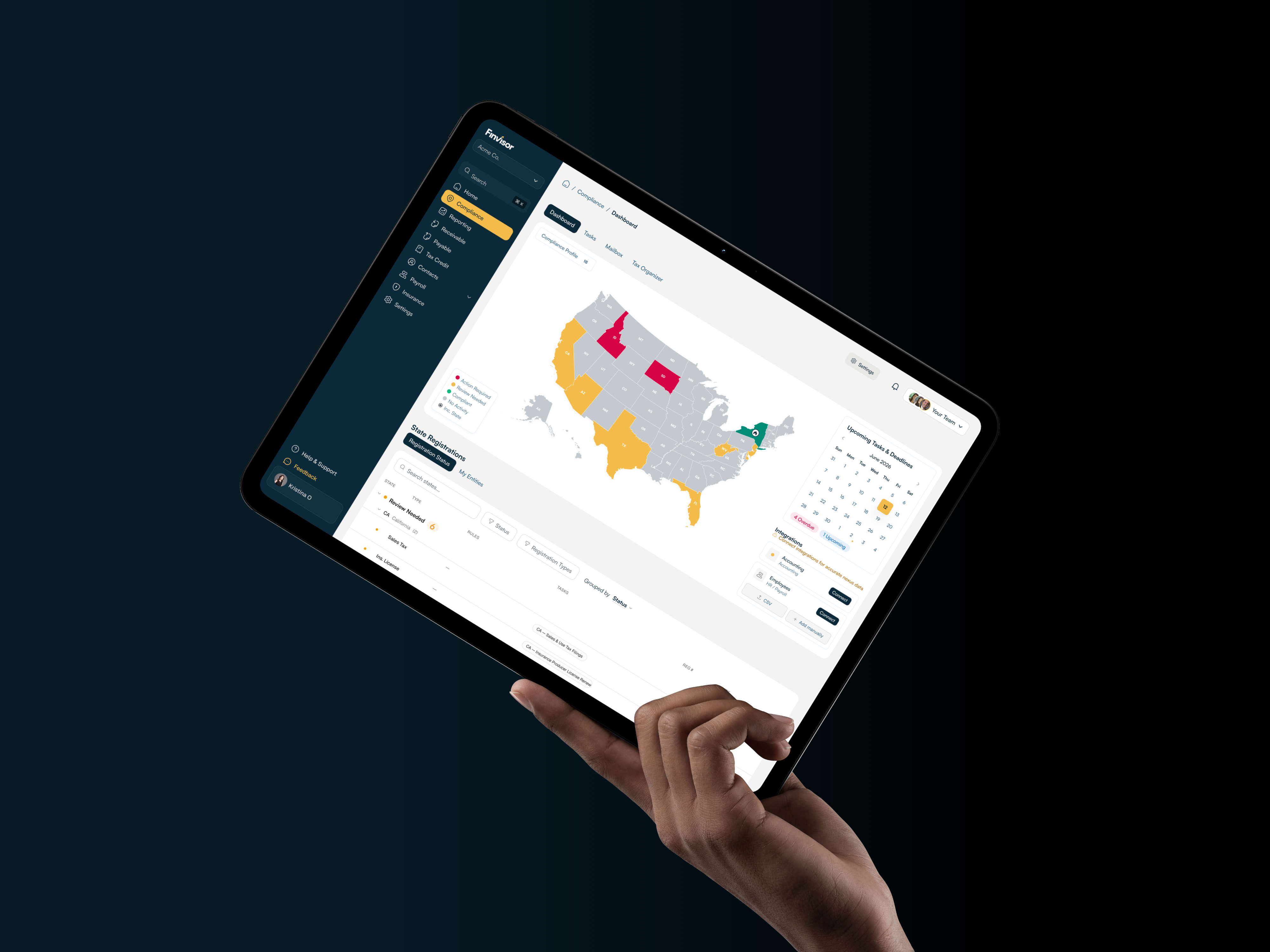
Product UI The brand feels most convincing when the product is visible and specific.
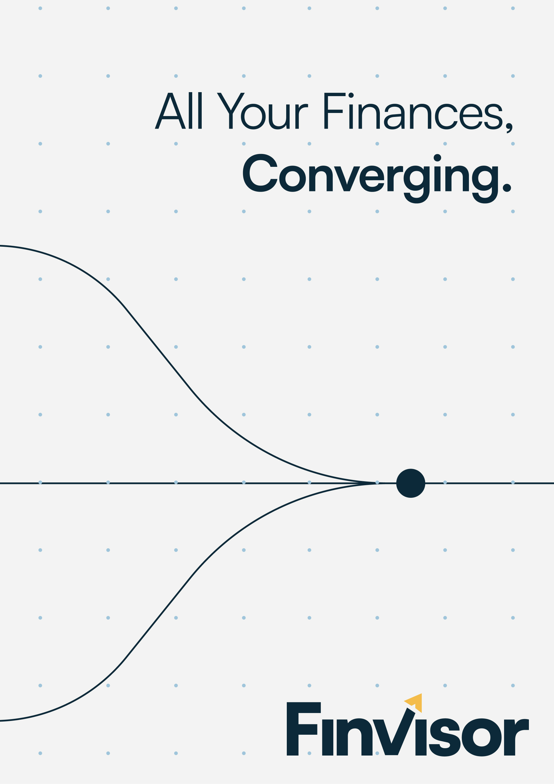
Brand graphics Geometry, dots, and direct language can carry abstract finance ideas without feeling generic.
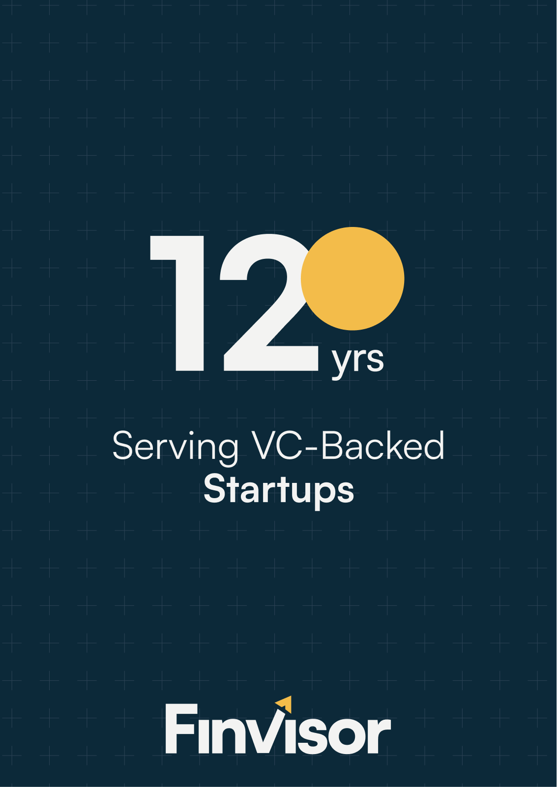
Milestone poster Use the pattern system and simple proof points to make experience feel concrete.

Advisor photography Real people make the expertise tangible. The copy should be as direct as the image.

Founder-facing proof Owner visibility, direct language, and a real service promise make the brand feel accountable.
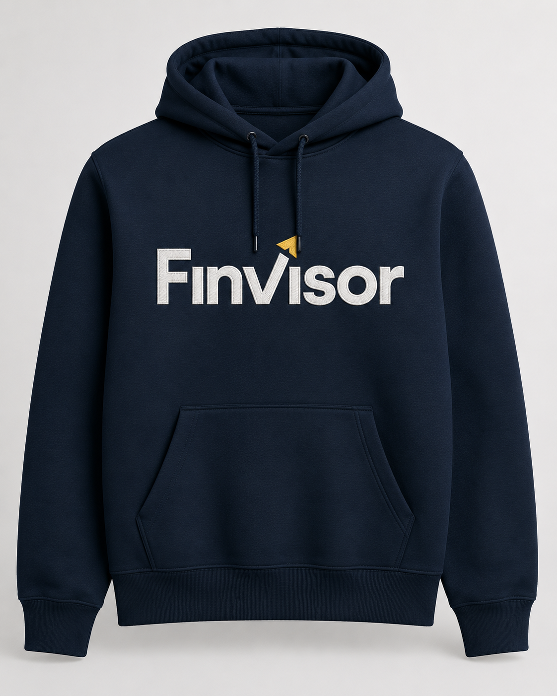
Team apparel The reversed lockup works well on navy materials when the chevron stays gold.
The deck skill turns Finvisor source material into presentation-ready artifacts without losing source content. Use it when auditing, reskinning, rebuilding, or creating decks from PPTX, PDF, screenshots, notes, or existing slide content.
Use finvisor-ui/deck-skill.md as the operating instructions for mode selection, source preservation, design rules, output format, and QA.
Use brand-guide.html as the canonical visual source. The skill should inspect the relevant sections before designing.
Keep logos, patterns, brand-in-use examples, advisor photos, source images, and product visuals available through repo-relative paths.
Provide the PPTX, PDF, screenshots, notes, or outline. The skill must extract text and meaningful images before changing the design.
Ask the user to choose: Audit-only, Reskin-only, Rebuild-preserve-content, or Net-new deck.
Recommend HTML for best brand fidelity. Use PPTX only when editable PowerPoint or Google Slides handoff is required. Offer both when useful.
Create a source ledger for all visible text, details, repeated footers, proof points, service names, claims, and credentials.
Create an image ledger for logos, photos, headshots, screenshots, charts, badges, and meaningful source visuals.
Review color, typography, logo, photography, iconography, patterns, and Brand In Use before choosing slide archetypes.
Choose deck rhythm, slide families, grids, proof moments, pattern usage, image treatment, and clean vs. textured slides.
Use real text and real source imagery. Do not flatten text into images or create fake UI, fake logos, fake people, or generic icons.
Run content coverage, image preservation, accessibility, alignment, text-fit, pattern-scale, reference-match, and brand-taste QA.
Use for highest visual fidelity: exact grids, nested rounded frames, continuous patterns, Satoshi typography, responsive preview, and browser screenshot QA.
Use when the user needs PowerPoint or Google Slides editability. Treat it as an editable export with stricter rendered PNG QA.
Build HTML as the source of truth, then create a simplified PPTX/export version when editable handoff is also needed.
Return findings, priority, and slide-by-slide fixes without creating a new artifact.
Every source text detail and meaningful image must appear, be intentionally relocated, or be explicitly flagged.
No near-alignment. Rectangles, media, cards, and panels must share exact grid edges, row heights, gutters, and spacing.
Text cannot clip, touch borders, sit too close to edges, break into vertical stacks, or become unreadable in rendered previews.
No random gold squares, fake icons, fake UI, generic SaaS card grids, shadows, gradients, or decorative elements outside the guide.
This guide is the visual source of truth. When the system changes, update the HTML first, then record the decision in the design documentation so future work starts from the same rules.
Edit brand-guide.html when sections, examples, assets, copy, or interaction behavior change.
Store referenced images and downloads inside the repo, using relative paths that work after deployment.
Update DESIGN.md whenever the guide changes a rule, component pattern, section, asset, or interaction.
Keep .impeccable/design.json aligned when tokens, active sections, icon sets, assets, or core rules change.
DESIGN.md.